Here is the reality behind those numbers: according to Unbounce, 96% of visitors who land on your site are not ready to buy. That does not mean they are worthless to you - it means that if you can capture their contact information before they leave, you have an actual shot at bringing them back when they are ready. The challenge is doing that and it doesn’t make your site feel like a pop-up minefield that sends visitors running.
That is where sticky bars and banners come in. These are the slim, persistent strips that sit at the top or bottom of a webpage and follow visitors as they scroll. Done right, they are soft, helpful, and fairly effective at converting casual browsers into leads you follow up with. Done wrong, they are just more noise - but the good news is that getting them right is not tough.
I’ll walk you through how to use sticky bars and banners to grow your lead list, from picking the right message to timing them well and placing them where they will actually perform. Whether you are setting one up for the first time or trying to get better results from what you already have, you’ll find helpful input you can put to work instantly.
Key Takeaways
- Sticky bars convert at 3.69% across millions of sessions while staying non-intrusive, unlike popups that interrupt the browsing experience.
- Placement matters: top bars suit time-sensitive offers, while bottom bars work better on content-heavy pages where visitors need time to warm up.
- Vague CTAs kill conversions; specific copy like “Get the free checklist” outperforms generic phrases like “Sign up” by giving visitors a clear reason to act.
- Timing triggers-scroll depth, time delays, exit intent-determine whether your bar feels natural or like unwanted pressure on arriving visitors.
- Track conversion rate, click-through rate, and dismissal rate together; each combination tells a different story about what needs fixing.
What Sticky Bars and Banners Actually Do (And Why They Work)
A sticky bar is a thin strip that sits at the top or bottom of a webpage and stays in place as you scroll - it doesn’t take over the screen or block content - it just stays visible, quietly doing its job while the reader browses.
That’s the important difference between a sticky bar and a popup. A popup demands attention by interrupting the experience, but a sticky bar stays present without forcing anything. Readers can ignore it, engage with it, or come back to it later. That low-pressure approach is a big part of why it works.
Sleeknote analyzed data across millions of sessions and found that sticky bars drew over 126 million views with a conversion rate of 3.69% - a real result for a format that asks so little of the visitor.
The format earns attention through consistency instead of interruption. Someone might scroll past your sticky bar three or four times before they click. That’s fine, and each scroll reinforces the message without annoying the reader. Popups don’t get that patience.
This also makes sticky bars helpful for leads that need a little more time to warm up. A first-time visitor might not be ready to subscribe instantly, but a persistent bar keeps the invitation open - by the time they’ve read enough to feel interested, the bar is still right there. Tools that help you turn anonymous website visitors into enriched leads can make that warm-up period even more valuable.
It’s also worth mentioning how lightweight the format feels to the user. There’s no “X” to hunt for, no overlay to dismiss, and no sense that the page is being held hostage. That low friction makes readers more receptive to whatever you’re asking them for. If you’re exploring your options, it’s worth looking at some of the best sticky bar and notification tools available to find the right fit.
Where to Place Your Sticky Bar for Maximum Visibility
Placement matters more than you might expect. A bar that sits in the wrong place - even with great copy - can seem pushy or go ignored.
The two main options are a bar fixed to the top of the screen or one anchored to the bottom. Top bars get seen immediately, which makes them ideal for time-sensitive promotions or announcements where you want instant attention. Bottom bars feel less aggressive and tend to be more effective when you want to let visitors settle in before asking for anything.
The page a visitor is on tells you quite a bit about where their head is at. A homepage visitor is still figuring out if they trust you, so a top bar asking for an email instantly can seem too forward. A blog reader who has spent three minutes with your content is in a different place - they already see some value in what you do, so a bottom bar nudging them toward your newsletter fits.
Landing pages are a bit different. Visitors arrive there with a job, so the sticky bar should support that job instead of pulling attention in a different direction. In that case, placement can become less about top versus bottom and more about what the bar is actually saying.
Ask yourself: does the visitor see your bar before or after they have received something from you? If they see it before, you are asking for trust you have not yet built. That rarely goes well. If you need help thinking through your setup, feel free to reach out to our support team.
Bottom bars give visitors a bit of room to breathe first, which is why they convert well on content-heavy pages. Top bars are at their best when the message is legitimately time-sensitive or when brand recognition is already strong enough to carry the ask.
Writing Copy That Gets People to Actually Click
The words inside your sticky bar do most of the heavy lifting. You could have perfect placement and a well-timed display, but weak copy will still kill your conversion rate.
The most common mistake is a vague call to action with no context. “Sign up” on its own doesn’t tell a visitor what they’re getting or why they should care. Something like “Get the free checklist” or “Save your seat for Wednesday’s session” gives a reason to act and a picture of what comes next.
It’s helpful to try to remember where the visitor is in their process. Someone reading a beginner blog post is probably looking to learn more, so a CTA with a free guide or email series fits. Someone on a pricing page is already weighing their options, so a CTA like “Talk to someone before you decide” speaks directly to what they need in that moment. The copy that works on one page can seem decidedly out of place on another.
Urgency and curiosity are two tools worth using, but only when they’re genuine. A limited-time discount is a fair reason to act fast. A teaser like “Most visitors miss this one step” can pull people in if the payoff actually delivers. Don’t manufacture pressure just to sound urgent.

Keep the copy short. Your sticky bar has very little space and even less of the visitor’s attention. One crisp sentence and a short button label is usually enough. The button text is the last push - not the place to explain everything.
Write to what this visitor wants right now. The answer changes depending on the page and the person.
Design Choices That Affect Your Conversion Rate
Design is not just about making things look nice - it directly changes how many people take action. Getsitecontrol found that email forms with images convert at 4.3% compared to 2.63% without one - that’s a lift of over 63%. Adding a relevant image to your sticky bar is worth testing before you dismiss it.
Color contrast is one of the first things to get right. Your call-to-action button needs to stand out from the background of the bar itself. If they are a similar shade, the button gets lost and clicks drop. An easy rule: pick a button color that doesn’t appear anywhere else in the bar.
Font size matters more than you might expect. A bar crammed with small text is easy to scroll past, and that’s also the case on mobile. Stick to one or two font sizes and make sure that the words that matter most are the largest ones on the bar.
Your sticky bar competes with your headline, your navigation, and your images all at once - it needs to be bold without clashing with your existing brand colors or feeling like a separate website stuck on top of yours.
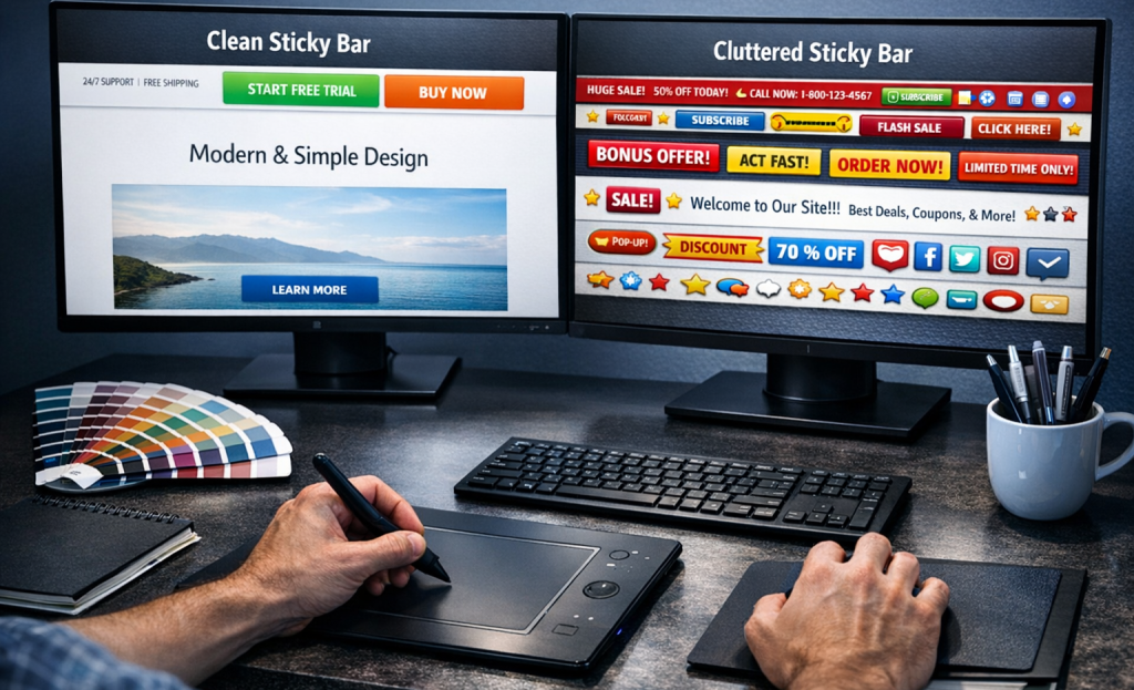
Cluttered bars are a real problem. A headline, a subheading, an image, a form field, and a button all in one bar makes the whole thing hard to read fast. People don’t pause to figure it out - they just move on.
A/B testing different design versions is the most reliable way to find what works for your audience. Test one variable at a time - button color one week, image versus no image the next. Small changes in layout can produce results that are well worth the extra effort to measure.
Timing and Triggers - When to Show Your Bar
A sticky bar that appears the second someone lands on your page can seem like a door-to-door salesperson who starts their pitch before you’ve even said hello. Timing is what separates a bar that feels natural from one that feels like pressure.
Most tools give you a handful of trigger options to work with. A time-based trigger delays the bar until the visitor has spent a set number of seconds on the page. A scroll-depth trigger waits until they’ve read a percentage of the content - say, 60% or 70% of a blog post. Exit intent fires the bar when the visitor’s cursor moves toward the top of the browser, which tells you they’re about to leave.
Scroll depth is worth mentioning for content-heavy pages. Someone who has read most of your post has already shown interest, so a relevant lead magnet at that point feels like a natural next step instead of an interruption.
You can also use session-based rules to control repeat exposure - that means the bar only appears once per visit, or stays hidden for returning visitors who have already signed up. That rule keeps the experience from feeling repetitive for people who come back to your site.

Sticky bars account for 16.74% of all popup format views, according to Sleeknote data; it’s a real share, and it goes well with how the format earns attention steadily over time instead of in a single burst. The bar stays visible as the visitor scrolls, so the trigger you choose shapes how long that exposure actually lasts.
The right trigger can depend on your page type, your content length, and what you want the visitor to do next.
Lead Magnets That Pair Well With Sticky Bars
A sticky bar gives you one line to make your case. That means the offer you put behind it has to be immediately understood - no setup, no context, no explanation.
Some lead magnets are ideal for that constraint. Discount codes work well because the value is obvious (“Get 10% off your first order”). Free guides and checklists work when the title is enough to feel helpful on its own. Waitlist signups work because they tap into anticipation without needing much detail. Email courses can work too, as long as the topic is narrow and the benefit is clear from a few words.
What tends to not work is anything vague. A freebie called “a free resource” or “exclusive content” tells visitors nothing about what they actually get. Generic offers are easy to scroll past - and in a sticky bar, that’s what most will do.

It’s helpful to remember where your average visitor is in their awareness of your product or problem. Someone landing on your site for the first time probably isn’t ready to commit to anything that feels like a big choice. A low-friction offer like a discount or a short guide fits that stage much better than, say, a free consultation or a complete email series.
The most helpful lead magnets in sticky bars tend to be specific. Not “free marketing tips” but “free checklist to write better email subject lines.” The more concrete the outcome, the more reason a visitor has to care.
Ask yourself if a stranger would understand the value of this offer in under three seconds. If the answer is no, the problem probably isn’t the bar - it’s the offer itself.
How to Track Whether Your Sticky Bar Is Actually Working
A sticky bar that gets thousands of views but almost no sign-ups is not a traffic problem - it’s a copy or design problem. Before driving more visitors to your page, check what your existing visitors are doing when they see the bar.
The three numbers worth watching are your conversion rate, your click-through rate, and your dismissal rate. Your conversion rate tells you how many visitors completed the action you wanted. Your click-through rate shows how many visitors engaged with the bar at all. Your dismissal rate shows how many actively closed it and moved on.
These three numbers together tell a story. A low click-through rate with a high dismissal rate usually means the message is not connecting. A decent click-through rate with a low conversion rate suggests a landing page or form issue instead.

It also helps to check an easier thing first: is the bar actually showing to anyone? Check your targeting rules and display conditions, because sometimes a bar fails not because of messaging but because it was never visible to the right audience.
Tools like heatmaps and session recordings can fill in the gaps that raw numbers miss. Watching how actual users scroll and interact around your bar gives you context that a spreadsheet can’t. Some platforms let you layer this data alongside form submission data, which makes it much easier to see where visitors drop off.
When you find a high view count paired with a low conversion rate, that’s your signal to run a test. Change the headline, swap the button text, or try a different color. Small adjustments to the bar itself can move the numbers more than almost anything else.
Small Bar, Big Results - Now Go Set One Up
If you’re just starting, it’s easy: pick one goal, write one strong CTA, and launch one bar. See how it performs before layering in more complexity. The temptation to over-optimize before you have data is real, but a simple bar that loads on every page is already ahead of nothing.

The math has a way of being encouraging here. A bar with even a modest conversion rate, showing up on every page, every session, every day, adds up faster than expected. Start small, watch the numbers, and adjust; that’s all there is to it.
FAQs
What is a sticky bar and how does it work?
A sticky bar is a thin strip fixed to the top or bottom of a webpage that stays visible as visitors scroll. Unlike popups, it doesn’t interrupt the browsing experience - it quietly maintains presence until a visitor is ready to engage.
How well do sticky bars convert compared to other formats?
According to Sleeknote data from millions of sessions, sticky bars achieve a conversion rate of 3.69%. That’s a solid result for a format that remains non-intrusive and doesn’t force visitor interaction.
Should I place my sticky bar at the top or bottom?
Top bars work best for time-sensitive offers where immediate attention is needed. Bottom bars suit content-heavy pages, giving visitors time to engage with your content before seeing the ask.
What type of copy works best in a sticky bar?
Specific, benefit-driven copy consistently outperforms vague phrases. “Get the free checklist” gives visitors a clear reason to act, while generic CTAs like “Sign up” provide no compelling reason to engage.
What metrics should I track for my sticky bar?
Monitor three key metrics together: conversion rate, click-through rate, and dismissal rate. Each combination tells a different story - high dismissals suggest messaging problems, while low conversions despite clicks may indicate a landing page issue.


