Here’s something worth knowing before greenlighting a months-long overhaul: research from Forrester found that every $1 invested in user experience can return as high as $100; it’s a staggering ROI, and it doesn’t come from blowing up your entire site - it comes from how actual users move through your pages - and then making targeted changes that remove friction and build trust at the right moments.
The difference between a website that looks good and one that converts is usually just a handful of small decisions. A button placement here, a headline change there, a single line of social proof added above the fold. These aren’t dramatic changes. Most can be tested in an afternoon. But their impact on how visitors feel - and what they do next - can be significant.
What follows are seven helpful design changes that are easy to overlook but hard to underestimate. Some are visual, some are structural, and a few are both. None of them need a developer on retainer or a brand-new budget. They just need a willingness to look at your site through your customer’s eyes - and make a few moves that actually matter.
Key Takeaways
- Small, targeted design changes-like button color and CTA copy-can significantly boost conversions without expensive site overhauls.
- Page speed directly impacts sales; 40% of visitors leave if a page takes longer than three seconds to load.
- Trust signals like security badges, testimonials, and money-back guarantees can lift conversions by up to 30% when placed strategically.
- Adding video to landing pages can improve conversions by up to 80%, as it builds trust faster than written content.
- Since over half of web traffic is mobile, unoptimized mobile experiences-small buttons, hard-to-read text-silently kill conversions.
Why Your CTA Button Color Is Quietly Killing Conversions
Your call-to-action button is doing a job every second someone lands on your page. But if it blends into the background or sends the wrong emotional signal, visitors scroll past it without a second thought.
The color of that button matters more than you give it credit for. Performable ran a test where they swapped a green button for a red one and saw a 21% increase in clicks. Ript Apparel made a similar move - changing green to yellow - and picked up a 6.3% lift. Neither company rewrote their pitch or rebuilt their layout. They just changed the color.
Part of it’s psychology. Red can create a sense of urgency, which encourages people to act now instead of later. Yellow pulls the eye because of how it contrasts against most backgrounds. These aren’t arbitrary effects - they’re rooted in how we process visual information.
The other piece is contrast. A button that sits comfortably in your color scheme might actually be working against you. If your site uses green, a green button will disappear into the page. Your CTA needs to stand out from its surroundings to draw the eye at all.

It’s worth looking at your site the way a first-time visitor would. Squint at the page - if your button doesn’t instantly draw your eye, that’s a sign something needs to change. Tools that help you turn anonymous visitors into leads often surface exactly this kind of friction.
There’s no single color that works for every site. You want to find the one that creates enough visual tension to get seen without clashing in a way that looks unintentional. A quick A/B test between two options gives you an actual answer in a matter of days.
The One-Word Copy Tweak That Lifted Signups by 20%
The color of your CTA button gets visitors to look. The words on it determine if they click. And the difference between a good word and a bad one is bigger than you might expect.
Researchers at Carnegie Mellon University ran a study on DVD trial signups and found that changing one small phrase in the CTA copy lifted conversions by 20%. The word “a” was swapped for “no” in a phrase about fees, which makes the offer feel less risky. That single change removed a small hesitation - and the numbers moved in a meaningful way.

That’s what language friction looks like in practice. Certain words feel vague or demanding to a visitor, and that feeling pushes them away without them even realizing it. Words like “Submit” feel transactional and cold. “Get My Free Guide” tells them what they walk away with and frames the action as a gain instead of a chore.
It’s helpful to remember what a visitor is feeling right before they click. Are they nervous about being locked into something? Unsure what comes next? The right words answer those unspoken questions. The wrong ones leave a gap that hesitation fills.
| Low-Confidence Word | Higher-Confidence Swap |
|---|---|
| Submit | Get My Free Guide |
| Buy Now | Start Saving Today |
| Sign Up | Create My Free Account |
| Learn More | See How It Works |
Small word swaps like these take minutes to test and cost nothing to try. The copy around your button matters too - a short reassurance like “No credit card needed” can do just as much work as the button text itself. If you’re exploring tools to display these CTAs, it’s worth checking out some of the best alternatives to the Hellobar widget to find the right fit for your site.
How a Slow-Loading Page Bleeds Sales Every Single Day
Your copy can be sharp and your buttons can be well placed, but if your page takes too long to load, none of that matters. Visitors won’t wait around to see it.
According to Kissmetrics, 40% of visitors will leave a page that hasn’t loaded within 3 seconds. Akamai research found that each extra second of delay can drop conversions by around 7%. Those numbers add up fast across a week or a month of traffic.
The frustrating part is that slow load times are usually caused by fixable things. Large, uncompressed images are one of the biggest culprits. Bloated third-party plugins add extra weight that your server has to carry on every page load. Cheap shared hosting can also throttle your speed when traffic picks up - even slightly.
First and foremost, know where you stand. Google’s PageSpeed Insights is a free tool that scores your page and tells you what to fix. GTmetrix is another one - it gives you an overview of load time, page size, and the files that are slowing things down. Run your URL through either of these and you’ll have a concrete list to work from.

A few quick wins can make a real difference. Tools like Squoosh or TinyPNG let you compress images and upload them without losing visible quality. If you’re on WordPress, auditing your active plugins and removing ones you don’t use anymore is a low-effort fix with a big payoff.
Speed works quietly in the background. Visitors don’t think about it consciously, but they feel it - and a faster page keeps them present long enough to read what you’ve worked so hard to write. If you run into trouble along the way, our support team is happy to help.
Trust Badges and Testimonials: The Shortcut to a Confident Buyer
When someone lands on your site for the first time, they don’t know you yet. That unfamiliarity creates hesitation, and hesitation kills sales. Trust signals are out there to close that gap fast.
A security badge near your payment field tells a nervous buyer that their card details are safe. A money-back guarantee next to the “Buy” button removes the fear of making the wrong call. Real customer testimonials - placed below your hero section or close to your call to action - let other people’s words do the convincing. According to ConversionXL, trust signals like these can lift conversions by as much as 30%.
Placement matters quite a bit here. A testimonial buried at the bottom of the page won’t do much work. Trust signals should appear at the exact moment a buyer starts to pause - which is usually right before they commit to something.
| Trust Signal Type | Where to Place It | Why It Works |
|---|---|---|
| Security Badge (SSL, Norton) | Checkout page, near payment field | Reduces fear of fraud |
| Customer Testimonials | Below the hero section or near CTA | Social proof builds confidence |
| Money-Back Guarantee | Product page, near “Buy” button | Lowers perceived risk |
| Star Ratings / Review Count | Product listings, landing pages | Quick visual credibility cue |
One thing to watch: too many badges can backfire. A cluttered row of logos starts to look like wallpaper and loses its effect entirely. Pick the trust signals that are most relevant to your buyers and give each one room to breathe.
Where You Put Things on the Page Matters More Than You Think
Even with the right words and the right social proof in place, a poorly arranged page can still push visitors away. The layout of your page does quiet work - it either guides a visitor toward a buy or leaves them wandering without direction.
People don’t read web pages the way they read books. Eye-tracking research has shown that visitors scan in predictable patterns. On text-heavy pages, eyes move across the top, then down the left side - this is the F-pattern. On pages with more visual structure, like landing pages, a Z-pattern takes over; the eye moves diagonally from top-left to bottom-right.
What that means for you is simple. The most important elements - your headline, your value statement, your call to action - belong in the places where eyes land first. If your buy button is buried below a wall of text, visitors will never reach it.

This is where “above the fold” still matters. Anything a visitor can see without scrolling gets the most attention and the most trust. Put your important action there.
Whitespace matters as much as what you actually put on the page. A cluttered layout makes the brain work harder to process what it’s seeing, and that friction translates directly into hesitation. When a page feels too busy, visitors stall - and stalling in an online store tends to end in leaving.
Visual hierarchy is the practice of making important things look important. Larger text, bolder contrast, and deliberate spacing all help draw the eye to what you want visitors to see next. You don’t need a design degree to get this right - you just need to look at your page and ask what your eye lands on first.
Adding Video to Your Landing Page Can Double Your Conversions
Video is one of the most underused elements on a landing page. According to Unbounce, adding a video can improve conversions by as much as 80%. That lift is hard to get from any other single change.
The reason video works so well comes down to trust. Text tells what you do, but video shows them. A short product demo or explainer clip lets visitors see your product in action before they commit to anything. That familiarity moves them closer to a buying decision faster than a paragraph of benefits ever could.
Customer story videos work especially well because they let actual customers do the talking. A 60-second clip of a customer explaining how your product helped them is more persuasive than a written testimonial - it feels human, and that matters.
Not every video helps, though. Autoplay with sound is one of the fastest ways to lose a visitor - it feels intrusive and they will just leave. A slow-loading video has the same effect, so keep file sizes small and test load times on different connections. Low production quality can also work against you if it makes your brand look unpolished.

You don’t need a big budget to get this right. A clean, well-lit video shot on a decent phone can perform just as well as something professionally produced. What matters most is that the content is relevant, brief, and easy to watch without sound.
Place your video near the top of the page where it supports your main message, answering the visitor’s first question - “what is this, and why should I care?” - before they even have to scroll down.
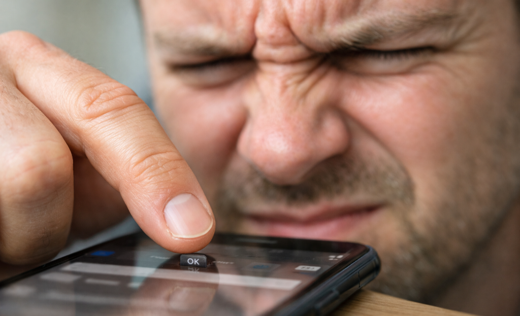
Your Mobile Experience Might Be Turning Away Half Your Visitors
More than half of all web traffic now comes from mobile devices - and in a lot of industries, that number is closer to 60 or 70 percent; it’s not a small slice of your audience; it’s most of it.
If you can’t tap your call-to-action button on a phone, it doesn’t matter how polished your desktop site looks.
Small buttons are one of the biggest silent killers of mobile conversions. When a button is too small to tap without accidentally hitting something else, visitors don’t try again - they leave. The same goes for text that needs to be pinched and zoomed to read, which instantly tells visitors that the page wasn’t built with phone users in mind.
Forms are another weak point. A contact form or checkout flow that works fine on a desktop can seem like a frustrating obstacle on a phone. Too many fields, no auto-fill support, and input boxes that are hard to tap all add friction at the wrong moment - right when someone is ready to convert.
The fix doesn’t have to be a full redesign. Check that your buttons are large enough to tap comfortably, your font size is readable without zooming, and your forms are as short as they can be. Run your site through Google’s free mobile-friendly test to get a quick read on where things stand.
Every change I’ve covered here works best when your mobile experience isn’t quietly undermining it. Better copy, stronger CTAs, and trust signals all don’t work if the person reading them is having a hard time getting through your site on their phone.
Small Tweaks, Big Wins - Here’s Where to Start
None of this is guessing. Every change covered here is grounded in actual behavioral data and conversion research. When you make a change and your numbers improve, you’ll know why. That turns your website from a static brochure into a tool you actively sharpen over time.
Think of your site as a living thing - something that grows and improves with every small adjustment. The businesses seeing the biggest gains online aren’t always the ones with the flashiest redesigns. They’re the ones paying attention, who test and treat every visit as a chance to learn something. A few intentional changes are all it takes to get started.
FAQs
What button color change can boost conversions most effectively?
There’s no single best color, but high contrast matters most. Performable saw a 21% lift switching green to red, while Ript Apparel gained 6.3% switching to yellow. Test two contrasting options against your site’s existing color scheme to find what works.
How does page speed directly affect my sales?
40% of visitors leave if a page takes longer than three seconds to load, and each additional second of delay can drop conversions by around 7%. Use free tools like Google PageSpeed Insights or GTmetrix to identify and fix speed issues quickly.
Where should I place trust signals on my website?
Place trust signals at the exact moment visitors hesitate-security badges near payment fields, testimonials below the hero section or near your CTA, and money-back guarantees next to the buy button. Avoid cluttering the page with too many badges, as this reduces their effectiveness.
Can adding video really double my landing page conversions?
Yes-according to Unbounce, adding video can improve conversions by up to 80%. Short product demos or customer story videos build trust faster than written content. Keep videos brief, avoid autoplay with sound, and place them near the top of the page.
What quick fixes improve mobile conversion rates?
Ensure buttons are large enough to tap comfortably, text is readable without zooming, and forms are short with auto-fill support. Run your site through Google’s free mobile-friendly test to quickly identify problem areas affecting your mobile visitors.