
Here is the thing worth knowing: webinar registration pages actually convert better than most landing pages. According to GetResponse, the average webinar landing page converts at 22.84% - roughly double the common landing page benchmark. That means the format itself is not the problem. People sign up for webinars. They do it all the time. If yours is falling short of that number, something is in the way.
The tough part is that registration pages look easy on the surface. A headline, a few bullet points, a form, a button. How much could go wrong? As it turns out, quite a bit - and the problems are not always obvious. They like to hide in the details: a headline that does not communicate value, a registration form that asks for too much, a page that loads slowly on mobile, a call-to-action that does not feel urgent enough to act on right away.
I’ll talk about the most common reasons webinar registration pages underperform and, more importantly, what to do about each one. If your page is not pulling the numbers you need, the answer is somewhere in here.
Key Takeaways
- Webinar registration pages average 22.84% conversion rate - double typical landing pages - so underperformance signals a fixable problem.
- Shorter registration forms convert significantly better; two-field forms outperform longer ones by 34%.
- Copy should lead with outcomes visitors gain, not event descriptions or presenter credentials.
- 64% of registrants sign up within the final week, and a three-reminder email sequence can boost attendance by 27%.
- One-click join links improve attendance by 15%; friction after registration - logins, app downloads - costs you already-won attendees.
The Registration Form Mistakes That Quietly Kill Sign-Ups
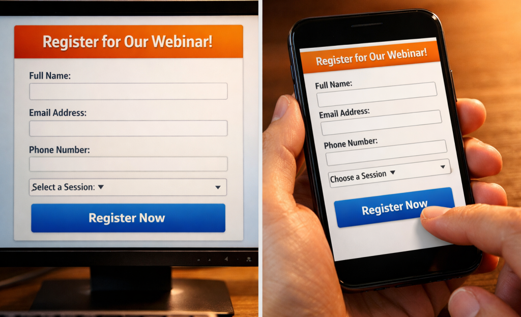
Most webinar hosts never stop to question their registration form. They just add fields because each one feels helpful at the time - job title, company size, phone number, industry - and before long, the form has eight fields and a dropdown menu no one asked for.
Here’s a quick exercise: count the fields on your registration form right now.
The data on this is pretty telling. Forms with five or fewer fields see a 10% higher conversion rate than longer ones, and two-field forms convert 34% better than forms with more fields; it’s not a small gap. People are willing to sign up. But they’re not willing to fill out a mini application to attend a free event.
The underlying problem is that extra fields feel low-cost to add and high-value to have. Someone on the marketing team wants to segment by industry. Someone in sales wants phone numbers to follow up. These are understandable goals. But they’re being funded by your conversion rate.
It’s helpful to try to draw a hard line between fields that get used and fields that just collect dust. Name and email are the obvious keepers - you need them to send the confirmation and the recording. Everything else should be looked at more closely. How you label those fields matters just as much as which ones you include.
| Form Field | Worth Keeping? | Why |
|---|---|---|
| First name | Yes | Personalizes follow-up emails |
| Email address | Yes | Essential for delivery and follow-up |
| Job title | Sometimes | Only if you actively use it to segment |
| Phone number | Rarely | High friction, low completion rate |
| Company size | Rarely | Usually sits unused in a spreadsheet |
| Industry | Rarely | Adds steps without adding much value |
If a field isn’t connected to an action your team will actually take, it’s just friction between a visitor and a confirmed registration.
The fix is to strip the form back to what you need to run the webinar and send a follow-up. You can always learn about your audience after they’ve shown up.
Why Your Page Copy Fails to Answer the Only Question Visitors Are Asking
Every person who lands on your registration page is silently asking one thing: “What’s in it for me?” Your copy has a matter of seconds to answer that before they leave. Most pages don’t answer it at all.
The most common mistake is writing copy that describes the webinar instead of selling the result. There’s a difference between “Join us for a 60-minute session on content strategy” and “Learn how to get 3 months of content ideas out of a single brainstorm.” One tells visitors what the event is. The other tells them what they walk away with. Visitors don’t register for events - they register for results.
Presenter-focused copy is a close second in terms of what kills conversions. Spending the first paragraph on the host’s credentials before saying anything about what the visitor gets is a trust problem - it tells them that the page is written for the host’s ego, not the visitor’s needs. Save the bio for further down the page, once you’ve already given them a reason to care.

Vague titles do damage too. Something like “Marketing in the Modern Era” sounds like a conference keynote title and says almost nothing to a cold visitor. A cold visitor is a person who has never heard of you before and has no context for what you do. They need specifics, and a title that sounds great but communicates nothing will not earn their registration.
Internal jargon is another quiet conversion killer. Words and phrases that your team uses every day can mean very little to people outside your world. If your page copy only makes sense to those who already know your product or industry, you’ve written it for the wrong audience.
The fix is to look at your page and ask what a stranger would take away from reading it in 10 seconds. Pull your value proposition to the top. Lead with the problem your webinar helps solve. Write the way your audience talks about that problem - not the way you talk about your answer. It also helps to track your page’s micro-conversion metrics so you can see exactly where visitors are dropping off before they register.
Look at registration pages in your space that convert well and see how they are structured. The best ones front-load the outcome and let everything else support that promise. Tools like landing page builders with built-in CRO features can help you test different structures and find what resonates with your audience.
When and How People Actually Register - and How to Use That Timing
Even a well-written registration page can underperform if your promotional timing is off. The copy gets people to say yes. But they have to see the page at the right moment to say yes at all.
A number worth mentioning: 64% of registrants sign up within the final week before the event. The bulk of your audience isn’t making decisions weeks in advance. They’re registering close to the date, once the event feels relevant and timely to them.
Email is also the dominant channel here. Around 65% of sign-ups are because of email marketing, which tells you that social posts and paid ads play a supporting role at best. If your email sequence is thin or poorly timed, you’re likely leaving a large portion of possible registrants on the table.
The three-reminder email sequence is one of the most effective ways to lift live attendance. Research suggests a 27% increase in attendance when hosts send a structured series of reminders instead of a single promotional email; it’s not a small difference - it’s the lift that determines whether a webinar is a success or a disappointment.
The table below breaks down how to structure each reminder and what your audience needs to hear at each stage.
| Reminder Timing | Audience State | Recommended Action |
|---|---|---|
| 1 week before | Awareness phase | First email invite with full value pitch |
| 1-2 days before | Decision phase | Urgency-focused reminder email |
| Day of event | Commitment phase | Short, direct “starts today” nudge |
Each message serves a different job. The first email plants the idea and makes the case for attending. The second arrives when people are close enough to the event to actually put it in their calendar. The day-of push is short because it doesn’t need to sell anything - it just needs to get a person who already registered to follow through.
Look at your latest promotional calendar and ask yourself if it aligns with how your audience actually behaves. Most hosts send one or two emails and expect registration to take care of itself. Using urgency ethically in your reminder messaging can make a meaningful difference without eroding trust with your audience.
The Mobile and Access Friction Problems Most Hosts Overlook
Around 78% of webinar registrations happen on desktop, so your registration page needs to work well on a full browser first. Mobile still accounts for roughly 22% of sign-ups, so you can’t ignore it. But if you have to choose where to start your optimization work, desktop is the right answer.
Mobile registration pages break down in predictable ways. Forms with too many fields become tedious to fill out on a small screen. Buttons that are easy to click with a mouse become frustrating to tap with a thumb. Run through your own registration page on your phone and get frustrated at anything that feels annoying - because that feeling is what’s driving people away.
A lot of hosts lose attendees they’ve already won over at the next stage. The registration experience doesn’t end when someone hits submit. The confirmation email, the reminder, and the join link matter just as much.

BrightTALK found that one-click access to a webinar drives a 15% higher attendance rate compared to login-gated entry; it’s an actual difference, and it can depend on friction after the fact. When someone gets a reminder email and clicks a join link, they expect to land in the room. If they’re instead asked to log in to a platform, create a password, or verify their account, a percentage of them will just close the tab.
The fix is to send a direct, personalized join link in every confirmation and reminder email. Most webinar platforms generate these automatically, so it’s less about adding something new and more about making sure that you haven’t accidentally turned that feature off or buried the link under other content. Optimizing your signup flow for maximum conversions covers similar principles that apply here.
It’s also worth checking what your attendees see when they click that link on a mobile device. Some platforms redirect to an app download page instead of launching the webinar in a browser. That extra step - download the app, open it, find the event - is enough to lose a person who was otherwise ready to attend. The psychology behind high-converting buttons explains why even small barriers at this stage cost you real attendance.
The registration page gets attention. But the path from registration to attendance has its own weak points that deserve the same care.
Your Registration Page Isn’t Broken - It Just Needs the Right Fixes
Don’t try to fix everything at once. Make that one change, watch, then move to the next. Small, deliberate improvements compound faster than a single overnight overhaul.
As you work through any of it, keep this in mind: every person who lands on your registration page is making a quiet judgment call about whether your webinar is worth an hour of their life. They have meetings to get back to, inboxes piling up, and a dozen other things competing for that slot. The goal isn’t to trick them into registering - it’s to make it easy for them to say yes. When your page does that well, the conversions follow.
FAQs
What is the average webinar registration page conversion rate?
According to GetResponse, the average webinar registration page converts at 22.84%, roughly double the typical landing page benchmark.
How many form fields should a webinar registration page have?
Keep forms to two fields - name and email - whenever possible. Two-field forms convert 34% better than longer ones, and extra fields quietly kill sign-ups.
When do most people register for webinars?
64% of registrants sign up within the final week before the event, so front-loading your promotions too early often means missing your best conversion window.
How much do reminder emails improve webinar attendance?
A structured three-reminder email sequence can boost live attendance by 27% compared to sending just a single promotional email.
Does a one-click join link really impact attendance rates?
Yes. BrightTALK found that one-click webinar access drives 15% higher attendance compared to login-gated entry, as extra steps cause already-registered attendees to drop off.


