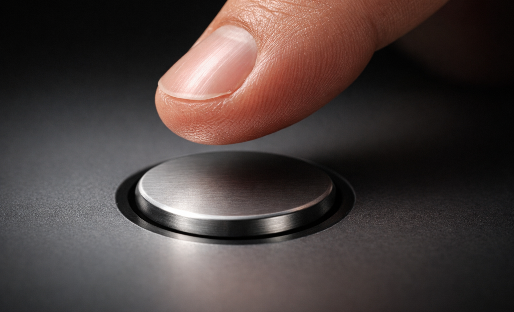
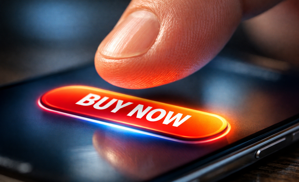
A rectangle with a few words on it shouldn’t carry that much weight. But for businesses, the difference between a button that converts and one that gets ignored can mean thousands of dollars in lost or gained revenue. Designers and marketers have known this for years - which is why entire A/B tests have been run over something as seemingly trivial as changing a button’s color from green to orange.
What’s actually happening isn’t magic or luck - it’s psychology. When a visitor lands on a page and encounters a CTA, their brain is quietly running through a fast series of evaluations: Is this safe? Is it worth it? What happens next? Most of that processing happens beneath conscious awareness, because of cognitive patterns, emotional responses, and ingrained behavioral tendencies that marketers can either work with or unknowingly work against.
I’ll pull back the curtain on those mental mechanics. You’ll get a look at what’s going on inside a visitor’s head the second they see a CTA button - and why good design, the right language, and a little understanding of human behavior can turn a forgettable button into one that people legitimately want to click.
Key Takeaways
- Buttons outperform text links because affordance theory triggers the brain to recognize interactive shapes before reading any words.
- Color contrast matters more than specific color choice; high-contrast buttons can improve response rates by up to 50%.
- First-person action-oriented copy like “Start My Free Trial” creates psychological ownership, significantly boosting conversions over generic alternatives.
- Genuine urgency and scarcity can increase conversions dramatically, but fake countdown timers destroy trust and are hard to recover from.
- Personalized CTAs convert 202% better than generic ones by reducing mental effort and matching the visitor’s current intent.
Why Your Brain Responds to Buttons Differently Than Text Links
There is an actual psychological difference between a button and a plain text link, and it shows up in behavior data. Unbounce found that switching from text links to buttons can increase clicks by as much as 45%. That is not a small margin, and it seems like something happening in the brain before a person even decides to click.
The explanation comes from affordance theory, which is the idea that the brain reads objects by what they appear to invite. A door handle invites pulling. A raised button invites pressing. The brain does not need to think this through consciously - it just reads the visual shape and responds.
The visual design does the communicating with these buttons. A button has depth, contrast, and boundaries. These elements signal to the brain that this object is interactive and waiting for input. A line of blue underlined text carries none of the tells.
This matters quite a bit in web design because users scan pages instead of read them in full. A button can register as something to act on before the brain has processed the label. The shape alone starts the job of persuasion.
Text links blend into the surrounding content and ask the reader to interpret context to know what will happen. Buttons remove that interpretive work. They announce themselves as actions instead of references, and that distinction is what drives the difference in click behavior.
Visual cues carry meaning before words do. When the design of an element tells “do something here,” the brain is already ready to respond. The words on the button then reinforce what the shape already started.
The Color Decisions That Make Readers Stop Scrolling
One study found that people form an impression of a product within 90 seconds, and as high as 90% of that judgment can depend on color alone. That number is worth sitting with for a bit. Color is not just decoration - it’s doing emotional work before a person has read a single word.
Different colors trigger different feelings, and those feelings have a direct connection to how likely someone is to click. Red gives you a sense of urgency and excitement, which is why it works pretty well for sales and time-limited promotions. Blue conveys trust and calm, which makes it a favorite for finance and healthcare businesses. None of these associations are accidental - they’re embedded in how people process what they see.

| Color | Emotional Association | Common CTA Use |
|---|---|---|
| Red | Urgency, excitement | Sales, limited-time offers |
| Green | Go, safety, growth | Sign-ups, free trials |
| Blue | Trust, calm | SaaS, finance, healthcare |
| Orange | Enthusiasm, warmth | E-commerce, subscriptions |
There is no single best button color. What matters far more than any particular shade is contrast - how much the button stands out against the page around it. Adobe has found that high-contrast buttons can improve response rates by as much as 50%, which tells you that visibility does the heavy lifting. If you’re exploring notification bar tools to test color and placement, it’s worth checking out some of the best Hellobar alternatives available.
A green button on a green background is invisible. A green button on a white page with dark text is hard to miss. The right color choice is always relative to its surroundings and the emotional tone of the brand it lives within.
How the Words on a Button Shape What a Reader Feels
Color gets a reader’s attention, but the words are what actually move them. The copy on a button carries actual emotional weight, and small changes to just a few words can produce results that are out of proportion to the effort involved.
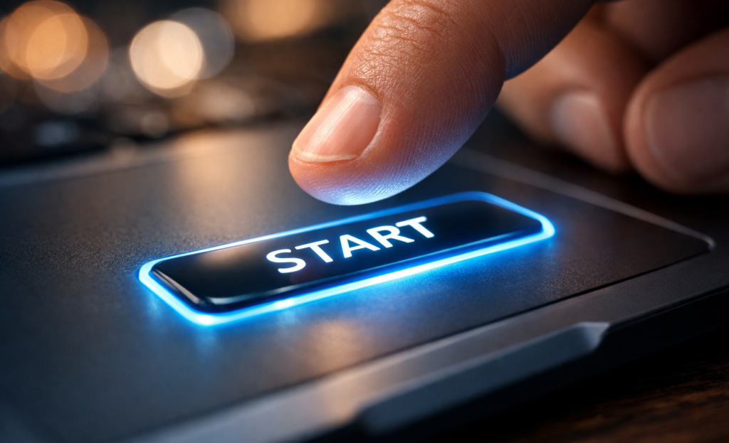
Action verbs do the heavy lifting here. Words like “Get,” “Download,” and “Try” create a sense of forward motion - they tell the reader what they’re about to do and make it feel immediate. WordStream found that strong action verbs on CTA buttons can improve performance by as much as 20%, which is a real gain from what amounts to a word choice.
There’s also something worth mentioning in the difference between first-person and second-person phrasing. “Start My Free Trial” reads differently than “Start Your Free Trial,” even though they say the same thing. The first-person version puts the reader inside the action before they’ve clicked anything, which gives you a soft sense of ownership over what comes next. That feeling of “this is already mine” is an actual psychological push.
The data supports this in a pretty striking way. PartnerStack tested swapping out “Book A Demo” for “Get Started” on a button and saw a 111.55% lift in conversions. Both phrases point to the same next step, but one implies a commitment and the other an easy beginning. Readers respond to language that removes friction - even when that friction is only in the words themselves.
None of this is accidental. The best-performing buttons are written with intention, and every word is a choice that shapes how a reader feels in the second before they act. If you’d like help putting these ideas into practice, get in touch with our support team.
The Urgency Trigger and Why Scarcity Works on All of Us
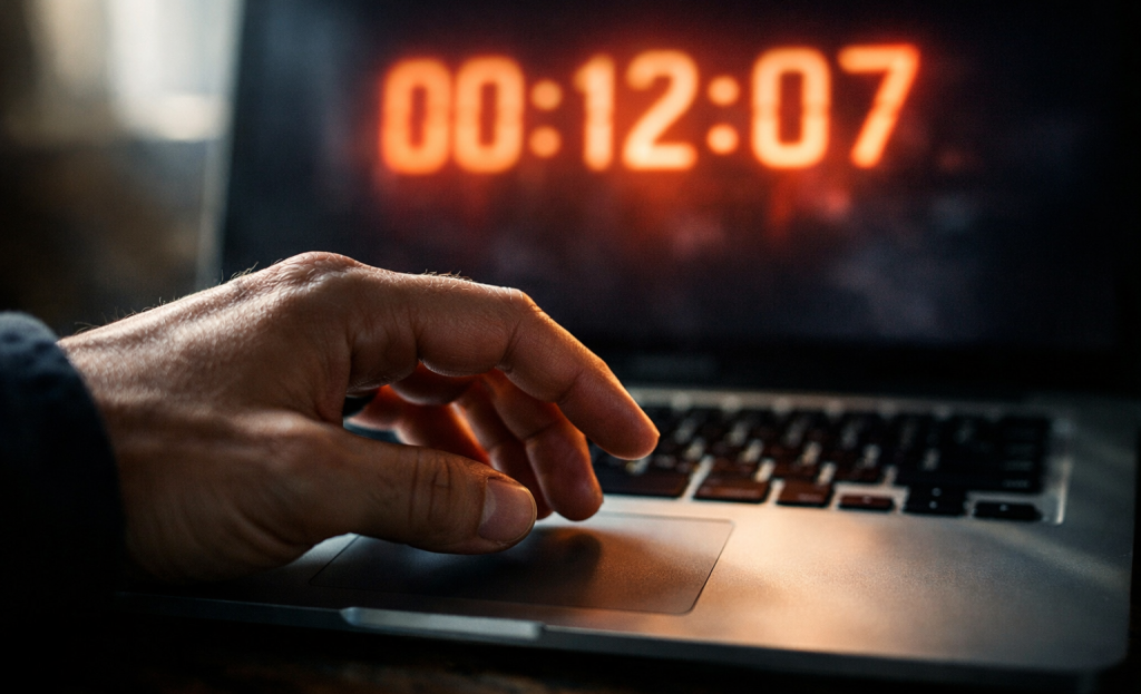
The fear of missing out is not a modern marketing invention - it’s a wired human response that goes back to survival instincts around scarce resources. When something feels limited, the brain pays more attention to it and treats it as more valuable.
This is why urgency-driven calls to action convert well. Some studies have shown that adding urgency to a CTA can increase conversions by as much as 332%; it’s not a small bump - that’s a fundamental change in how people respond to the same button with different framing.
Think about the last time a countdown timer changed what you did online. Maybe you rushed to check out before a sale ended, or grabbed a seat on a flight because only two were left. That pull was actual, and it worked because the urgency was actual too.
That’s the important distinction. Genuine urgency - a true deadline, limited stock, a one-time event - earns that response. Fake urgency is a different story.
Readers are sharper at finding the difference. A countdown timer that resets every time you reload the page, or a “only 3 left” sign that never changes, doesn’t create pressure anymore - it creates distrust, and distrust is very hard to recover from.
Ethical urgency respects the reader - it tells them something true that helps them decide with the right information. “Sale ends Friday” means something if it ends Friday. “Limited spots available” means something if the places are actually limited.
The businesses that get this right don’t have to manufacture pressure. They build actual deadlines into their products and let the truth do the work.
Personalization and Why Generic Buttons Leave Money on the Table
HubSpot analyzed 330,000 CTAs and found that personalized ones converted 202% better than generic versions. That number is hard to brush aside.
The reason personalization works pretty well can depend on mental effort. When a button speaks directly to where you are in your process, you don’t have to work hard to choose if it’s for you- it already is. That reduction in friction is doing the heavy lifting.
Consider the difference between a button that says “Get Started” and one that says “Start Your Free Trial” shown to a person who just read a pricing page. The second one matches the moment- it goes well with what the person is already thinking about, and that alignment is what makes it feel relevant instead of random.
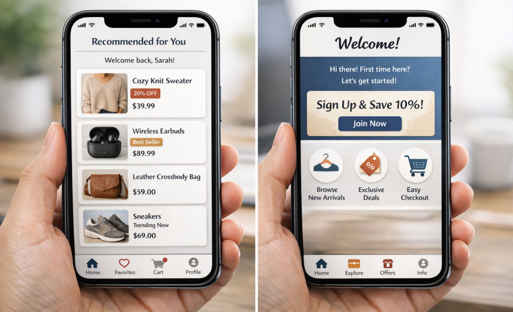
Personalization goes well past a first name in an email subject line- it includes things like where a visitor is located, what pages they’ve browsed, if they’re a first-time visitor or a returning customer, and how close they are to making a decision, and each of these signals can change what a CTA should say to land well.
Dynamic CTAs make this possible at scale. Instead of one static button for every visitor, the page serves different button text or messaging based on what it knows about that person- it’s the same button placement, but the words change to line up with the context.
Behavioral segmentation is worth looking at here as well. Visitors grouped by what they’ve done- not just who they are, can be targeted with CTAs that speak to intent. Someone who has added items to a cart is in a very different headspace than someone reading a blog post for the first time.
A button that “gets you” doesn’t feel like an ad- it feels like a logical next step.
Button Size, Placement, and the Unspoken Rules of Attention
Even the best-written button can fail if it’s too small to tap or buried where no one looks. Size matters more than people give it credit for. W3.org recommends a minimum touch target of 44×44 pixels, and that number exists for a reason - fingers are not precise instruments, and that’s also the case on a phone screen.
Mobile optimization is worth taking seriously here. CTAs designed specifically for mobile can improve conversions by 32.5%, which is the difference between a button that gets clicks and one that gets scrolled past.
Placement connects directly to how people read on screens. Eye-tracking research in web design has identified patterns like the F-pattern and Z-pattern, which describe where attention lands on a page. Buttons placed along these paths get seen; buttons placed outside them have to work much harder to earn a look.
Visual hierarchy plays into this too. A button surrounded by dense text loses the contrast it needs to stand out as a clickable action. White space around a button is not wasted space - it tells the eye to stop and pay attention.
Different placement zones serve different purposes, and matching the zone to the context makes an actual difference.
| Placement Zone | Why It Works | Best For |
|---|---|---|
| Above the fold | Catches attention immediately | High-intent landing pages |
| End of content | Reader is primed after consuming value | Blog posts, long-form pages |
| Sticky/floating | Always visible as user scrolls | E-commerce, SaaS trials |
| Inline within content | Captures mid-content interest | Educational or tutorial content |
Choosing the right zone depends on understanding where your reader’s head is at that moment on the page.
Trust Signals That Make a Button Feel Safe to Click
A button can be the right size, in the right place and still go unclicked. The reason is usually anxiety. People pause because they’re not sure what comes next - will they be signed up for something? Will a charge appear on their card? That second of doubt is enough to lose them.
That’s where micro-copy earns its place. Small lines of text placed near a CTA button - like “No credit card required” or “Cancel anytime” - do quiet work. They speak directly to the worry a person hasn’t voiced yet and lower the perceived cost of clicking. Research into risk aversion in online behavior shows that people overestimate negative results when there’s uncertainty involved. A few words can reframe the action from risky to low-stakes.
Social proof works in a similar way. When people see that thousands of others have already clicked that same button and signed up or bought something, the choice feels less personal. Numbers like “Join 50,000 users” or a row of recognizable brand logos nearby tell the brain that this is a well-worn path - it’s a form of borrowed trust.
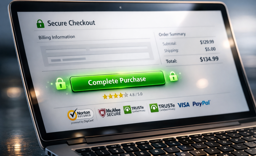
Security badges - padlock icons, SSL indicators, third-party seals - play a role too, and that’s especially true near payment buttons. They don’t need to be prominent to be helpful. Their presence in the periphery is enough to calm a background worry about data safety.
Brand familiarity also matters more than people give it credit for. A person who has seen your brand multiple times before will click with far less hesitation than a first-time visitor. Consistent exposure across touchpoints builds the comfort that makes a CTA feel like a natural next step instead of a leap into the unknown.
Small Button, Big Brain Game - Here’s What to Do With All of This
The most helpful thing you can do is look at your existing CTAs with fresh eyes. Ask yourself: does this button respect the reader’s hesitation, or does it expect compliance? Does the copy describe what the user gets, or only what they have to do? Is the surrounding context building confidence, or is the button floating in a vacuum and hoping for the best? That honest audit - even a quick one - surfaces opportunities that data alone don’t flag.
You don’t need to overhaul everything at once. Start with one page, one button, one intentional change. Swap passive copy for action-oriented language. Shift a color to create better contrast. Add a single line of reassurance beneath the button. These are small moves, but in the psychology of choice-making, small moves matter enormously. The difference between a button that gets ignored and one that drives results is usually far narrower than it looks - and now you have the tools to start closing it.
FAQs
Why do buttons outperform text links for CTAs?
Affordance theory explains it - the brain recognizes a button’s shape as interactive before reading any words. This triggers an instinctive response to act, giving buttons a significant click advantage over plain text links.
Does button color really impact conversion rates?
Color matters, but contrast matters more. High-contrast buttons can improve response rates by up to 50%. The right color choice is always relative to its surroundings and the emotional tone of the brand.
What button copy works best for driving clicks?
First-person, action-oriented copy like “Start My Free Trial” creates psychological ownership and outperforms generic alternatives. Strong action verbs like “Get” or “Try” can improve CTA performance by up to 20%.
Is urgency in CTAs effective or manipulative?
Genuine urgency - real deadlines or limited availability - can increase conversions dramatically. However, fake countdown timers or false scarcity destroy reader trust, which is extremely difficult to recover from.
How much better do personalized CTAs perform?
HubSpot found personalized CTAs convert 202% better than generic ones. They reduce mental effort by matching the visitor’s current intent, making the next step feel relevant rather than random.
