

Cart abandonment is one of the most costly problems in e-commerce. According to the Baymard Institute, the average cart abandonment rate across e-commerce sits at a staggering 70.22%. That means roughly seven out of every ten shoppers who reach checkout leave without buying. If your store is doing everything right - running ads that drive traffic, stocking quality products - and you're still not hitting the revenue you expect, the checkout page is almost certainly where the gap lives.
Let's talk about what makes this especially frustrating: by the time a customer reaches checkout, the hard part is supposed to be over. They've already decided they want what you're selling. The drop-off isn't a marketing problem or a product problem - it's a friction problem - a collection of small, fixable problems that create just enough doubt or inconvenience to make leaving feel easier than finishing.
I'll break down what those friction points look like in practice. From trust signals that are missing at the worst possible moment to checkout flows that ask too much of the customer too late, the patterns behind abandonment are more predictable than most store owners know. More importantly, they're correctable - without a full redesign or development budget.
If you've ever stared at your analytics wondering why conversions stall right at the finish line, what follows was written with you in mind.
Key Takeaways
- Around 70% of shoppers abandon carts at checkout, mostly due to small, fixable friction points rather than product or marketing issues.
- Unexpected costs are the top abandonment trigger, with 48% of shoppers leaving when final prices surprise them at the last step.
- Mandatory account creation causes 26% of drop-offs; offering guest checkout and reducing form fields significantly improves completion rates.
- Mobile checkout abandonment runs 10-15 percentage points higher than desktop, making mobile optimization a direct revenue issue.
- Baymard Institute estimates better checkout design could recover a 35.26% conversion rate increase, worth roughly $260 billion in orders.
The Hidden Costs That Send Shoppers Running Before They Pay
Nearly half of all shoppers in the U.S. abandon their cart because the final price is higher than they expected. That number comes from Baymard Institute research, and it seems like something worth taking seriously: unexpected costs at checkout are the single biggest reason shoppers leave without buying.
Consider what that actually looks like from a shopper's perspective. You find a $12 item, add it to your cart, go through the motions, and then see a total of $22 at the last step. Shipping fees, handling charges, and taxes that were never shown earlier all appear at once. At that point, the buy no longer looks like the deal it seemed to be.
That's a trust problem and a design problem. When costs stay hidden until the final screen, it feels less like a checkout process and more like a bait-and-switch. Shoppers don't need to be especially price-sensitive to feel put off by that experience.
The fix requires intentional design choices. Show shipping estimates early - best on the product page or in the cart before checkout begins. If taxes can vary by location, you can use a zip code field to calculate them before the shopper reaches the payment screen. You want to make sure that the final total is never a surprise.
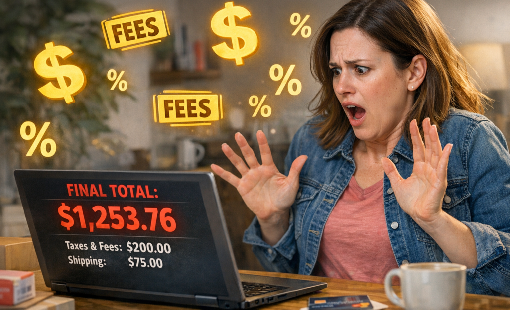
Some stores worry that showing full costs early will push shoppers away sooner. But a shopper who leaves during product browsing because of shipping costs is far less frustrated than one who fills in their details and then abandons at the last step. One is a rational choice; the other a waste. If you're looking for tools to help address these issues, the best Shopify CRO tools can make this process significantly easier.
Price transparency builds the trust that keeps shoppers moving forward. When shoppers know what they're paying at each step, the checkout process feels easy instead of stressful.
Forced Account Creation and Long Forms Are Killing Your Conversions
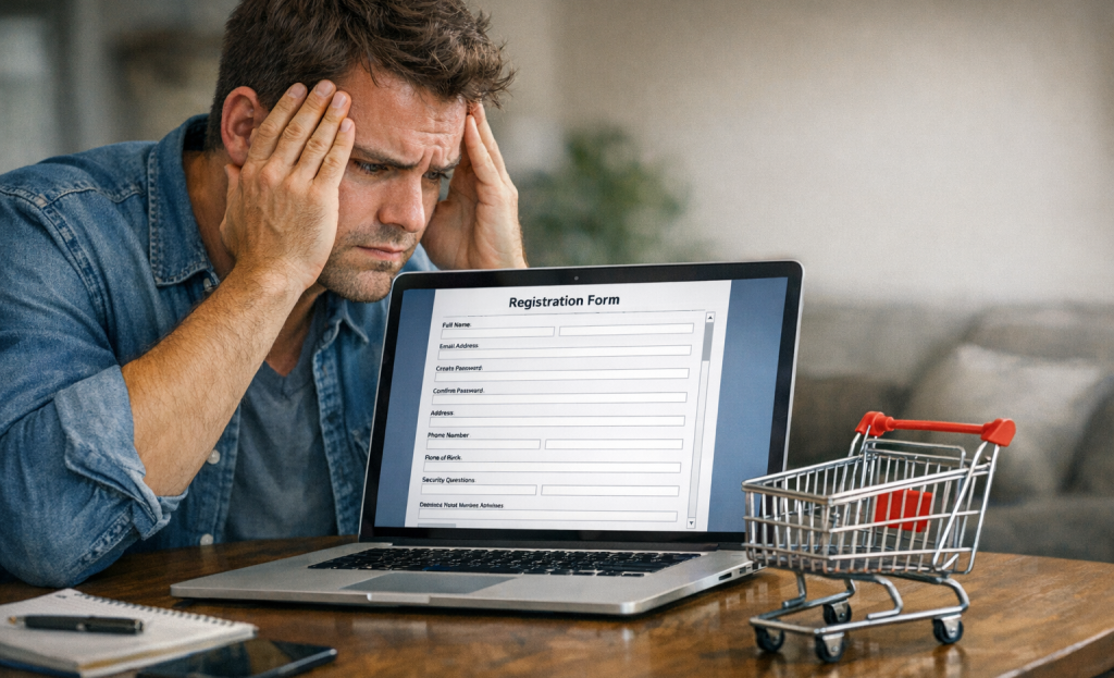
After hidden costs, the next biggest reason shoppers leave is being asked to create an account before they can pay. According to checkout abandonment research, mandatory account creation accounts for 26% of drop-offs; it's more than a quarter of your almost-customers walking away because you asked for too much before they can even finish buying.
It's a job application, not a buy. Someone who just wants to buy one thing should not have to set a password, confirm their email, and fill out a profile for it.
Guest checkout is the easy fix here. Let shoppers check out without an account and then invite them to save their details afterward if they want to. That small difference in sequence - buy first, sign up later - removes a wall that shoppers will not climb.
Long forms create a separate but related problem. UX research on form fatigue and field design shows that the more fields shoppers see, the more likely they are to abandon the process entirely. A phone number, a second address line, a fax number (yes, some forms still do this), and other non-essential fields add frustration fast. Keep only what you actually need to complete the transaction.
Autofill compatibility is worth considering too. Most browsers and phones can pre-populate name, address, and card details automatically. If your form does not support that, you are making shoppers type everything by hand on a small screen, which slows things down and increases input errors.
| Friction Type | Abandonment Rate Contribution | Suggested Fix |
|---|---|---|
| Mandatory account creation | 26% | Offer guest checkout |
| Long or complex forms | 21% | Reduce fields, enable autofill |
| Unexpected costs | 48% | Show total cost early |
| Security concerns | 17% | Add trust badges and SSL signals |
Every extra step you add to the checkout process is another chance for shoppers to leave.
Slow Load Times and Mobile Gaps That Bleed Sales Every Day
57% of shoppers will leave a page that takes more than 3 seconds to load - a checkout lost before a single field gets filled in. Speed is a technical concern and a revenue concern.
A slow checkout hurts everyone, but the mobile experience makes it worse. Abandonment rates on mobile run 10 to 15 percentage points higher than desktop within the same store; it's the same product, the same price, the same checkout - and a dramatically different outcome just because of the device.
The gap exists for a few connected reasons. Compressed screens leave little room for error, so a form that feels fine on a desktop can seem cramped and confusing on a phone. Payment flows that weren't built with mobile in mind cram too much into too little space. Buttons that are easy to tap on a large screen become frustrating when they're small or placed where thumbs don't land.
The result is friction that feels physical. A shopper has to pinch to zoom, re-tap a field they missed, or scroll past a layout that wasn't designed for how they're holding their phone. Every small annoyance can add up, and at checkout, patience runs short. Reducing that cognitive friction matters more than most store owners realize.
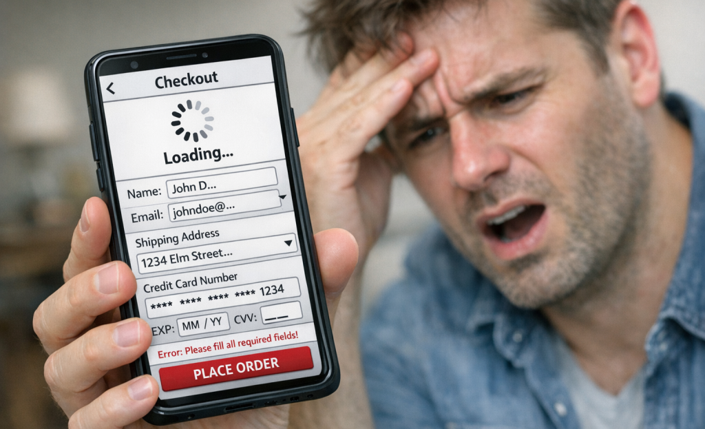
A fair challenge: when did you last go through your own checkout on a mobile device? Actually complete the process, on a phone, with your own payment details. Most store owners haven't done this in months, and the experience is usually worse than they expect.
A slow or awkward mobile checkout doesn't just frustrate in the moment - it trains them not to come back. And since mobile shopping continues to grow as a share of total purchases, every percentage point of extra abandonment carries more weight than it did a few years ago.
Why Shoppers Don't Trust Your Checkout Page With Their Card
Around 17% of shoppers abandon a cart because they're worried about credit card theft; it's a big slice of your almost-customers walking away at the worst possible second.
A checkout page doesn't have to be actually unsafe to lose that sale - it just has to feel unsafe. Shoppers make that call in seconds, and a few missing details are enough to tip them toward the back button.
A missing HTTPS padlock is one of the fastest ways to lose a shopper's confidence. Browsers now flag unsecured pages, and most shoppers have learned to look for that padlock before they type in a card number. If your checkout doesn't have it, you're fighting an uphill battle before the customer even reaches the payment fields.
Payment logos matter more than most store owners expect. When a shopper sees the PayPal, Visa, or Apple Pay logo at checkout, it tells them that a familiar and trusted system is taking care of their data. If you don't have those logos, the page feels anonymous - and anonymous doesn't inspire confidence.
Your return policy also factors in here. If a shopper can't find it quickly at checkout, they start to wonder what you're hiding. A short, plain-language line about returns near the payment button removes that hesitation without taking up much space.
Trust badges from recognizable security providers work in a similar way. They tell the shopper that an external party has verified the page is legitimate. Placing them close to the "pay now" button puts the reassurance where the anxiety peaks.
Social proof near the payment step can also help cut back on last-second doubt. A short customer review count or a simple line like "10,000 happy customers" reminds the shopper they're not taking a risk that others haven't taken before them.
Checkout Design Fixes That Recover Real Revenue
Baymard Institute found that better checkout design could unlock a 35.26% increase in conversion rates - which translates to around $260 billion in recoverable orders across U.S. and EU markets combined; it's not a small margin, and it makes a strong case for treating your checkout page as a revenue tool instead of an afterthought.
Most of the fixes are not tough. A progress indicator, just to give you an example, does quiet work. When shoppers can see that they're on step two of three, they're far less likely to abandon the form because they don't know how long it'll take. Inline error messages work in a similar way - instead of waiting until the shopper hits "submit" to flag a problem, you can flag it in time so they fix it and move on.
Single-page checkout is worth thinking about too. Multi-step flows can seem long, and every extra page is another chance for shoppers to leave. Consolidating your checkout into one scrollable page won't work for every store. But it's an actual change worth making where it fits.
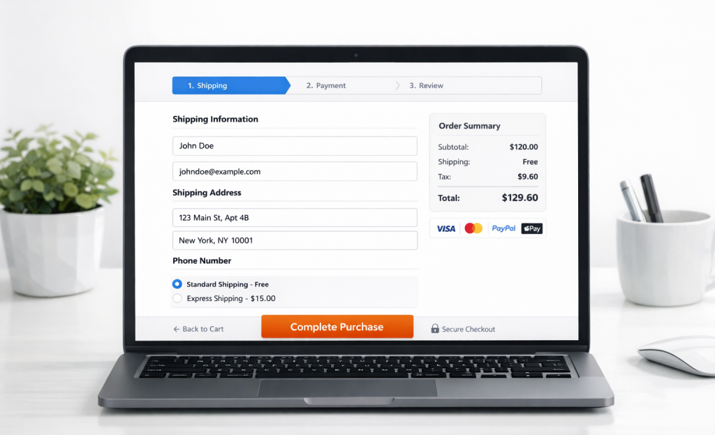
The table below covers four targeted fixes and what each one does for your shoppers.
| Fix | Problem It Solves |
|---|---|
| Show total cost on product page | Removes cost surprise at checkout |
| Enable guest checkout | Removes account creation barrier |
| Add progress bar | Reduces form-length anxiety |
| Optimize for mobile tap targets | Closes the mobile abandonment gap |
You don't need to rebuild everything at once. Audit your own checkout against these points and find the one or two places where friction is highest. Small, focused changes move the needle faster than a full redesign.
Your Checkout Page Isn't Broken - It Just Needs to Stop Getting in the Way
You don't need a full redesign or a development sprint to start seeing results. Some of the highest-impact improvements - clearer trust signals, a simplified form, an honest look at your shipping costs - take hours, not months. Small changes made and tested tend to compound. A 5% improvement in checkout completion isn't just a rounding error; it's revenue that was already yours.
Rather than overhauling everything at once, pick one friction point that resonates most and run a focused test this week. Watch the numbers and let the data steer your next move; it's not a small step - it's how actual progress gets made.
FAQs
What is the average cart abandonment rate in e-commerce?
According to the Baymard Institute, the average cart abandonment rate is 70.22%, meaning roughly seven out of ten shoppers leave without completing their purchase.
Why do unexpected costs cause shoppers to abandon checkout?
When hidden fees like shipping and taxes appear only at the final step, shoppers feel misled. Baymard Institute research identifies unexpected costs as the single biggest abandonment trigger, affecting 48% of shoppers.
How does mandatory account creation affect checkout completion?
Mandatory account creation causes 26% of checkout abandonments. Offering guest checkout removes this barrier, and inviting shoppers to save their details after purchase significantly improves completion rates.
Why is mobile checkout abandonment higher than desktop?
Mobile abandonment runs 10-15 percentage points higher than desktop due to cramped layouts, small tap targets, and forms not optimized for touchscreens, creating friction that pushes shoppers away.
What trust signals reduce payment security concerns at checkout?
Adding an HTTPS padlock, payment logos like PayPal or Visa, visible return policies, and security trust badges near the payment button reassures shoppers and reduces security-related abandonment, which affects around 17% of shoppers.


