
Here is the part that makes it stranger: most of that traffic is coming from phones. More than half of all web traffic worldwide now originates from mobile devices, which means the majority of the people ignoring your form are doing it from the palm of their hand. And the data backs up what your dashboard is quietly telling you - mobile pages convert at just 2.9% on average, compared to 4.0% on desktop, according to a research study from Unbounce. That gap is not trivial - it represents a slice of possible subscribers, leads, and customers that never make it past your form.
Most marketers respond to this problem by going back to the offer. Maybe the lead magnet is wrong. Maybe the copy needs more urgency. Maybe the targeting is off. These are basic instincts, and sometimes they are right. But there’s a category of conversion killers that don’t get the attention they deserve - and it has nothing to do with what you are giving or how you are describing it.
The problem, far more than anyone wants to admit, is the form itself. The way it looks on a small screen, the way it behaves when someone tries to type into it, the small moments of friction that feel invisible on a desktop but become walls on mobile. The offer is fine. The copy is fine. The form is quietly breaking the whole thing.
Key Takeaways
- Mobile pages convert at just 2.9% versus 4.0% on desktop, and poor form design is often the real culprit.
- Around 81% of users have abandoned an online form, with much of that abandonment happening within the first second of loading.
- Common friction points like disappearing labels, small tap targets, and auto-zoom quietly destroy mobile form completions.
- Mobile pop-ups average 2% conversion rates, damage brand perception, and can trigger Google search ranking penalties.
- Multi-step forms use the foot-in-the-door principle to build commitment gradually, improving conversions by up to 300%.
Why Mobile Users Abandon Forms Before They Even Start
The choice to fill out a form or leave it alone happens fast - much faster than the builders of those forms know. On a phone, a user takes one look and has already made a judgment about whether the effort is worth it. That judgment lands before they’ve typed a single character.
Around 81% of users have abandoned at least one online form. That number isn’t only about who started and got stuck halfway through. A large portion of that abandonment happens right at the start, in that first unforgiving second of contact.
A few things like to work together to push users away. Visual clutter is a big one - when a form loads and immediately shows five or six fields stacked on top of each other, it signals effort and commitment before the user has decided they trust you yet. On a desktop with a wide screen, that same form might look structured and manageable. On a 6-inch phone screen, it can look like quite a bit to ask.
Distrust is another quiet factor. Mobile users are more guarded about where they enter personal information because they’re on the go, distracted, or on a network they don’t control. If a form looks generic or poorly formatted on their screen, that low visual quality can become a signal about the brand behind it. How you label your form fields plays a bigger role in that first impression than most people realize.
Consider what your form looks like the second it loads on a small screen - not in a preview tool, not scaled down in a browser, but actually loaded on a phone, thumb-ready, in real conditions. Most form builders never check here.
The deeper issue is that mobile users don’t give forms the benefit of the doubt. On a desktop, a user might scroll down to see if the form gets better or easier. On mobile, the instinct is to go back. The bar for a first impression is higher because the patience for a bad experience is lower. Understanding the psychology behind what prompts action can help you design forms that feel worth completing rather than worth abandoning.
That first-load second is where so many forms lose users who would have otherwise converted. The form never had a fair chance because the experience of landing on it felt like more trouble than it was worth.
The Friction Points Hidden Inside Standard Form Design
Most form builders are designed for desktop first. The mobile experience gets bolted on afterward, and that gap shows up in ways that quietly push users away before they ever hit submit.
The number of fields is one of the biggest problems. A name field, an email field, a phone number field, a birthday field - it piles up fast on a small screen. One study found that 54% of mobile users will abandon a form when it resembles another full sign-up process. People aren’t being impatient. They’re making a basic call about whether the trade-off is worth it.
Labels are another sticking point that gets ignored. When a label sits inside the input field as placeholder text, it disappears the second a user taps to type. The user then has to remember what the field was asking for, or tap out and look again. That small second of uncertainty is enough to break focus and cause some to leave.
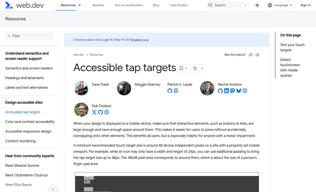
Tap targets are a structural problem baked into most default form styles. A checkbox or a submit button that looks fine on a 27-inch monitor can be nearly impossible to tap accurately on a phone. Fingers are not cursors, and a tap target that’s too small turns an easy action into something that takes three attempts.
Then there’s the keyboard problem. On mobile, the on-screen keyboard can take up half the screen. If the active input field sits near the bottom of the form, the keyboard will cover it entirely. The user is typing without being able to see what they’re writing, which creates errors and frustration in equal measure.
Auto-zoom is a related issue that form builders don’t address. When a text input has a font size below 16px, iOS will automatically zoom in to make it readable. That sounds helpful. But the zoom disrupts the layout and leaves the user needing to manually zoom back out to see the rest of the form - it’s a small thing that feels broken.
None of these friction points are dramatic on their own. But inside a single form, two or three of them happening in sequence gives you an experience that feels clunky and unpolished. Small design issues like these can quietly kill conversions - users don’t analyze why a form feels hard to use. They just close it.
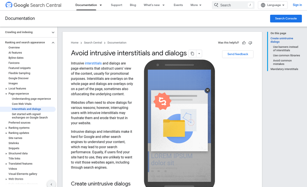
How Pop-Ups Became the Most Hated Format on Mobile
Pop-ups are everywhere, and users hate them. HubSpot found that 70% of users think worse of a brand after seeing a pop-up, and average conversion rates for mobile pop-ups sit around 2%. That is not a rounding error - it’s a format that’s actively working against you.
So why do marketers use them? Partly because pop-ups are easy to set up and the results look decent on the surface. If you get 100 sign-ups from a pop-up in a week, it looks like a win. What you don’t see is how many people left the page, blocked your site, or decided not to trust you with their email address.
On mobile, the problem gets worse. A full-screen pop-up on a small device does not feel like an invitation - it feels like an obstacle. Users are already working with limited screen space and shorter attention spans, and a pop-up that covers the content they came to read creates immediate frustration. The instinct is to close it - not to connect with it.
Google took this seriously enough to build a penalty around it. Since 2017, the mobile interstitial penalty has downgraded the search rankings of pages that use intrusive pop-ups on mobile.

There are some exceptions. Small banners, sign-in dialogs, and age verification screens are not penalized. But the large, page-covering opt-in boxes that most email tools produce by default? Those fall directly in the penalty’s scope. If you’re evaluating your options, it’s worth reading about how to choose the right popup plugin for your WordPress site before committing to a format.
The deeper issue is list quality. A person who dismisses three pop-ups before finally giving in and entering their email is not a motivated subscriber - they are an annoyed one. An annoyed subscriber is far less likely to open your emails, click your links, or become a customer. You end up with a bigger list that performs worse.
The pop-up is a shortcut that trades short-term volume for long-term damage. The data does not say pop-ups are useless in every context. But on mobile they carry costs that most conversion dashboards don’t show you - costs in trust, in rankings, and in the quality of the subscribers who actually stick around.
What Multi-Step Forms Do Differently (And Why It Works)
There’s a format worth mentioning, and it works in a way that feels almost counterintuitive. Multi-step forms break a single form into a sequence of small questions, and that small difference has a measurable effect on how many people actually finish them.
The psychology behind it relies on commitment. When someone answers the first question - something easy, like “What’s your biggest challenge right now?” - they’ve already started. That small act of participation makes them more likely to continue. Behavioral psychologists call this the foot-in-the-door principle, and it’s worth reading about if you want to know why people follow through on things they’ve already partially done.
Each small step functions as a micro-yes. The person isn’t agreeing to fill out a long form; they’re just answering one quick question. Then another. By the time they reach the email field, they’re invested enough to finish. The perceived effort feels low even when the total number of fields is the same as a traditional single-step form.
Venture Harbour found that multi-step forms improved conversions by 300% compared to single-step versions; it’s not a small difference.
On mobile specifically, this format has another benefit. A single form with six fields stacked vertically looks like work on a small screen. The same fields spread across three steps feel more manageable because the person only sees two fields at a time. The visual load is lighter even when the workload isn’t.
| Factor | Single-Step Form | Multi-Step Form |
|---|---|---|
| Completion rate | Lower - full form is visible upfront | Higher - commitment builds gradually |
| Perceived effort | High - all fields visible at once | Low - one question at a time |
| Mobile usability | Poor - long scroll, small tap targets | Better - focused layout per step |
| Drop-off point visibility | Hard to pinpoint | Easy to track by step |
That last row in the table is underrated. When you can see where people leave your form, you can fix the right thing instead of guessing.
The Technical Side of Mobile Forms Most Marketers Ignore
Form design and structure matter. But there’s a layer underneath that which quietly decides if your form ever gets a chance to convert. Most marketers never look at it.
Page load speed is the first place to check. Slow pages drive visitors away, and they don’t come back. A heavy page with uncompressed images or too many scripts loading in the background can kill your numbers before a single field gets filled in.
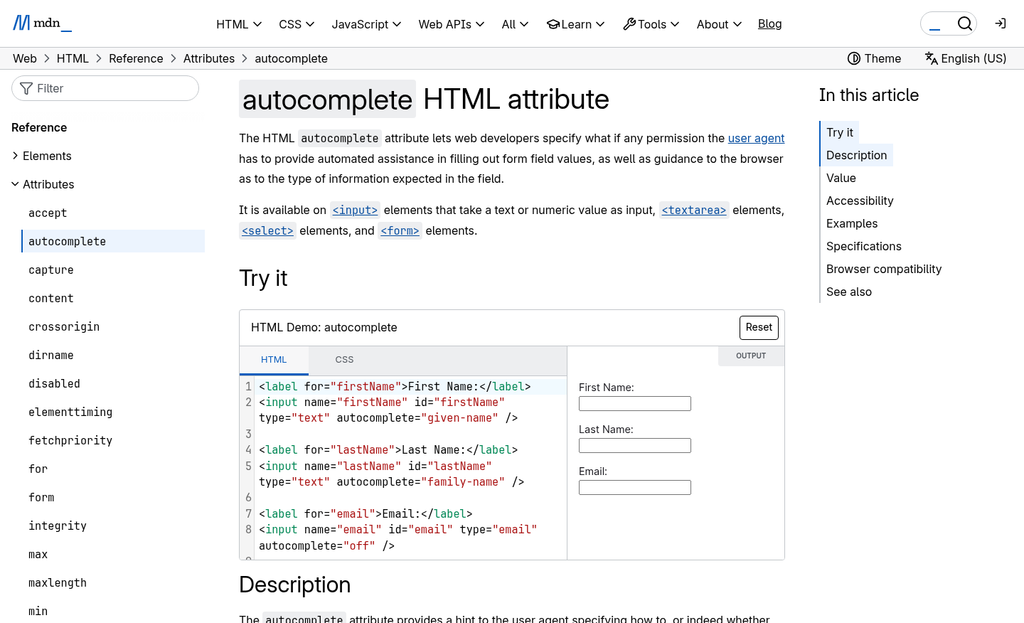
Input field types are another thing worth getting right. When you use the correct HTML input type for each field, mobile browsers respond by showing the right keyboard automatically. Use type="email" and the keyboard shows an @ symbol. Use type="tel" for a phone number field and the user gets a number pad instead of a full keyboard. These small fixes remove a small bit of friction each time, and that adds up across thousands of visitors.
The autocomplete attribute is one of the most ignored tools in mobile form setup. When you add the right autocomplete values to your fields, browsers can fill in saved information for the user with almost no effort on their part. An email field with autocomplete="email" lets the browser recommend a saved address instantly. Fewer keystrokes means less annoyance and a higher chance the user finishes the form. If you want to see how this plays out on a real page, optimizing a free trial signup page for maximum conversions covers several of these same principles in a practical context.
| Field Type | Recommended Input Type | Autocomplete Value |
|---|---|---|
| Email address | type=”email” | autocomplete=”email” |
| Phone number | type=”tel” | autocomplete=”tel” |
| First name | type=”text” | autocomplete=”given-name” |
| Postal code | type=”number” | autocomplete=”postal-code” |
Tap target size is also worth a mention. Buttons and input fields that are too small to tap accurately frustrate users fast. The general guidance is to make interactive elements at least 48 pixels tall so a finger can land on them without a second attempt. Running A/B testing tools built for small business websites can help you confirm whether sizing changes are actually moving the needle.
None of this is glamorous work. But it’s the thing that separates a form that performs from one that just sits there.
Fix the Form, Fix the Funnel
The good news is that these are fixable problems. You don’t need to rebuild your entire funnel or redesign your site. In most cases, a handful of targeted changes can meaningfully move your conversion rate. The barriers are usually invisible until you actually look for them - and once you see them they’re hard to unsee.
Pull up one of your opt-in forms on a phone - not a browser preview, an actual device. Then ask yourself:
- Can I tap every field and button easily with my thumb, without zooming in?
- Does the form load quickly, and does it display correctly without horizontal scrolling?
- Is there any visible trust signal - a privacy note, a familiar logo, social proof - near the submit button?
- Am I asking for more information than I actually need right now?
- When I tap submit, does it actually work - and do I land somewhere that confirms it?
If even one of the answers makes you wince, you’ve found your starting point. Fix that first, then move to the next one. Small, deliberate improvements compound, and your mobile visitors will notice before your analytics even catch up. If you’re looking for tools to help identify and act on these issues, the best conversion rate optimization tools can make the process considerably faster.
FAQs
Why do mobile opt-in forms convert lower than desktop forms?
Mobile pages convert at just 2.9% compared to 4.0% on desktop. Poor form design, visual clutter, and small tap targets create friction that causes mobile users to abandon forms before they even start typing.
What are the most common friction points in mobile forms?
Key friction points include too many fields, disappearing placeholder labels, small tap targets, keyboards obscuring input fields, and auto-zoom triggered by font sizes below 16px. These issues combine to make forms feel broken and frustrating on small screens.
Why are pop-ups so damaging on mobile devices?
Mobile pop-ups convert at only 2%, and 70% of users think worse of a brand after seeing one. Google also penalizes pages using intrusive mobile interstitials, which can hurt search rankings alongside brand perception.
How do multi-step forms improve mobile conversion rates?
Multi-step forms use the foot-in-the-door principle, breaking forms into small questions that build gradual commitment. Venture Harbour found they improve conversions by up to 300%, and they reduce perceived effort on small screens.
Which technical fixes improve mobile form performance quickly?
Using correct HTML input types triggers the right keyboard automatically, while adding autocomplete attributes lets browsers prefill saved information. Ensuring tap targets are at least 48 pixels tall and improving page load speed also meaningfully reduce abandonment.

