
Cognitive overload is a common experience on landing pages. It happens when a page requires more mental processing than a visitor can comfortably manage in the moment. The brain, faced with too many decisions or too much ambiguity, defaults to the easiest available action - which is usually closing the tab. For anyone building or optimizing a landing page, cognitive load is the invisible barrier standing between a curious visitor and a completed sign-up form.
The frustrating part is that the culprit is rarely one glaring mistake - it’s the accumulation of small decisions - a vague call-to-action here, an extra form field there, a color scheme that competes for attention - that quietly erode a visitor’s willingness to commit. The encouraging part is that those same small decisions, made with intention, can just as quietly tip things in the other direction. Reducing friction doesn’t need a full redesign or a massive budget - it requires understanding how visitors actually process information under real-world conditions.
I’ll walk through helpful, evidence-backed ways to strip away that friction. You’ll find changes to copy, layout and design that make it easier for visitors to know what you’re offering, trust that it’s worth their time and take the next step without second-guessing themselves.
Key Takeaways
- Extraneous cognitive load-caused by cluttered layouts, vague headlines, and competing CTAs-is the biggest conversion killer on landing pages.
- Reducing form fields dramatically boosts sign-ups; cutting from eleven fields to four can increase conversions by 160%.
- Landing pages written at a 5th-7th grade reading level convert at 11.1%, nearly double the rate of college-level copy.
- Removing navigation menus eliminates escape routes; one case study showed conversions doubling simply by removing the nav bar.
- Specific CTA button text and nearby microcopy like “No credit card needed” reduce last-second hesitation and increase clicks.
What Cognitive Load Actually Means for Landing Page Performance
Cognitive load is the mental energy used to process and use a page. Every word they read, every choice they weigh, and every element they try to make sense of draws from a finite mental budget. When that budget runs out, they don’t push through - they leave.
There are three types of cognitive load worth learning about. Intrinsic load is the natural difficulty of the task itself, like filling in a form. Extraneous load comes from poor design choices that make the task harder than it needs to be. Germane load is the mental effort put into understanding and retaining what you want them to.
For landing pages, extraneous load is the one that does the most damage - it’s the noise. Cluttered layouts, vague headlines, font sizes, competing calls to action - these don’t add value, they just create friction. A visitor who has to work to understand your page will mentally check out before they ever reach your sign-up button.
This isn’t abstract. Research has shown that presenting multiple offers on a single page can reduce conversions by as much as 266% compared to a focused, single-offer page. That number points to something important: the more decisions a visitor has to make, the less likely they are to make any of them.
Germane load matters too. But differently. You want visitors to spend their mental energy on your value - not on decoding your layout. You want to remove every unnecessary layer of thinking so the only thing left to process is your message.
Intrinsic load is the one thing you can’t remove. Some tasks are tough by nature, and that’s fine. What you can do is cut back on everything around that task so the difficulty of the task itself doesn’t feel worse than it is.
Think of your landing page as having a cognitive budget for each visitor. Every element either spends that budget or protects it. The sections ahead will show you where the biggest withdrawals tend to happen.
How Form Length Quietly Kills Your Sign-Up Rate
Forms are one of the most direct places where cognitive load turns into lost sign-ups. Every field you add is a small choice a visitor has to make, and those decisions accumulate fast enough to push people away before they ever hit submit.
HubSpot’s research puts numbers to this in a way that’s hard to ignore. Cutting a form from four fields to three showed some a 50% lift in conversions. Cutting from eleven fields down to four showed some a 160% lift; it’s not a minor improvement - it’s a transformation, and it came purely from asking for less.
Omnisend found something similar when looking at field types. Forms that grabbed email and phone number converted at around 10.15%. When those same forms also asked for birth date or gender, conversion dropped to between 5% and 6%. The extra fields didn’t add much value to the business. But they added enough friction to cut results nearly in half.
The honest question to ask about every field on your form is whether it helps you, or if it just feels like it should be there. A lot of forms collect data because at some point someone thought it might be helpful - not because there’s a plan to use it. How you label those fields matters just as much as how many you include.
An audit is easy. Go through each field and ask what happens if you remove it. If the answer is “nothing changes on our end,” that field is costing you conversions without giving you anything back.
| Fields Collected | Conversion Rate |
|---|---|
| Email + phone only | ~10.15% |
| Email + phone + birth date or gender | ~5-6% |
If you legitimately need more information from users, progressive profiling is worth a deeper look. The idea is to collect basic facts at sign-up and then collect more over time as the relationship develops. You get the data you need without front-loading the experience with too much to fill out. Pairing this approach with micro-commitments throughout the user journey can make that gradual data collection feel natural rather than intrusive.
The Reading Level Rule That Most Copywriters Ignore
Copy difficulty is one of the quietest drivers of cognitive load on a landing page. The words you choose don’t just communicate your message - they determine how much mental effort a reader has to spend to understand it.
A number worth sitting with: landing pages written at a 5th-7th grade reading level convert at around 11.1%. But college-level writing converts at just 5.3%; it’s not a small gap - it’s the difference between a page that works and one that mostly doesn’t.
There’s also a -24.3% correlation between tough words and conversion rates. The harder your words are to process, the less likely someone is to sign up. That pattern holds across industries and page types.
This has nothing to do with dumbing things down. People are reading faster and picking up on friction faster, and copy that requires processing effort gets treated as friction - which pushes people away before they can even know what happened.
Simple language feels more direct and honest too. A sentence like “Start tracking your goals today” does more work than “Leverage our platform to facilitate goal-oriented progress monitoring.” Both say a similar thing. But one of them makes you think.
The good news is that this is easy to check. Tools like the Hemingway App and the Flesch-Kincaid readability score let you paste in your copy and see where you land. Aim for Grade 6 to Grade 8 as a starting point. You can always adjust from there depending on your audience.
Cut the abstract nouns, shorten the sentences, and replace formal words with simpler ones. Then read both versions out loud. The easier one will usually feel more confident and human.
Subheadings and button text matter here as well. These are the words read first when visitors scan a page, so they carry weight. If those short pieces of copy are dense or vague, the rest of the page starts at a disadvantage. This is especially worth keeping in mind when choosing a landing page builder with built-in CRO features, since many templates default to formal, corporate-sounding placeholder text that can quietly hurt your conversions before you’ve even written a word.
Visual Hierarchy and Whitespace as Cognitive Relief
Words matter. But so does the space around them. Whitespace is not wasted estate - it gives the brain a bit to process what it just read before moving on to the next thing. Pages that pack in too many elements force visitors to work harder just to figure out where to look, and that extra effort quietly chips away at the motivation to sign up.
Visual hierarchy is the invisible guide that moves the eye from your headline down to your call to action without them having to think about it. The basic structure is easy: a strong headline grabs attention first, a supporting subheadline can add context, and the CTA sits at the bottom of that flow. When those three elements are in the right order with enough contrast between them, a visitor can read your page in seconds.
It’s helpful to know how people actually read on screens. Research into F-pattern and Z-pattern eye tracking shows that most visitors scan instead of read word for word. They hit the top of the page, sweep across, then drift down the left side. A well-structured layout works with that natural movement instead of against it.
Clutter is the enemy of that flow. When a page has too many competing elements at the same visual weight, nothing stands out as a priority and the visitor has to make non-stop small decisions about where to focus. Those decisions add up and create choice fatigue before anyone even reaches your sign-up button. Tracking micro-conversion metrics can help you spot exactly where that drop-off happens.
Proximity helps quite a bit here. Related elements placed close together signal that they belong together, so the brain can group and process them as a single idea instead of a few separate ones. Contrast - in size, color, or weight - tells the eye what to look at and what can wait.
A gut-check: if someone landed on your free trial signup page with no context, they need to know immediately where to look first. If the hierarchy is going to need thought to find, it probably needs work.
Why Removing Navigation Menus Increases Conversions
Visual hierarchy guides the eye. But a navigation menu can undo that in one click - it gives visitors a way out before they have made a decision, and that’s the problem.
A navigation bar was built for exploration. On a website homepage, that makes sense because visitors arrive with different intentions and need to find their own way around. A landing page is different. Visitors arrive with one question in front of them: do I want this or not? Every link in your navigation menu is an invitation to go somewhere else instead of answering that question.
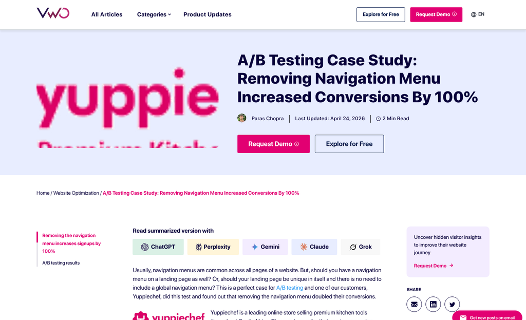
The Yuppiechef case is worth learning about here. The South African online kitchenware store removed the navigation menu from one of their landing pages and watched conversions go from 3% to 6%. That is a doubling of sign-ups with no new copy, no redesign, and no extra traffic. The only change was taking something away.
Navigation menus are the most visible escape hatch. But they are not the only ones. Footer links to your about page, terms, and social media icons all pull attention toward the edges of the page and away from your call to action. A visitor who clicks through to your Instagram is probably not coming back to sign up.
Count every clickable element on your landing page that does not lead to your CTA, and each one is a competing destination. The more destinations you have, the less likely a visitor is to choose the one you actually want. Reducing distractions applies to popups too - every unnecessary element competes for the same limited attention.
This does not mean a landing page needs to feel bare or untrustworthy. You can include a logo link, a privacy policy link, and your CTA. That is enough. You want to make the next step feel like the natural and only move - not one option among many.
A homepage earns the right to have navigation because it serves multiple purposes at once. A landing page has one job. Give it the focus it needs to do that job well.
Page Speed as a Cognitive Load Factor Nobody Talks About
Cognitive load doesn’t start when someone reads your headline - it starts the second they tap a link and wait for something to happen. A slow page creates anxiety before a visitor has seen a single word of your content.
Google found in 2018 that 53% of mobile users leave a page that takes more than 3 seconds to load; that’s more than half your possible sign-ups gone before they’ve had a chance to feel anything about your product. The trust erosion happens silently and fast.
Waiting does damage to attention - it causes doubt to creep in, and by the time the page loads the visitor is already less engaged than they would have been. You’re asking them to work harder just to get started, and that’s not a great first impression.
A lot of visitors are on mobile connections that are slower compared to what gets tested on a desktop in an office. Older phones, rural connections, and busy public networks all give you a worse experience when you preview your own page. Design for that reality.
The helpful fixes here are well-established. Compress your images before upload so they don’t carry unnecessary file weight. Use lazy loading so images below the fold don’t slow down what the visitor sees first. Cut out any third-party scripts that aren’t doing work on the page.
| Speed Issue | What It Costs You | Quick Fix |
|---|---|---|
| Large uncompressed images | Slow initial load, high bounce rate | Compress with a tool like Squoosh or TinyPNG |
| Unused third-party scripts | Added load time with no user benefit | Audit and remove scripts that aren’t essential |
| No lazy loading | All images load at once on arrival | Add native lazy loading with the loading=”lazy” attribute |
Speed improvements directly cut back on cognitive load because they cut back on friction before the visitor even gets to your message. A fast page feels trustworthy, and that trust carries through to the CTA - much like how inconclusive A/B test results often trace back to friction issues that were never properly isolated in the first place.
Designing a CTA That Requires Zero Mental Effort to Click
The call-to-action is the last cognitive hurdle between a visitor and a sign-up. Everything on your landing page builds toward this moment, so it’s worth getting the details right.
Vague button text like “Submit” or “Learn More” creates a moment of hesitation. The visitor has to pause and ask themselves what comes next. Specific copy like “Get My Free Trial” or “Start Reading Today” answers that question before it forms. That reduction in uncertainty is what gets the click.
Button placement matters more than you might expect. A CTA buried below dense paragraphs forces visitors to work to find it. Put it where the eye lands after reading your key benefit. That friction disappears immediately.
The same thing goes for size and contrast. A button that stands out from the page background doesn’t need to be loud or garish - it just needs to be the most visually obvious element in that area. Your visitor’s eye should land on it without any hunting.
Microcopy is where landing pages leave easy wins on the table. A short line beneath your button - something like “No credit card needed” or “Cancel any time” - removes the last small doubts that stop people from clicking. These aren’t decorative touches. They’re trust signals that do real work right at the moment a person decides.
Privacy notes near form fields serve the same job. Something as short as “We’ll never share your email” can dissolve hesitation that no amount of headline copy could fix. The closer a reassurance is to the action it supports, the more helpful it can become.
If you want a low-effort starting point to improve conversions, A/B test your CTA copy first - it’s one of the fastest changes to make and one of the most revealing to measure. Two versions of a button label can tell you quite a bit about what your visitors actually need to feel confident.
One Page, One Job - Now Go Simplify Yours
You don’t need to overhaul everything at once. Pick one thing to change. Shorten your form by two fields. Remove the nav bar. Small moves compound quickly, and each improvement gives you real data to build on.
Simplicity on a landing page isn’t a design trend - it’s a mindset. The best-converting pages aren’t great because they’re packed with information; they’re great because they make the next step feel obvious. You already know your audience well enough to start. Trust that, and make the page a little easier to say yes to.
FAQs
What is cognitive load on a landing page?
Cognitive load is the mental effort visitors spend processing your page. When too many elements compete for attention, visitors become overwhelmed and leave instead of signing up.
How many form fields should a landing page have?
As few as possible. Research shows cutting from eleven fields to four can increase conversions by 160%. Only ask for information you genuinely need and will use.
Does reading level affect landing page conversion rates?
Yes. Pages written at a 5th-7th grade level convert at 11.1%, nearly double the 5.3% rate of college-level copy. Simpler language reduces friction and feels more trustworthy.
Should landing pages include a navigation menu?
No. Navigation menus give visitors an easy exit before deciding. Removing a nav bar doubled conversions in one case study, from 3% to 6%, with no other changes made.
What CTA button text converts best?
Specific, action-oriented text like "Get My Free Trial" outperforms vague options like "Submit." Adding microcopy such as "No credit card needed" nearby reduces last-second hesitation.


