

Most website owners are making decisions based on aggregate numbers - bounce rates, session durations, funnel drop-offs - which tell you what is happening but nothing about why. That gap between data and insight is where heatmaps come in. Instead of giving you another column of percentages to interpret, heatmaps show you a visual recording of visitor behavior: where people click, how far they scroll, and which parts of your page they ignore.
That shift from abstract metrics to human behavior changes everything about how you strategy optimization. Rather than running on gut instinct or cycling through random A/B tests, you can see the friction points with your own eyes. Pages that have been analyzed and adjusted with heatmap data see an average conversion lift of 14% - not because of any single dramatic overhaul, but because small, well-targeted fixes compound faster when you know where visitors are stuck.
This guide will walk you through how to use heatmaps practically and purposefully: how to find the patterns that signal a conversion leak, and how to make changes that actually move the needle. If your traffic and your results have felt out of sync, you're in the right place.
Key Takeaways
- Heatmaps come in three types-click, scroll, and move maps-each revealing different friction points in visitor behavior.
- Pages analyzed with heatmap data see an average 14% conversion lift through small, targeted fixes rather than dramatic overhauls.
- Up to 70% of visitors may never reach a CTA placed in the lower half of a page, making scroll depth analysis critical.
- Prioritize auditing high-traffic pages like checkout and product pages first; low-traffic pages offer minimal actionable data.
- Heatmap insights should lead to A/B tests-moving a conversion rate from 2% to 5% represents a 150% revenue increase.
What Heatmaps Actually Show (And What They Don't)
Heatmaps come in three main types, and each one measures something different. Click maps record where users click or tap on a page. Scroll maps show how far down the page visitors go before they leave. Move maps track where users move their mouse cursor on desktop screens.
Each type tends to surface a different problem. Click maps are great for catching things like broken links, ignored calls to action, or elements that look clickable but aren't. Scroll maps tell you if your most important content is even seen before visitors leave. Move maps can hint at what users are reading closely or skimming past.
That said, heatmaps only show you what users do - not why they do it.
That's worth sitting with for a bit. If a scroll map shows that 70% of visitors leave before reaching your pricing section, that's helpful information. But it doesn't tell you if they left because the page felt too long, because something earlier put them off, or because they already had what they needed. The behavior is visible; the reason behind it isn't.
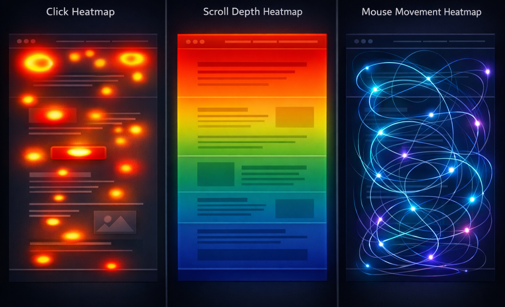
Move maps have an extra caveat too. Mouse movement on desktop is a loose proxy for eye movement. But it's not a precise one. People don't always hover over what they're reading, and they don't always read what they hover over. Treat move map data as a starting point for questions instead of a confirmation of anything.
| Heatmap Type | What It Measures | Where It Reveals Problems |
|---|---|---|
| Click Map | Where people click or tap | Ignored CTAs, fake-looking links, navigation confusion |
| Scroll Map | How far down the page people scroll | Key content placed below where most people stop |
| Move Map | Where the mouse cursor travels on desktop | Areas of interest or sections people skim past |
What each tool can and can't tell you shapes how you interpret the data. That interpretation gets quite a bit more reliable when you have enough of it.
How Much Traffic You Need Before Your Data Means Anything
Heatmaps can look convincing even when the data behind them is thin. A handful of clicks arranged in a pattern can look like user behavior when it's just noise. Before you act on what you see, it's worth learning whether your data has enough weight to trust.
The general threshold most practitioners work with is 2,000 visitors for desktop heatmaps and 1,000 for mobile. These aren't hard laws. But they give your data enough volume to surface patterns instead of random variation. Below those numbers, a few unusual sessions can skew the whole picture.
Acting on thin data is where conversion mistakes get made. You might move a button because it looks ignored, when only 200 people saw that page and three of them clicked it; it's not a pattern - it's a sample too small to mean much. Layout changes based on that are more likely to hurt you than help you. Tools like Crazy Egg or Microsoft Clarity can help you interpret this data more reliably once you have sufficient volume.
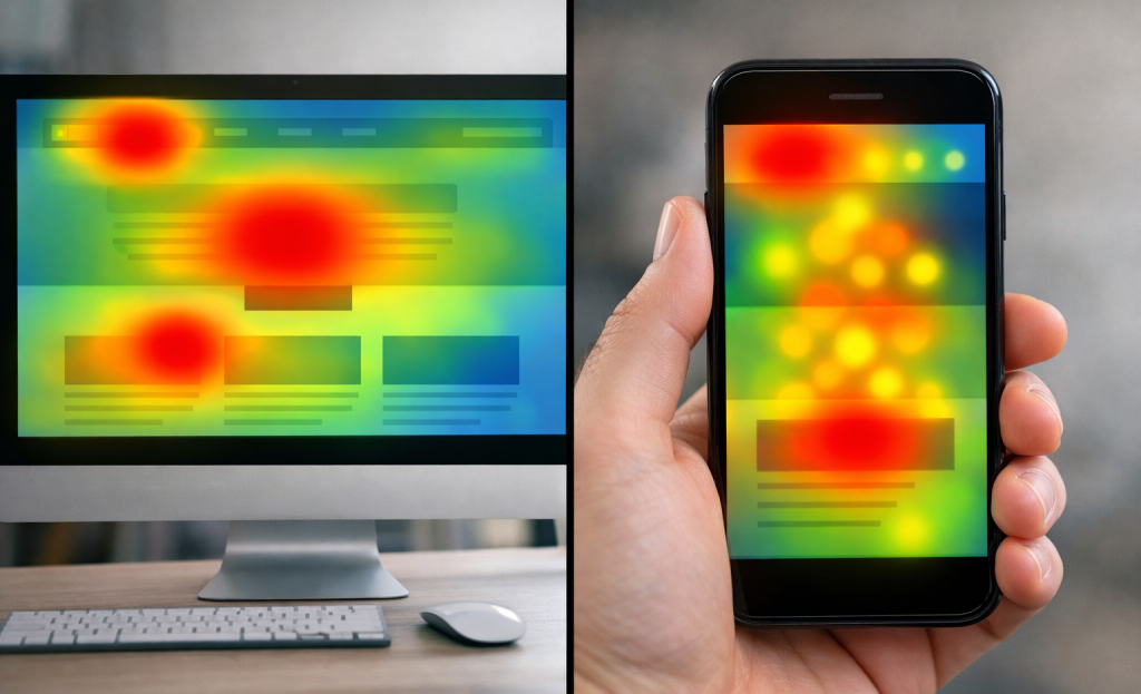
Device segmentation matters here too, and it's worth treating mobile and desktop as separate heatmaps. A navigation menu that gets heavy engagement on desktop could be bypassed on mobile. If you combine those sessions into one heatmap, the desktop behavior can drown out the mobile story - and vice versa. This is closely related to why mobile opt-in forms so often underperform when analyzed alongside desktop data.
| Device Type | Recommended Minimum Sessions | Why It Differs |
|---|---|---|
| Desktop | 2,000 sessions | Larger screens produce more complex click and scroll patterns |
| Mobile | 1,000 sessions | Simpler layouts mean patterns emerge with fewer sessions |
| Tablet | 500-1,000 sessions | Lower traffic share; treat as supplementary data |
Most heatmap tools let you filter by device type, so take advantage of that. Running separate analyses for mobile and desktop users gives you a more honest read on what's actually happening for each group.
Pages with low traffic aren't ready to audit yet - it's better to run heatmaps where you already have volume and get reliable data than to pull conclusions from pages that haven't seen enough visitors to tell you anything meaningful. When you do have sufficient data, tracking micro-conversion metrics alongside your heatmaps can add important context to what you're seeing.
Which Pages to Audit First for the Biggest Wins
Once your data is reliable, the next choice is where to look first. Not all pages deserve equal attention, and starting in the wrong place can cost you weeks of effort with almost nothing to show for it.
The pages to prioritize are the ones where visitors are already making decisions. Your main landing pages, product or service pages, and checkout flow are the highest-value targets because that's where conversions either happen or fall apart. A behavior pattern on your checkout page is worth far more to investigate than the same pattern on a low-traffic blog post.

That last point matters more than most act on. Auditing a blog post that gets 200 visits a month feels productive. But the data is thin and the stakes are low. Even if you find something to fix, the impact on your revenue is minimal. Start where the traffic and the transactions are.
There's also a structural argument for this. One study found that moving key elements above the fold can increase conversions by around 20%. That gain only translates into revenue when it happens on a page that visitors actually visit in volume. The same fix on a low-traffic page might net you a handful of extra conversions per month. The psychology behind your calls to action matters just as much as page placement when you're optimizing high-traffic pages.
| Page Type | Audit Priority | Why It Matters |
|---|---|---|
| Checkout / cart pages | Highest | Closest to the conversion point |
| Product or service pages | High | Where buying decisions form |
| Main landing pages | High | High traffic and first impressions |
| Low-traffic blog posts | Low | Limited data and limited upside |
A good way to build your audit list is to pull your top ten pages by traffic and then cross-reference them with your conversion goals. Any page that appears on both lists goes to the top of the queue.
Reading Scroll Maps to Spot Hidden Drop-Off Points
A scroll map will teach you how far down a page visitors travel before they leave. The color coding tells the story fast - warm colors near the top mean lots of eyes, and cooler colors further down mean less made it there.
Here's the number that should get your attention: research from heatmap studies has found that as high as 70% of visitors may never reach a call to action placed in the lower half of a page. It's not a small leak; it's most of your traffic walking away before they ever see what you want them to see. If your CTA placement is suffering, it may be worth looking at tiny website design changes that can instantly boost sales.
What a False Bottom Looks Like
One of the biggest causes of early drop-off is something called a false bottom - this happens when a section of the page - a wide image, a colored banner, or a visual break - looks like the end of the page to a visitor. They don't scroll further because nothing tells them there is more to see.
It's easy to miss in your own design because you built the page and you know what's below. Your visitors don't have that context. If the visual design accidentally signals "this is it," most of them will take that at face value and leave.
How to Find Your Drop-Off Point
Pull up your scroll map and look for where the color changes from warm to cold in a sudden jump instead of a gradual fade. A gradual fade is normal - engagement decreases as you scroll. A sharp drop is a signal that something is pushing visitors away at that point.
Note the percentage where the drop happens and then look at the page content at that depth. Think about what a visitor sees right before the drop-off. Is there a design break that could read as the end of the page? Is an important element sitting just below where most visitors stop? Tools built with built-in CRO features can help you structure pages so critical content lands where visitors are actually looking.
The scroll map has the "where." Your job is to match that to the "what" on the page so you can figure out what to fix. Once you've identified the problem area, A/B testing tools can help you confirm whether your changes actually move the needle.
What Click Maps Reveal About Confused and Frustrated Visitors
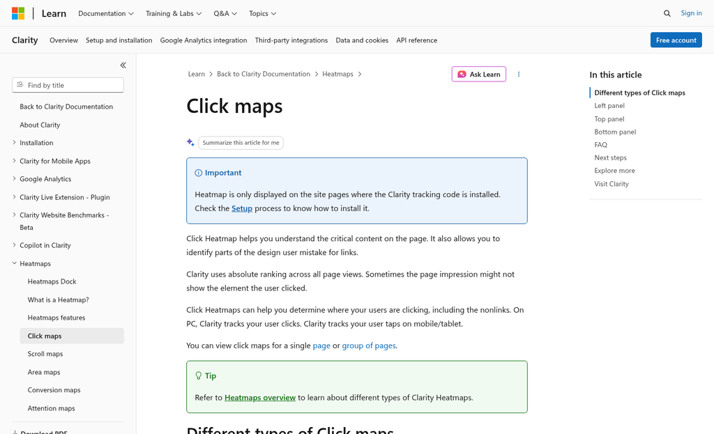
Click maps show you where visitors are clicking on your page - and the patterns that show up can be very telling. Two in particular are worth your attention: rage clicks and dead clicks.
A rage click happens when a visitor clicks the same element repeatedly in quick succession - this usually means they expected something to respond and it didn't. A dead click is similar - it's a click on an element that has no effect at all. Both of these signal a design problem - not a user problem.
When visitors click things that don't work, they don't wait around to figure out why. They leave - it's a conversion cost, and it's one that's easy to miss without click data in front of you.
When Your Layout Works Against You
One of the more helpful things click maps give you an idea about is which elements on your page are pulling attention away from your main call to action. If a decorative image or a section heading is getting more clicks than your CTA button, that's a layout problem worth fixing.
A well-documented e-commerce case illustrates this: heatmap data revealed that visitors were repeatedly clicking near - but not on - the "Add to Cart" button. After repositioning the button to match where users were looking and clicking, the site saw a 35% uplift in add-to-cart conversions. The product hadn't changed. The price hadn't changed. Just the placement.
That result is worth taking note of. Cross-referencing your click map with your page layout takes only a few minutes and gives you an idea about which elements are competing with the actions you actually want visitors to take.
Look for clickable-looking elements that aren't linked anywhere. Underlined text, button-shaped graphics, and icon images are all too common culprits. If visitors are clicking on them and nothing is happening, you either need to make them functional or redesign them so they don't look interactive at all. How you label and style interactive elements matters more than most people realize when it comes to reducing this kind of confusion.
Click maps give you a direct line into how visitors interpret your page - which parts feel interactive to them and which parts feel like obstacles. Combined with strategies like using micro-commitments to guide user behavior, this kind of insight can meaningfully improve how people move through your pages.
Decluttering Above the Fold Using Heatmap Evidence
The space visitors see before they scroll is the most valuable real estate on your page - it's tempting to fill it with a logo, a navigation bar with eight links, a rotating banner, a row of trust badges, and a headline all fighting for attention at once. Heatmap data cuts through that temptation by showing you which of those elements visitors actually connect with.
Move maps and click maps together paint a pretty honest picture. If your slider gets almost no clicks and your trust badges sit in a cold zone, that's not a judgment call anymore - it's data. The elements you thought were working hard might just be taking up space.
Reducing above-the-fold clutter has been shown to lift engagement by around 16%. That gain comes from subtraction instead of rearrangement. Moving a low-value element to a different spot on a crowded page doesn't help much. Removing it entirely is what creates room for the things that actually convert.
This is where heatmaps earn their place in the process. Instead of debating internally about what belongs above the fold, you can point to the data and say "this nav item gets zero clicks" or "visitors ignore this badge completely." That makes the conversation about what to remove much easier to have.
A helpful exercise is to list every element above the fold and check it against your heatmap. Anything in a cold zone with no actual interaction is a candidate for removal. You don't need a perfect score across the board - you just need your most important element, usually your primary call to action, to get the warmest attention on the page.
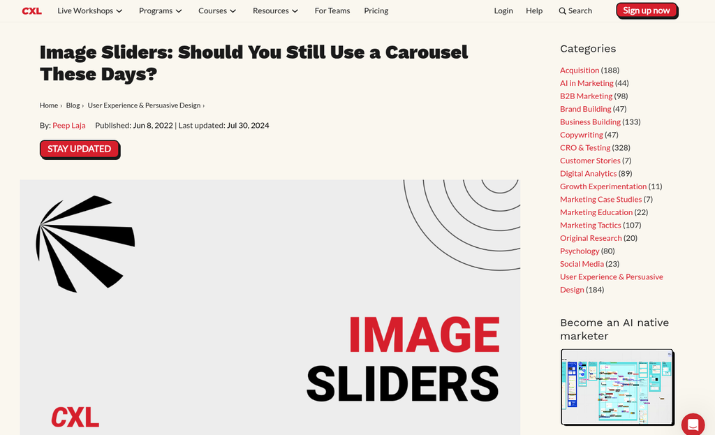
Sliders are worth calling out specifically. They feel dynamic but show up as dead zones in click and move maps because visitors don't wait for the next slide - it's a bit of screen space spent on something most visitors scroll past.
Once you know what to cut, you have a direction for the next step - and that's where testing comes in.
Turning Heatmap Insights Into A/B Tests That Validate the Fix
Heatmaps tell you where something is likely going wrong, but not if your fix will work. A/B testing answers that question, and combining the two is where the progress happens.
The process is straightforward. You look at a heatmap pattern, create a hypothesis about why it's causing a drop in conversions, build a variation that addresses it, and run the test. Each step depends on the one before it, so the quality of your hypothesis matters quite a bit. A weak hypothesis produces a test that doesn't teach you much even if it wins.
A hypothesis follows a simple structure: "Because visitors are doing X, we believe changing Y will result in Z." For example, if your heatmap shows that clicks are clustering around a product image instead of the add-to-cart button, your hypothesis could be that moving the button closer to the image will increase purchases. It's testable, direct, and grounded in behavior data.
From there, you design a single variation that isolates the change. Testing one thing at a time is what matters here. If you redesign the whole page at once, you won't know which change drove the result. Small, focused tests give you answers you can use.
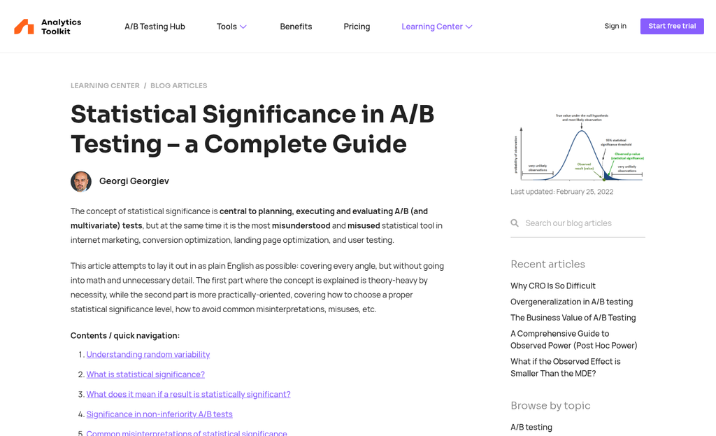
Run the test long enough to reach statistical significance before you draw conclusions. Most testing tools will flag this. But a general rule is to wait for at least 100 conversions per variation before making a call. Ending tests too early is one of the most common ways teams make the wrong choice.
It's worth stepping back to appreciate the scale of what this process can produce. Moving a conversion rate from 2% to 5% is a 150% increase in revenue from the same traffic. That result doesn't come from guessing - it comes from a repeatable cycle of observation, hypothesis, and validation.
Once a test concludes, the winning variation becomes your new baseline and the process starts again. Your heatmap data refreshes with new visitor behavior, and you'll find the next thing to test. That's how incremental improvements accumulate into results over time.
From Leaky Pages to a Conversion Machine - Your Next Move
The process you've worked through here is straightforward: find the pages where leaks are costing you the most, read your scroll and click data, cut or reposition whatever is creating friction, and then test your changes to see what actually moved the needle. Each step builds on the last, which turns raw behavioral data into deliberate, confident decisions.
Don't try to fix everything at once. Pick one high-traffic page this week - your homepage, your top landing page, or your most-visited product page - and run a heatmap on it. One page, one insight, one change; it's a manageable starting point, and it's enough to produce a measurable lift. Once you see results, the next page can become obvious.
Conversion optimization doesn't come from a single dramatic overhaul - it comes from a series of small, well-informed improvements that compound over time. Heatmaps give you the visibility to make those improvements with confidence instead of guessing. Look at the data, act on it, and let it lead the way.
FAQs
What are the three main types of heatmaps?
The three main types are click maps, scroll maps, and move maps. Click maps show where users click, scroll maps show how far down users scroll, and move maps track mouse cursor movement on desktop screens.
How much traffic do you need for reliable heatmap data?
The recommended minimums are 2,000 sessions for desktop heatmaps and 1,000 for mobile. Below these thresholds, a few unusual sessions can skew results, making patterns unreliable and potentially leading to harmful page changes.
Which pages should you audit with heatmaps first?
Prioritize high-traffic pages closest to conversions: checkout pages, product or service pages, and main landing pages. Low-traffic pages offer minimal actionable data and limited revenue impact even if improvements are made.
What are rage clicks and why do they matter?
Rage clicks occur when visitors repeatedly click the same element expecting a response that never comes. They signal a design problem, not a user problem, and often cause visitors to leave, directly costing you conversions.
How do heatmaps and A/B testing work together?
Heatmaps identify where friction exists, and A/B testing confirms whether your fix works. You form a hypothesis based on heatmap behavior, build a focused variation, and run the test until reaching statistical significance before drawing conclusions.

