

That discomfort is worth paying attention to. It means you care about your visitors' experience, and that instinct will actually serve you well here. But here is the thing most people get wrong: they blame the popup format itself when the culprit is usually the copy sitting inside it. A poorly worded popup is an ambush. A well-written one is a helpful push from a person who actually gets what you need.
The difference between those two experiences comes down to learnable writing choices - the words you use, the assumptions you make about your reader, the tone you strike in roughly 30 words or less. None of it requires you to be manipulative or aggressive. The most helpful popup copy tends to be the most straightforward.
What follows is a helpful walkthrough of how to write popup copy that earns the click instead of demanding it - so your visitors feel like they made a choice, not like they were talked into something they did not want.
Key Takeaways
- Pushy popups usually stem from weak copy, not the format itself - guilt-trip opt-outs, fake urgency, and vague benefits damage trust.
- Benefit-led headlines outperform feature-led ones; specificity like "Save $20" converts better than vague promises like "Save Money."
- First-person CTA buttons like "Get my free guide" outperform commands like "Download now," sometimes lifting click-through rates by 90%.
- Click-triggered popups convert at 54.42% on average because visitors opt in willingly, requiring less persuasive work from the copy.
- A visible close button, single CTA, and honest opt-out text signal respect for the visitor and measurably improve conversion rates.
Why Most Popup Copy Feels Pushy in the First Place
The popup itself isn't the problem. A well-timed popup with the right message can seem legitimately helpful. What turns visitors off is the language inside it - patterns that signal manipulation instead of value.
The most common offender is the guilt-trip opt-out button. Instead of a neutral "No thanks," the decline link reads something like "No, I don't want to save money" or "I'll pass on growing my business." The intent is to make visitors feel bad about leaving. And visitors see through it. That copy doesn't persuade - it just makes them distrust the brand.
Fake urgency is another pattern that damages trust fast. Countdown timers that reset every visit, or copy that screams "Only 2 left!" with no scarcity behind it, feel dishonest to anyone who has spent time online. People have learned to spot these tricks and they associate them with businesses that prioritize the sale over the person. If you rely on urgency as a tactic, there are ways to use it without eroding trust.
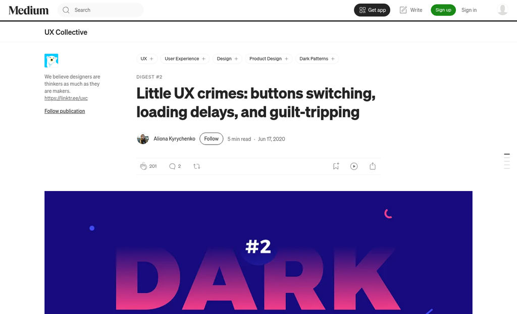
Vague benefits are less obvious but just as damaging. Copy like "Sign up for exclusive content" or "Join our community" doesn't tell a visitor what they actually get. The writer hasn't done the work to translate the value into something concrete, so the visitor has no reason to say yes. Vague language also reads as an afterthought. That impression sticks.
A helpful question to hold onto here: does this copy respect the visitor's time and intelligence? Pushy popup copy usually fails that test in some way - it either assumes the visitor is easy to manipulate, assumes urgency where there's none, or buries the value under filler words.
The root of the problem is a mismatch between what the writer wants and what the visitor needs to see. Copy written from a conversion goal first - without stopping to see what the visitor is thinking in that moment - tends to land as pressure instead of persuasion. That mismatch is worth diagnosing before anything else, and it often connects to how popup fatigue develops when messaging repeatedly misses the mark.
The Anatomy of a High-Converting Popup Message
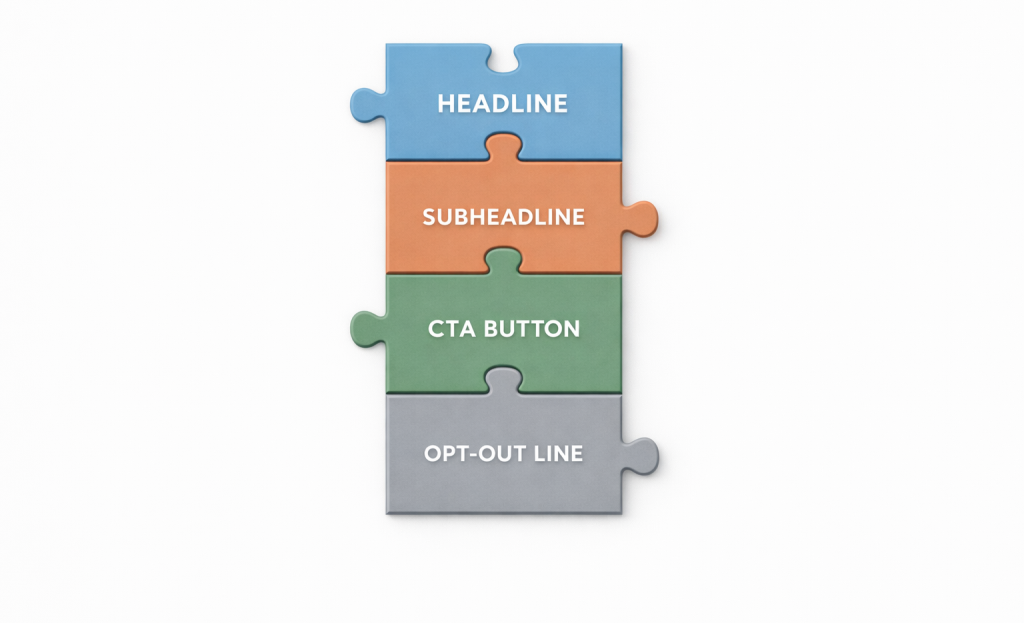
A popup is made up of four working parts: the headline, the subheadline, the CTA button, and the opt-out line - and each one has a job to do, and when any part doesn't work, the whole message loses momentum. Once you know what each ingredient is responsible for, writing them gets quite a bit easier.
Start by thinking about hierarchy. Your headline is the first thing a reader sees, so it has to earn the next second of their attention - not just announce that a popup exists. A subheadline supports it by adding context or cutting back on hesitation. The CTA button is where the reader makes a choice, so the words on it matter more than you think. The opt-out line is last, but it's worth treating as more than an afterthought.
A helpful way to remember the flow: if your headline doesn't land, none of the other elements get a chance to do their job. At every stage, ask yourself if each line is pulling its own weight or just taking up space. If you're finding that signups still aren't where you want them, it may be worth looking at why your lead magnet isn't converting before rewriting copy.
| Element | Weak Copy Example | Strong Copy Example |
|---|---|---|
| Headline | Sign up for our newsletter | Get 10 dinner ideas in under 30 minutes |
| Subheadline | Join thousands of subscribers | A free weekly email for people who hate the "what's for dinner?" question |
| CTA Button | Submit | Send me the recipes |
| Opt-Out Line | No thanks | No thanks, I'll figure it out myself |
The strong examples are written from the reader's point of view. The CTA button in particular changes from a mechanical instruction to a human response. The opt-out line names the alternative, which makes the value of saying yes feel more tangible without being aggressive about it. This kind of framing also connects to broader small design and copy choices that move the needle on conversions.
Each ingredient builds on the one before it. Think of them less as separate boxes to fill in and more as one continuous conversation with your reader.
How to Write a Headline That Leads With the Benefit
Your headline does more heavy lifting than any other line in the popup. Visitors choose in a split second whether to read on or close the window, and that choice usually depends on the first few words they see.
The most common mistake is to lead with what you want instead of what the visitor gets. A headline like "Join Our Newsletter" tells what action to take but gives them no reason to care. Flip it around to something like "Get Weekly Tips to Cut Your Editing Time in Half" and the visitor can see what's in it for them before they decide anything.
There is a clear difference between feature-led and benefit-led copy. A feature describes what something is - a discount, a free download, a membership. A benefit describes what changes for the person because of that feature. People don't sign up for a 10% discount; they sign up to spend less money on something they already want to buy.
Claspo's 2026 research found that top-performing promotional popups use benefit-first copy in the headline; it's not a coincidence - it goes well with how people actually read - they're scanning for relevance to themselves, not for information about you.
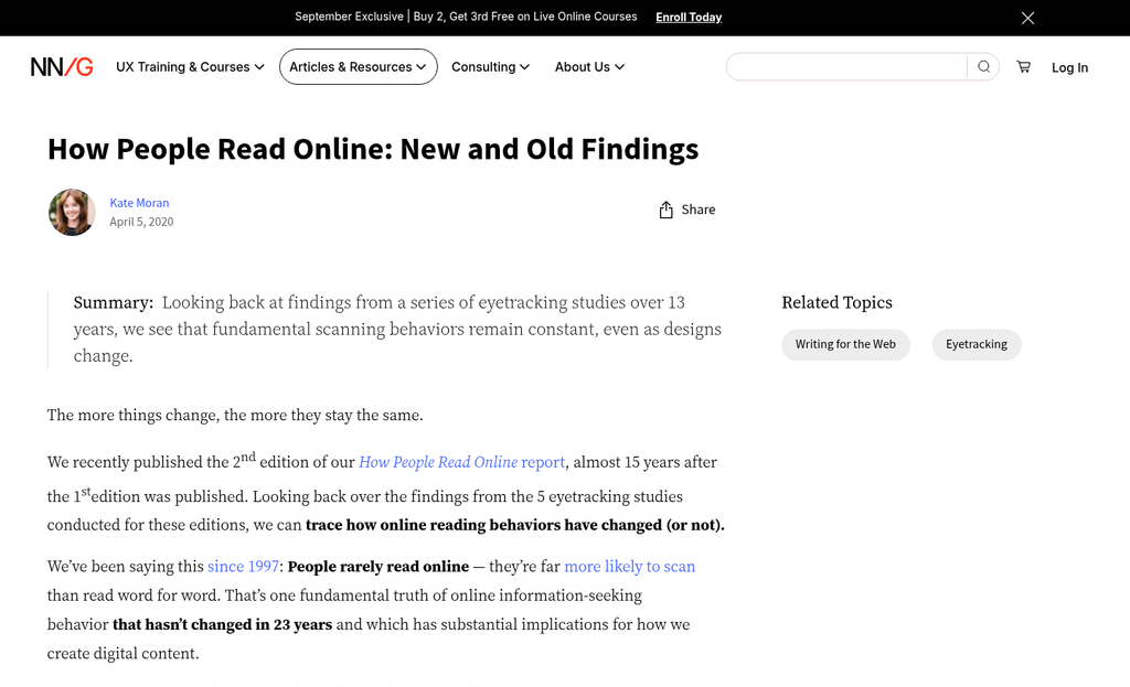
Specificity matters more than most writers expect. A vague benefit is almost as weak as no benefit at all. "Save Money" is technically a benefit but it's so broad it doesn't land anywhere. "Save $20 on Your First Order" gives the reader something concrete to weigh against the small effort of entering their email. The more specific you are, the more believable and interesting the promise can become. This same principle applies when you reduce cognitive load on landing pages - clarity and specificity work together to lift conversions.
A helpful exercise is to write your headline and then ask: whose perspective is this written from - mine or theirs? If the answer is yours, rewrite it until it answers the visitor's silent question: "What do I get from this?" The way you frame form field labels follows the same logic - every word should speak to what the visitor gains, not what you need from them.
| Feature-Led Headline | Benefit-Led Rewrite |
|---|---|
| Subscribe to Our List | Get Free Recipes Delivered Every Week |
| 10% Off Discount Available | Save 10% on Your First Purchase Today |
| Download Our Guide | Learn to Double Your Leads in 30 Days |
Writing CTA Buttons That Feel Like a Choice, Not a Command
The headline gets to pause. But the CTA button is where they choose. A weak or pushy button can undo everything the rest of your popup worked to build.
One of the biggest improvements you can make is to switch from second-person to first-person phrasing on your button. "Download now" tells them what to do. "Get my free guide" puts them in the driver's seat. That small difference in perspective has been shown to lift click-through rates by as high as 90%, and the reason makes sense - people respond better when copy aligns with their own thinking instead of someone else's instruction.
First-person buttons also do something soft but helpful. They force you to frame the action around what the reader gets - not what you want them to do. "Start my free trial" is stronger than "Start free trial" for that reason. If you're weighing how to structure that offer, it's worth understanding whether a free trial or freemium model converts better for your specific audience.
Giving a way to say no actually makes the yes more meaningful. Research found that two-button popups - ones with a genuine opt-out option alongside the CTA - converted 14.34% better than single-button versions. A choice removes the feeling of being backed into a corner, and that alone can change how someone responds.
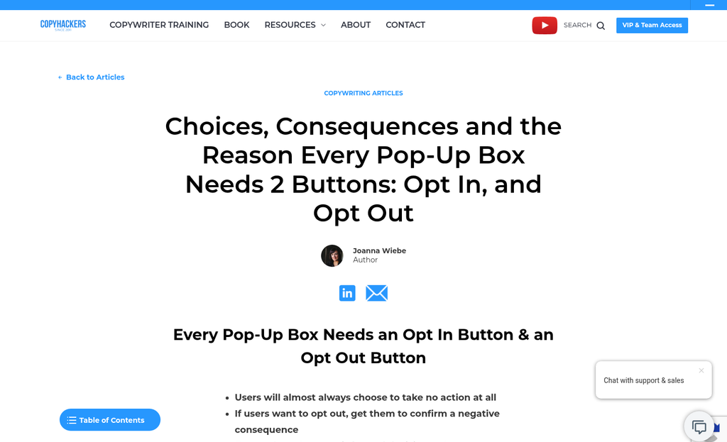
The opt-out line matters just as much as the button itself. A lot of popups get this wrong by writing dismissal text that guilts the reader into staying. Lines like "No thanks, I hate saving money" are a turn-off. They feel sarcastic and condescending, which is the opposite of what you want them to feel right before they leave. If you're unsure which popup format leads to better engagement overall, comparing floating bars and slide-in popups can help you decide what fits your goals.
Write your opt-out line to be neutral and honest. Something like "No thanks, I'll pass for now" or "I'm not interested" is enough. You don't need to punish them for saying no, and you don't need to make it dramatic.
The two-button format is a way to show confidence in your own popup. If what you're giving away is legitimately helpful, you don't need to trap anyone - you just need to make it easy to say yes.
Using Urgency Honestly Without Crossing Into Manipulation
Countdown timers work. Popups with a countdown timer convert at 14.41% compared to 9.86% without one - it's a real and actual gap. But that number assumes the urgency is legitimate, and that's where popup copy goes wrong.
Fake countdown timers are one of the most common shortcuts in popup design. The clock hits zero, the visitor refreshes the page, and the timer starts again from the top. Most visitors see this. When they do, the trust you spent time building disappears almost instantly - and so does any chance of a conversion.
Real urgency does not have to be dramatic to be helpful. A sale that ends Friday, a discount tied to an event, or a legitimately limited stock quantity - these are all honest reasons to ask someone to act. The copy just has to match what is actually true.
It also helps to know that urgency is used selectively by the popups that perform best. According to Claspo's 2026 data, only 30% of top-performing popups use countdown timers, and 45% use limited-time language. These tools show up when they are earned - not as a default setting on every popup regardless of context.
Limited-time language is worth using on its own terms. Phrases like "this week only" or "offer ends Sunday" create a soft deadline without a ticking clock on screen - it will seem less pressured to the reader while still giving them a genuine reason to choose now instead of later.
The difference between urgency and manipulation is honesty about the stakes. If something is not actually running out and the deadline is not real, the copy is making a promise the page can't keep. The gap between what the popup says and what the visitor experiences is what erodes confidence in a brand over time.
Before adding a timer or a scarcity claim, it's worth confirming that the limit is real. If it is, say so plainly. If it's not, find a different reason to make the popup worth reading. The FTC guidelines on deceptive advertising are also worth reviewing to ensure urgency tactics stay within legal and ethical boundaries.
Choosing the Right Trigger So Your Popup Feels Invited, Not Imposed
Before a visitor reads a single word of your popup, they've already formed a feeling about it. That feeling comes from timing. A popup that appears because a visitor clicked a button to see it lands very differently from one that interrupts them thirty seconds into reading a page.
The trigger type shapes the tone before your copy even gets a chance to work.
Click-triggered popups convert at 54.42% on average - the highest of any trigger type - and the reason is easy. When a visitor clicks something to open a popup, they've already decided they want to see what's inside. Your copy doesn't have to work as hard to earn their attention because they gave it willingly. That removes a layer of friction that even the best-written copy can't replace.
Scroll-based popups sit in the middle ground. They appear after a visitor has read enough of a page to show interest, so they feel more relevant than an immediate interruption. They still carry some friction, but the context makes them easier to accept. Time-based popups are tied to the clock instead of to any action the visitor took, so they land the hardest. If you're seeing weak results across all your trigger types, it's worth understanding why A/B tests keep producing inconclusive results before drawing conclusions.
| Trigger Type | Avg. Conversion Rate | Perceived Pushiness |
|---|---|---|
| Click-triggered | 54.42% | Low - visitor opts in to see it |
| Scroll-based | Moderate | Medium - contextually relevant |
| Time-based | Lower | Higher - interrupts browsing |
The helpful takeaway is that timing and copy work together. A popup that appears at the right moment needs less persuasion in the headline because the visitor is already leaning in. A poorly timed popup forces your copy to do double the work - first to soften the interruption, then to actually make the case. This dynamic becomes especially visible when you look at what scroll depth data reveals about how visitors engage with your content.
If you have the ability to test different triggers, prioritize click-based and scroll-based options. Your copy will have a better environment to do its job.
Small Design Choices in Copy That Make a Big Trust Difference
The words in your popup matter. But so does how the whole thing is put together around those words. A first-time visitor makes a fast judgment about your brand based on what they see - and small structural decisions in your copy signal if you respect their time or not.
Start with your close button. Research into top-performing popups found that 71% of them have a visible close option. That one detail changes how the whole popup feels. Visitors who can see an easy way out like to relax, and a relaxed visitor is far more likely to actually read what you wrote.
Your call to action should do one job. About 94% of top-performing forms follow a single CTA, and there's a reason for that. When you give two or three actions to take, you create hesitation. One button, one ask, one next step - it's what gets clicks.
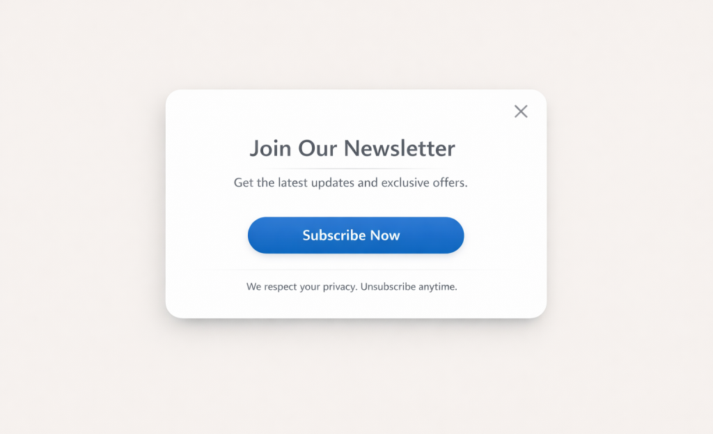
Fine print is worth thinking about too. A short reassurance like "No spam, unsubscribe any time" is helpful. But a wall of small text starts to feel like the opposite of reassurance. Copy that tries too hard to convince visitors they are safe accidentally raises the question of why there's so much to explain.
Think about what a first-time visitor assumes when they see your popup. If the button to leave is hidden, if there are two competing CTAs, or if the micro-copy reads like a legal disclaimer - they form an impression of your brand in that second. Those impressions build up over every interaction that follows. Using micro-commitments strategically can help shift those interactions in a more positive direction.
The popups that convert well are not the most aggressive ones. They are the ones that feel like they were written by a person who thought about the person on the other side of the screen. That comes through in word choice, in what you leave out, and in how easy you make it for someone to say no - because making it easy to say no is part of what makes them say yes. If you want to measure whether these changes are actually working, tracking your micro-conversion metrics is a good place to start.
Your Popup Is a First Impression - Write It Like One
The change is philosophical, not tactical. Write copy that makes the offer feel obvious to the right person instead of copy designed to stop people from leaving. When your popup legitimately matches what your visitor needs in that moment, you don't have to manipulate anyone into clicking. The click becomes the natural next step.
Launch the popup, watch what happens, and treat the data as a conversation. A low conversion rate isn't a failure - it's a signal that something in the message, the timing, or the offer isn't landing yet. Adjust one ingredient, test again, and refine. The best-performing popups don't start that way. They get there because someone kept asking the right question: does this feel helpful, or does it feel like a trap?
FAQs
Why do most popups feel pushy to visitors?
The problem is usually the copy, not the popup format itself. Guilt-trip opt-outs, fake urgency, and vague benefit statements signal manipulation rather than value, causing visitors to distrust the brand.
What makes a CTA button more effective?
Using first-person phrasing like "Get my free guide" instead of "Download now" puts the visitor in control. This small change can lift click-through rates by up to 90% by aligning the copy with the reader's perspective.
How should urgency be used in popup copy?
Only use urgency when it's genuine - a real sale deadline or actual limited stock. Fake countdown timers that reset on refresh destroy trust quickly and reduce the chance of conversion once visitors notice the trick.
Which popup trigger type converts best?
Click-triggered popups convert at 54.42% on average, the highest of any trigger type. Because the visitor chooses to open them, the copy requires less persuasive work to earn their attention.
How specific should popup headlines be?
Very specific. "Save $20 on Your First Order" outperforms vague promises like "Save Money" because it gives visitors something concrete to weigh. Specificity makes the offer more believable and more compelling.


