

The instinct at that point is usually to make the form more visible. Bigger button, bolder color, more aggressive popup timing. But pushing harder doesn't solve the problem, because the problem isn't about visibility - it's about the way people use things online - which is usually passive, distracted, and noncommittal until something changes their attention.
That change is what two-step try-ins are designed to create. Instead of asking visitors to fill out a form the second they land on your page, a two-step try-in introduces a small action first - something that feels low-stakes. That small first step does something to how people feel about completing the process - it's not manipulation; it's basically working with the way human decision-making actually functions instead of against it.
The mechanics of how to set this up, and why it works the way it does, are covered in detail throughout this post. But before getting into any of that, it helps to know what two-step try-ins are - and what makes them different from the standard strategy most websites still use.
Key Takeaways
- Two-step opt-ins require a button click before showing a form, creating a micro-commitment that increases visitor intent.
- The Zeigarnik effect explains why small first actions psychologically push people to complete the full sign-up process.
- Data shows two-step opt-ins (44%) and standard on-page forms (45%) perform nearly equally, making testing essential.
- Specific, first-person button copy like "Send me the guide" outperforms generic labels like "Subscribe" by stating clear benefits.
- Single opt-in grows lists faster; double opt-in produces cleaner, more engaged lists better suited for long-term email programs.
What a Two-Step Opt-In Actually Is and How It Works
A two-step opt-in is a sign-up process that happens in two stages. Instead of landing on a page and seeing a form straight away, a visitor clicks a button or link first. That click then shows the form where they enter their email address.
Compare that to a standard embedded form, which sits on the page and asks for your email immediately. There's no lead-up, no small action to take first - the form is there, waiting - it's a passive experience and visitors scroll straight past it.
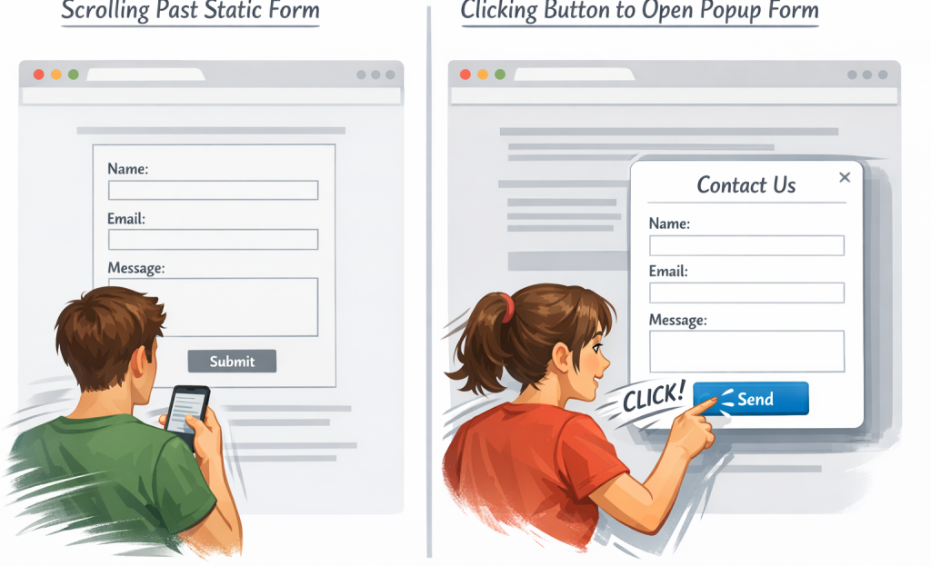
A simple example: a reader sees a button that says "Get the free guide," clicks it, and a form appears asking for their name and email. By the time they see that form, they've already decided they want what's on the other side.
That click matters more than it seems. There's a well-documented psychological principle called the Zeigarnik effect, which describes how people feel an internal pull to finish something they've already started. Once someone takes that first small action, they're more inclined to follow through to the next step. Researchers call this first action a micro-commitment - a low-stakes move that mentally nudges them toward the bigger one.
That's why two-step opt-ins convert better than standard forms. The button click filters out passive browsers and brings in people who are already leaning toward signing up. By the time the form appears, you're talking to a warmer audience. If you're seeing drop-off before that point, it's worth understanding why multi-step forms lose leads between steps.
| Standard Embedded Form | Two-Step Opt-In |
|---|---|
| Form is visible immediately | Form appears after a click |
| No action needed to see it | Requires a micro-commitment first |
| Passive experience for the visitor | Active choice from the visitor |
| Lower intent signal | Higher intent signal |
Where to Place Two-Step Opt-Ins for Maximum Visibility
Placement matters more than you might expect. A two-step opt-in on the wrong page can sit there quietly doing nothing. But the same opt-in in the right place can become one of your best-performing assets.
The key is to remember where reader intent is highest. Someone halfway through a blog post on a topic they care about is far more involved than a person who just landed on your homepage. That engagement is what makes them more likely to click a button and follow through.
Blog posts are one of the best places to start. You can embed a two-step trigger mid-post or at the end, tied directly to the content they just read. The connection between what they read and what you are asking them to sign up for makes the whole thing feel relevant instead of random.
Landing pages are another strong placement. When someone visits a dedicated page for a lead magnet or a free resource, they are already showing interest. A two-step opt-in here works because the click to open the form creates a natural next step instead of an interruption. If you want to get more out of these pages, it helps to reduce cognitive load so visitors focus on signing up.
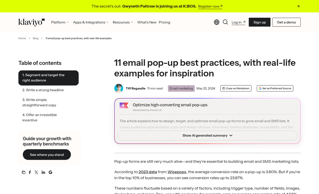
Exit-intent pop-ups are worth considering too. Pop-ups convert three to four times better than embedded forms, according to Stripo.email. Exit-intent triggers catch visitors at a natural pause point, right before they leave, which is a moment to present one last reason to stay in touch.
Content upgrades are another placement to consider. These are bonuses tied to a piece of content, like a checklist or template that expands on what they just read. A content upgrade paired with a two-step opt-in tends to produce strong results because the incentive is directly aligned with what the reader already wants. If your upgrades aren't pulling their weight, it's worth looking at why your lead magnet isn't converting.
One thing to keep in mind: don't load a single page with multiple triggers. Too many prompts compete with each other and tend to cut back on your sign-up rate.
Crafting Button Copy and Form Design That Gets the Click
Once a visitor sees your opt-in, the next job is to make that first click feel like an easy yes. The words on your button do heavy lifting here, and generic labels like "Subscribe" tend to underperform because they describe what the visitor is giving instead of what they get.
Button copy like "Yes, show me how!" or "Send me the guide" works way better because it speaks directly to the outcome. Specificity is the ingredient that matters. A button that says "Get my free meal plan" will usually outperform one that says "Sign up" because it answers the question the visitor is already asking: what's in it for me?
Keep the language first-person where you can. Phrases that start with "Yes, I want..." tend to pull higher click rates than ones written in second-person, because the visitor feels like they are making a choice instead of being pushed into one.
On the design side, color contrast matters more than most people give it credit for. Your button needs to stand out from the surrounding page without looking out of place. A button that blends in gets ignored, and a button that clashes feels off - shoot for something in between. Small design tweaks like these can have a measurable impact on how many visitors actually follow through.
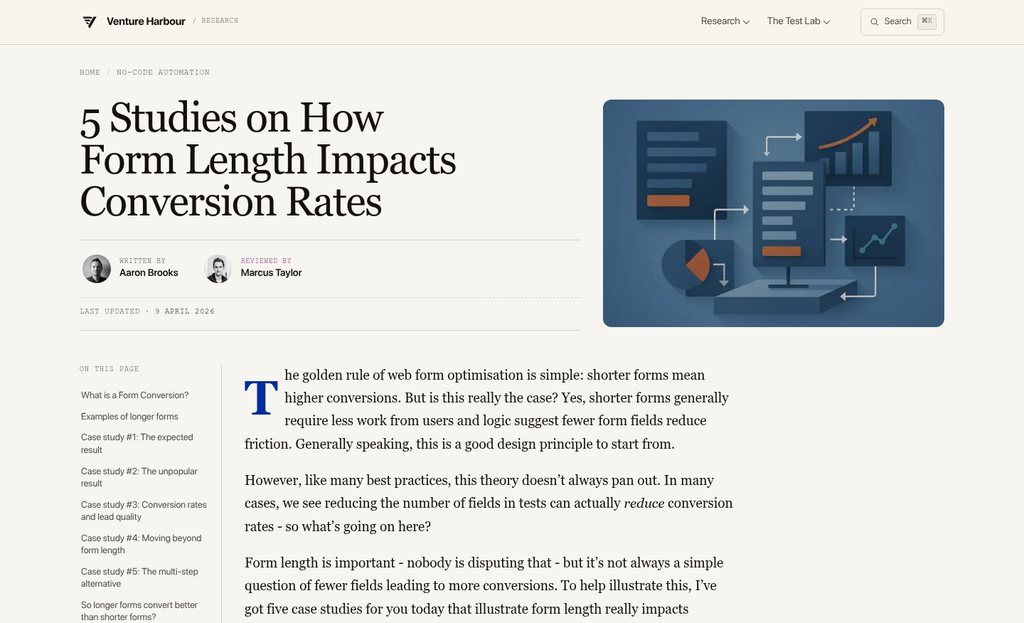
Form length also factors into how easy the second step feels. Asking for a name and email address is fine for most audiences. Adding more fields tends to cut back on completions, so it's worth being selective about what information you actually need at this stage. How you label those fields matters just as much as how many you include.
It's also worth knowing that gamified formats like spin-to-win popups convert at around 10% compared to 4-5% for standard forms; it's roughly a 125% lift, and it comes mostly from the interactive element that makes the opt-in feel more engaging. If your brand can carry that experience, it's a format worth testing.
What the Numbers Say About Two-Step Opt-In Performance
The data on two-step opt-ins is interesting, but it tells a tougher story than expected. Leadpages ran 10 split tests comparing two-step opt-ins against standard on-page forms, and the results were close. Two-step opt-ins averaged a 44% conversion rate. But on-page forms came in at 45%.
What's worth mentioning is how those tests broke down individually. Six out of ten tests favored the on-page form and four favored the two-step strategy; it's not a landslide in either direction - it's a near draw that depends heavily on the page, the audience, and the context around the form.
| Format | Average Conversion Rate | Tests Won (out of 10) |
|---|---|---|
| Two-Step Opt-In | 44% | 4 |
| On-Page Form | 45% | 6 |
Rejoiner's research adds another angle to consider. They found that two-step promotional emails had a 3.8% engagement rate and an 11.9% conversion rate with the involved users. Those numbers point to a smaller but more committed group moving through the funnel.
That pattern makes sense given what the two-step process actually does - it filters out passive interest and retains those who took a deliberate action to move forward. A lower raw volume with higher intent can be more valuable depending on what you're selling.
None of that means one format wins across the board. The honest takeaway from the data is that page context, your existing traffic quality, and how you write your call-to-action all pull more weight than the format alone. Testing on your own audience is the only way to know which strategy fits your situation.
Single vs. Double Opt-In: Choosing the Right Confirmation Flow
Once your two-step form is in place, you still have one more choice to make. You can add subscribers to your list the second they submit the form, or ask them to confirm via email first; it's the difference between single and double opt-in.
Double opt-in can cut back on your signup volume by anywhere from 15% to 40%. That's a loss. But those who do confirm tend to be more engaged and less likely to mark your emails as spam. For businesses where deliverability and list health matter most, that trade-off is usually worth it.
Single opt-in gets people onto your list faster with no extra steps - it's a fit if you need to grow a list quickly or when your audience is already very motivated to sign up. Event registrations and free tool downloads work well with single opt-in because the person already has a strong reason to be there.

Double opt-in works much better for long-term email programs like newsletters, courses, or anything where sustained engagement matters - it also gives you a cleaner record of consent, which can matter in regions with stricter data protection laws.
| Factor | Single Opt-In | Double Opt-In |
|---|---|---|
| Signup volume | Higher | Lower (15-40% drop) |
| List quality | More variable | Generally cleaner |
| Engagement rates | Can be lower | Tends to be higher |
| Deliverability risk | Higher | Lower |
| Best for | Fast list growth, gated downloads | Newsletters, long-term programs |
Think about what your list is actually for. If you want a large pool of contacts you run ads to or use to test messaging, single opt-in makes sense. If you want subscribers who read your emails, double opt-in builds that list.
Small Steps, Big Lists: Putting It All Together
No single format is guaranteed to outperform everything else on every site. Your audience, your offer, and even your button copy all change results. The only way to know what works for your list is to test it deliberately and pay attention to what the numbers are telling you.

Here are a few things you can do:
- Audit your current opt-in placement. Are your sign-up prompts buried where few people see them? Identify one or two high-traffic spots where a two-step trigger could replace a static form.
- Rewrite your button copy. Swap generic text like "Subscribe" for something that reflects the actual benefit, such as "Send Me the Guide" or "Get My Free Checklist."
- Set up a simple A/B test. Run your existing opt-in alongside a two-step version for two to four weeks - the right A/B testing tools can make this much easier - and compare conversion rates before making a permanent switch.
A growing email list doesn't have to feel tough. Start with one small difference, see how your audience responds, and build from there. If you're exploring new ways to capture leads, it's worth looking at some of the top opt-in tools available to find the best fit for your site. The best opt-in strategy is the one you actually do - so pick a starting point and go.
FAQs
What is a two-step opt-in?
A two-step opt-in is a sign-up process where visitors click a button first, which then reveals the email form. This small initial action creates a micro-commitment, making visitors more likely to complete the full sign-up.
Why do two-step opt-ins increase email sign-up rates?
They leverage the Zeigarnik effect - once someone takes a small first action, they feel psychologically compelled to finish. This filters out passive browsers, leaving a warmer, higher-intent audience by the time the form appears.
Where should I place two-step opt-ins on my site?
High-intent locations work best, including mid-post or end-of-post blog placements, dedicated landing pages, exit-intent popups, and content upgrades. Avoid placing multiple triggers on a single page, as they compete with each other.
What button copy works best for two-step opt-ins?
Specific, first-person phrases like "Send me the guide" or "Get my free checklist" outperform generic labels like "Subscribe." Benefit-focused copy answers the visitor's key question: what's in it for me?
Should I use single or double opt-in with two-step forms?
Single opt-in grows lists faster and suits gated downloads or event registrations. Double opt-in reduces signup volume by 15-40% but produces cleaner, more engaged lists - better for newsletters and long-term email programs.


