

This is a frustration that plays out quietly in the background of countless businesses every single day. The analytics show visitors landing on the homepage and then almost immediately disappearing. No scrolling, no clicking, no converting. Just a steady stream of visitors who showed up and left before giving the page a chance - it feels personal - even knowing it probably is not.
Here is the uncomfortable reality: the hero section - that strong, prominent space sitting at the very top of your homepage - is usually the thing driving them away. Not because it looks bad. But because it's working against the visitor in ways that are easy to miss when you are too close to your own brand. The same section that was designed to make a strong first impression is quietly doing the opposite, and the signs are easy to rationalize away.
I'll break down where hero sections go wrong, what visitors are actually experiencing when they land on yours, and what needs to change to turn that first impression into a reason to stay. The fixes are simpler than you might think - but first, it helps to know what is happening in those few critical seconds before a visitor decides to bounce.
Key Takeaways
- Visitors form visual opinions in 50 milliseconds, meaning design elements like contrast and layout density convert before any copy is read.
- Multiple competing calls to action can reduce conversions by up to 266%; hero sections should focus on one clear next step.
- Generic headlines like "Innovative Solutions" fail because visitors want to know what changes for them, not what your company does.
- 53% of mobile visitors leave if a page takes over 3 seconds to load; bloated hero assets like uncompressed images quietly drain conversions.
- Strong visual hierarchy - dominant headline, high-contrast CTA, intentional white space - guides visitors toward action rather than confusion.
The 50-Millisecond Problem Nobody Talks About
Research published in Behaviour & Information Technology found that visitors create a visual opinion of a website in as little as 50 milliseconds; it's not enough time to read a headline, not enough time to process a value proposition, and barely enough time to blink.
What that means for your homepage hero is uncomfortable but worth sitting with. Visitors are already creating an impression of your brand before a single word registers in their brain.
So what does that split-second reaction actually respond to? A few things drive it more than anything else. Visual hierarchy tells the eye where to look first, and a cluttered layout gives you a sense of disorder that registers as untrustworthy. Color contrast plays a big part too - low contrast reads as flat and hard to connect with. But harsh or clashing colors can seem aggressive before a visitor even knows why. Layout density matters in a similar way, because a page that feels packed tells the brain it requires effort to process, and the brain flags that as friction.

Perceived trustworthiness is also baked into this reaction. A design that looks dated or inconsistent doesn't just feel visual - it feels unreliable. Visitors won't articulate this to themselves. They'll just leave.
A helpful exercise: pull up your homepage and look at the hero section for three seconds, then close the tab. What emotion did that quick look leave you with? Calm and confident? Overwhelmed? Uncertain about what the page is even for?
That emotional residue is the thing to pay attention to - it has nothing to do with your copy or your call to action - it's a response to light, space, shape, and proportion. Most businesses spend months refining their messaging and almost no time thinking about how their hero feels at a glance.
The visual layer of your hero section is doing a job your words haven't even had the chance to start yet.
What Happens When Your Hero Tries to Say Everything at Once
A visitor lands on your page and sees a tagline, a sub-headline, a short feature list, two trust badges and three buttons asking them for three different things. Their brain doesn't prioritize for them - it just registers the noise and looks for the exit.
That's messaging overload, and it's one of the most common reasons hero sections fail to convert.
There's a finding from Growth Marketing Pro worth taking here. Their research found that having competing calls to action in a hero section can cut back on conversions by as high as 266%; it's not a small dip - it's your hero section actively working against you.
The logic behind that number makes sense when you think about how decisions work. When someone has one path to take, they can take it. When they have three paths, they stall. They're not sure which one is right for them, so they don't pick any of them.
Count how many things your latest hero is asking a visitor to do or read. Include every button, every link, every line of text that asks for attention. Most count higher than they expect to.
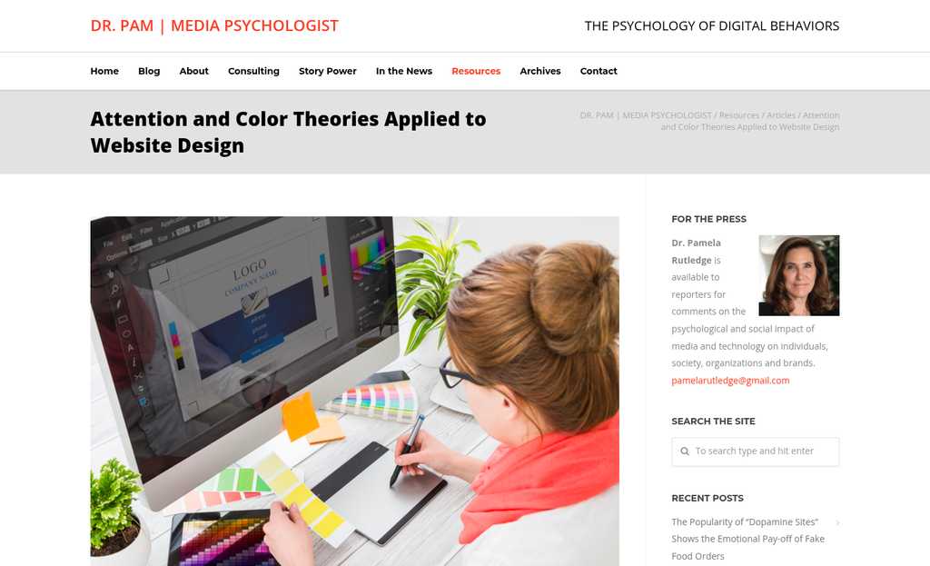
Each extra element you add to a hero section isn't neutral - it splits the visitor's focus and makes the primary action harder to find. A trust badge next to a CTA can feel like a smart combination. But it pulls the eye in two directions at once.
The same goes for feature lists. A bullet list of product benefits might feel like helpful context. But a visitor who just arrived isn't ready to absorb it. They're still deciding if they're in the right place.
Cutting elements isn't stripping your page down to almost nothing - it's respecting the order in which people need information. Your hero has one job: to get the right person to take one next step. Everything else can live further down the page where it has room to land. If you want to see how micro-commitments can guide visitors toward that step, that principle applies directly to how you structure what comes after the hero.
Why "What We Do" Headlines Miss the Point Entirely
There's a type of headline that shows up on homepages constantly, and it goes something like "Innovative Solutions for Modern Businesses" or "Welcome to Our Website." These headlines feel safe to write because they describe the company. But visitors aren't there to learn about your company - they're there because they have something they want to fix or achieve.
Visitors land on your hero section with a question already in their head, and that question is almost never "what does this company do?" It's closer to "can this help me get X?" A headline that answers the wrong question is noise.
The difference between feature-focused and benefit-focused copy comes down to this: a feature-focused headline tells what you do or what you have. But a benefit-focused headline tells what can become possible for them because of it. The first puts your company at the center. The second puts the visitor there instead, which is where they want to be.
Think about what your visitor actually wants as an end result - not the tool or the service, but the change they're hoping to see in their work or their life. That result is what your headline should speak to. It's worth taking a deeper look at outcome-driven headline frameworks, which give you a structured way to connect what you do to what your visitor walks away with.
Take your latest headline and ask: does it tell a visitor anything about what changes for them? If the answer is no, rewrite it from the visitor's perspective. Start with the result they want and work backward to how you help them get there.
The phrase "innovative solutions" has become almost meaningless at this point because every company uses it and none of them say anything different. Generic language doesn't just fail to convert - it quietly tells visitors that you haven't thought about them at all. If you're unsure whether your messaging is landing, the right A/B testing tools can show you which version of your headline actually resonates with real visitors.
How Hero Section Load Times Are Quietly Bleeding Your Conversions
Bad copy isn't the only thing that stops visitors from converting. Sometimes the page itself is the problem, and it has nothing to do with words at all.
53% of mobile visitors leave a page that takes more than 3 seconds to load; it's not a small number to brush aside. What makes it worse: every extra 100KB in hero assets raises bounce rate by around 1.8%. A bloated hero section is actively pushing visitors away before they can even read a word.
The usual culprits are pretty predictable. Oversized background images are one of the biggest offenders, and that's also the case when they're uploaded at full resolution without any compression. Autoplay videos are another. Browsers have to download a chunk of video data before the page feels ready. Heavy image sliders - the kind with five or six large images that rotate automatically - load those assets at once, which puts strain on load time. This kind of friction compounds quickly, and it's part of why mobile opt-in forms convert so poorly even when everything else looks right.
The fix starts with learning where you stand. Tools like Google PageSpeed Insights and GTmetrix will show you what's slowing your hero section down and give you a score to work from - it's worth running your page through one of these before making any other changes. While you're auditing performance, it's also a good time to track your micro-conversion metrics to see exactly where visitors are dropping off.
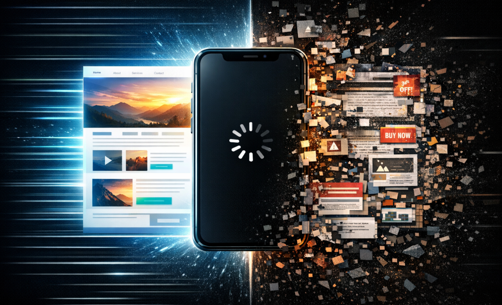
Here's a quick look at how common hero asset types perform:
| Asset Type | Typical File Size | Performance Impact |
|---|---|---|
| Compressed static image (WebP) | 50-150KB | Low impact, fast to load |
| Uncompressed JPEG/PNG | 500KB-3MB | High impact, slows load noticeably |
| Autoplay background video | 2MB-20MB+ | Very high impact, delays interactivity |
| Multi-image slider (unoptimized) | 1MB-8MB | High impact, loads all slides upfront |
| CSS/SVG animation | Under 50KB | Minimal impact, lightweight alternative |
A static, compressed image in a modern format like WebP will usually outperform a video or slider on load time. That alone is worth considering. Faster load times also make your scroll depth data more meaningful, since visitors actually stay long enough to engage with the rest of your page.
The Role of Visual Hierarchy in Guiding Visitor Attention
Where your eyes go first on a page isn't random - it's the result of deliberate design decisions. The size of your headline, where your CTA button sits, how much breathing room surrounds each element, and where your image lands all work together to either guide a visitor toward action or leave them with nowhere to go.
Nielsen Norman Group found that roughly 80% of visitor attention stays above the fold; it's the space you get before a visitor has to scroll, and every pixel of it has to work. If your hero is cluttered or unbalanced, visitors don't pause to figure it out - they just move on.
A well-structured visual hierarchy pulls the eye through a logical path. A strong headline grabs attention first because it's the largest element on screen. A supporting line of text can add just enough context. The CTA button sits close by, visually, with space around it so it feels like the natural next step.
A cluttered hero does the opposite. Multiple competing headlines, a busy background image, and a CTA button buried below a wall of text all pull attention in different directions at once. There's no path, so visitors don't have one.
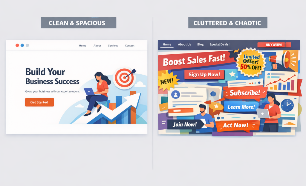
The table below breaks down the difference between strong and weak hierarchy options across the main elements of a hero section.
| Element | Strong Hierarchy | Weak Hierarchy |
|---|---|---|
| Headline | Large, concise, and the dominant text on screen | Similar size to surrounding text, easy to skim past |
| CTA Button | High contrast, close to the headline, surrounded by white space | Low contrast, buried below multiple text blocks |
| Supporting Text | Short and visually secondary to the headline | Long paragraphs that compete with the headline for attention |
| Image or Visual | Reinforces the message without overlapping key text | Dominates the layout and pushes the CTA below the fold |
| White Space | Used intentionally to separate and highlight each element | Minimal, making the section feel dense and hard to read |
White space deserves more credit than it gets - it's not wasted space - it's what makes each element feel intentional. Remove it and even a well-written hero starts to feel like a wall your visitors don't want to wade through. If you're evaluating tools to help structure these decisions, the best landing page builders with built-in CRO features can take a lot of that guesswork off your plate.
When Video Backgrounds Help - and When They Hurt
A well-placed background video can do quite a bit for a hero section. Unbounce found that homepage videos can lift conversions by as high as 80% in the right context, and it's not hard to see why - motion draws the eye, sets a tone quickly, and can communicate what a product does faster than a paragraph of text.
But that 80% figure comes with conditions attached. Video works when it supports the message without competing with it. The moment your background loop becomes more interesting than your headline, visitors watch the video instead of reading your CTA - it's a conversion loss dressed up as engagement.
The other problem is accessibility. Auto-playing video with lots of motion can be uncomfortable for users with vestibular disorders, and many users have their devices set to reduce motion for this reason. If your video plays regardless, you are failing those users entirely. The fix is to respect the prefers-reduced-motion media query so the video pauses or swaps for a static image when needed.
Mobile deserves its own mention here. Many sites disable video on mobile already, which is the right call for performance. But that means your hero still needs to work beautifully as a static layout - the video can't carry the load. If you're running A/B tests to measure this, make sure your sample sizes are large enough to draw real conclusions.
There's also the captions question. If your video has any spoken content or on-screen text, captions aren't optional. If you don't have them, you're cutting out a part of your audience entirely.
| Video works well when... | Video tends to backfire when... |
|---|---|
| The motion is subtle and looping | The footage is busy or fast-moving |
| It reinforces the headline message | It tells a different story than the copy |
| A static fallback exists for mobile | Mobile users see a broken or blank hero |
| Reduced motion preferences are respected | There is no accessibility consideration at all |
Before adding video, consider what job it's doing. If it can add context or emotion that your copy can't do alone, it earns its place. If it's just there to look good, a strong static image will perform just as well - sometimes better. The same logic applies to urgency elements and other persuasion tactics on your page: they need to pull their weight or they create noise instead of conversions.
Your Hero Section Deserves a Second Look
The good news is you don't need a full redesign to see results. Small, deliberate changes - a sharper headline, a single dominant CTA, a compressed background image - are the types of moves worth testing first. Carrot's own data found that hero-section-only changes drove conversion lifts of 25-55% for real estate investor and agent sites, which is a real return on what could be an afternoon of work. Run an A/B test, give it enough traffic to be statistically meaningful, and let the numbers tell you what your instincts can't.
Remember: the best-performing hero section isn't necessarily the most polished or the most elaborate. It's the one that makes a first-time visitor feel like they're in the right place - and gives them one reason to stay. That's the only benchmark that matters.
FAQs
Why are visitors leaving my homepage hero section quickly?
Visitors form visual opinions in just 50 milliseconds, before reading any copy. A cluttered layout, low contrast, or dense design triggers an immediate sense of friction or distrust, causing visitors to leave before your message has a chance to register.
How many calls to action should a hero section have?
Just one. Multiple competing CTAs can reduce conversions by up to 266%. When visitors face several options, they often choose none. Your hero's sole job is to guide visitors toward a single, clear next step.
What makes a homepage hero headline ineffective?
Headlines that describe what your company does, like "Innovative Solutions for Modern Businesses," fail because visitors want to know what changes for them. Effective headlines speak to the outcome the visitor wants, not the features you offer.
How does hero section load time affect conversions?
53% of mobile visitors leave if a page takes over 3 seconds to load. Uncompressed images, autoplay videos, and heavy sliders are common culprits. Switching to compressed WebP images can significantly improve load speed and reduce bounce rates.
Do background videos in hero sections help or hurt conversions?
Videos can boost conversions by up to 80% when subtle and message-aligned, but backfire when too busy or distracting. They must include accessibility considerations like reduced-motion support and a static fallback for mobile users.


