

Social proof notifications, done well, are genuinely useful. People look to others when making decisions, and a well-timed push that says "others like you found value here" can be the difference between a visitor bouncing and a customer converting. But somewhere along the way, businesses confused helpful context with relentless psychological pressure - and visitors noticed. Trust eroded. Eyebrows went up. The tool that was supposed to build confidence started doing the opposite.
The good news is that there's a difference between social proof that informs and social proof that manipulates, and it mostly comes down to intent, honesty, and a little self-restraint. This post walks through how to use these notifications in a way that actually serves your visitors - not just your conversion metrics - so your brand comes across as credible instead of desperate.
No used car lot. Promise.
Key Takeaways
- Social proof notifications inform visitors when accurate, but become manipulative dark patterns when fabricated or exaggerated beyond reality.
- Notifications appearing 5-8 seconds after page load feel natural; appearing sooner feels intrusive and reduces receptiveness.
- Nearly 45% of consumers lose brand trust when they detect manufactured urgency, and 95% can identify fake social proof.
- Specific, sourced data like "48 purchases in 24 hours via Trustpilot" builds far more credibility than vague, unsourced claims.
- Regular audits checking notification frequency, copy tone, data freshness, and bounce rates help maintain long-term visitor trust.
What Social Proof Notifications Actually Are (And What They're Not)
At their most basic, social proof notifications are small, real-time tells that show others are buying or trusting a product. A popup that says "Sarah from Denver just purchased this" is a classic example. So is a live counter that shows how many people are viewing a page, or a review snippet pulled from customer feedback.
These notifications sit on a spectrum. On one end, you have soft indicators like a star rating displayed near a product name. On the other end, you have aggressive tactics like countdown timers paired with fake scarcity messages and visitor counts that reset every few minutes to look busier than the site actually is.
The soft end of that spectrum tends to inform. The aggressive end tends to pressure. That distinction matters more than most people realise, and it's worth sitting with it for a bit before moving forward.
What social proof notifications are not is equally important to know. They are not the same as testimonials placed manually on a landing page, and they are not decoration. They work as live trust signals - small pieces of evidence meant to cut back on hesitation in the moment. When they work well, they give visitors a reason to feel confident. When they are fabricated or exaggerated, they become something closer to a dark pattern.
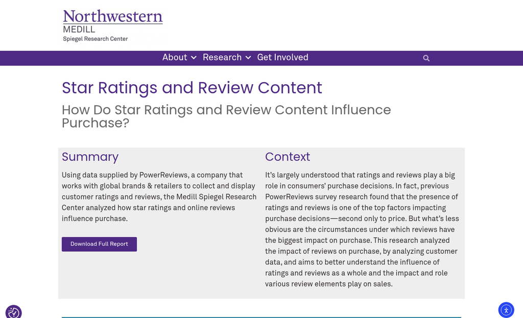
A dark pattern is a design choice that nudges toward a decision in a way that benefits the business more than the user. The line between a helpful push and a dark pattern gets crossed when the notification stops being informative and starts being manufactured. The helpful test is to ask: is the signal you are showing actually true, and would a visitor feel deceived if they found out how it was generated? It's the same question worth asking when thinking about how to use urgency and scarcity without hurting trust.
Social proof notifications can be legitimately helpful tools for building trust with new visitors. But that usefulness depends heavily on whether the data behind them is accurate and whether the presentation is honest about what it's showing.
Why Visitors Stop Trusting Notifications That Feel Forced
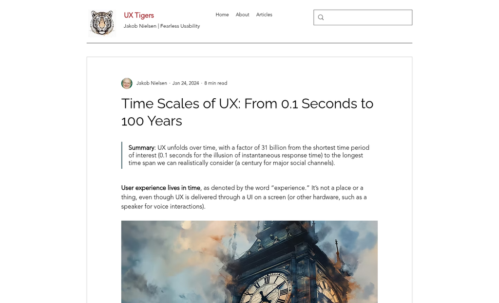
People are better at detecting dishonesty than most businesses give them credit for. Research from the Northwestern University Spiegel Research Center found that products with a 4.2 to 4.5 star rating actually sell better than the ones with a perfect 5.0. That one finding says quite a bit about how visitors process social proof. Too polished and too perfect triggers a quiet internal question about who curated it.
That internal alarm fires faster than most people consciously know. A visitor doesn't think "this notification is statistically improbable." They just feel something is off and move on. The feeling comes first and the reasoning follows.
Artificial urgency is one of the fastest ways to set that alarm off. Nearly 45% of consumers say they lose trust in a brand when they sense urgency has been manufactured instead of earned. A notification that says "37 people viewing this right now" sounds convincing in theory. But if a visitor has been on the page for ten minutes and that number hasn't changed at all, the credibility of everything else on the page drops with it.
Testimonials and activity notifications share a similar problem. Studies put the number of consumers who can detect fake or unverifiable social proof at around 95%. That is not a small segment of skeptical users - it's nearly everyone. Visitors aren't looking for reasons to distrust a site. But they will find them when notifications feel disconnected from reality.
A few patterns break trust reliably. Generic names like "A visitor from London" carry almost no weight. Purchase notifications that appear within a few seconds of a page loading feel scripted. Activity numbers that stay suspiciously round or reset at convenient intervals read as automated instead of organic.
The psychology underneath this is straightforward. People use social proof to reduce uncertainty and choose what feels safe. When the proof itself feels uncertain or unverifiable, it doesn't reduce anxiety - it can add to it. That is the exact opposite of what these notifications are supposed to do.
The Timing and Frequency Rules That Change Everything
Once trust starts to slip, it slips fast - and timing is one of the biggest reasons it does. A notification that appears within the first two or three seconds of a page load feels less like helpful information and more like an interruption. The visitor hasn't had a chance to settle in, so anything that pops up immediately reads as a push instead of a pull.
Research into notification behavior points to a sweet spot of around 5 to 8 seconds after page load. At that point, a visitor has had time to take in the page and develop a basic sense of where they are. A notification appearing then feels like a natural part of the experience instead of a demand for attention.
Frequency matters just as much as timing. Showing too many notifications in quick succession trains visitors to stop reading them altogether - this is what banner blindness looks like in practice. Visitors don't get angry; they just start to look past the notifications entirely, the same way they scroll past repetitive ads without registering them.
A rule to work with is 1 to 3 notifications per page visit - enough to build credibility without turning the experience into a stream of pop-ups. Staying within that range keeps each notification feeling like it has something worth saying.
| Timing Scenario | Likely User Experience |
|---|---|
| Notification appears in under 3 seconds | Feels intrusive; visitor hasn't oriented to the page yet |
| Notification appears at 5-8 seconds | Feels natural; visitor is engaged and more receptive |
| 4 or more notifications per page | Visitor begins to tune them out; trust erodes gradually |
| 1-3 notifications per page | Each one retains attention and reads as credible |
The mechanics are a foundation, but only part of the picture. The words inside those notifications carry their own weight and do their own work - very separate from when they appear.
What Your Notifications Say Matters as Much as When They Appear
The words inside a notification do heavy lifting. A vague message like "Someone nearby just viewed this!" gives visitors almost nothing to work with, and instinctively they sense that. There's no way to verify it, no helpful detail, and it reads more like a pressure tactic than a helpful signal.
Specific numbers are a different story. A notification that reads "48 people bought this in the last 24 hours" gives visitors something concrete to review. They can weigh that against what they already know about the product and make a more well-informed choice.
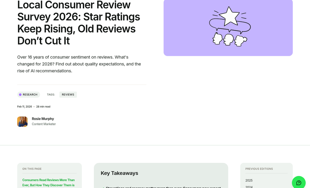
This connects to something worth keeping in mind: reviews are trusted 12 times more than claims made directly by a brand, according to Econsultancy. That gap exists because third-party signals feel independent. Your notifications work the same way - the more they look like data and the less they look like marketing copy, the more credibility they carry.
A test for any notification is to find what job it's doing. Is it giving visitors information that legitimately helps them choose, or is it designed to make them feel like they're about to miss out on something? Running tests on your notifications can help you separate what's actually working from what just feels like it should.
Those two goals produce very different results. Helpful notifications build trust over time. Pressure-based notifications can drive a one-time click but leave visitors with a vague sense that they were nudged instead of well-informed.
It's helpful to think about the facts your visitors would actually want to know. How many people purchased recently? What did other buyers say? And how long has this product been available? These are the types of facts that let visitors feel confident in a choice instead of rushed into one. Your site's engagement data can reveal which details your visitors are actually paying attention to.
Keep the language plain and direct. Phrases like "people are loving this" belong in ad copy, not in a notification that's meant to reflect real activity. When the wording feels neutral and factual, it's much easier for visitors to trust it.
Keeping Notifications Fresh With Accurate, Recent Data
There's a stat worth learning about here: 83% of consumers see reviews older than three months to be irrelevant. Stale data fails to persuade and actively works against you by making your brand look out of touch.
The fix starts with where your notifications pull their data from. Syncing notifications to a live or frequently updated data source means what visitors see reflects what's actually going on on your site. If purchased an hour ago, that's worth showing. If the last buy was six weeks ago, that's a different story.
Products with lower traffic need a more honest strategy - it's tempting to stretch the timeframe to fill a notification slot. But showing a "3 people bought this in the last 90 days" message can read as weak instead of reassuring. There's no need to manufacture activity where there isn't any.
When you legitimately don't have much recent activity to show, "honest silence" can become an option. Showing nothing is not the same as failing - it's choosing not to mislead. A blank space is far less damaging than a notification that makes visitors feel like they're the only one interested in a product.
That said, there are ways to manage low-activity products without going quiet. You can widen the data window slightly but be transparent about it, or use a different type of social proof that's still accurate - like a rating instead of a recent buy count. You want to find something true to say - not to find a way to say something. If you rely on visitor data to power these signals, understanding how lead enrichment data works can help you keep that information accurate and up to date.
A rule to keep in mind: if you'd feel uncomfortable explaining how a notification was generated, it probably shouldn't be there.
Being Transparent About Where Your Social Proof Comes From
One of the fastest ways to lose a savvy shopper's trust is to show them a notification with no indication of where it came from. People sense when something feels unverifiable - even if they can't quite name why.
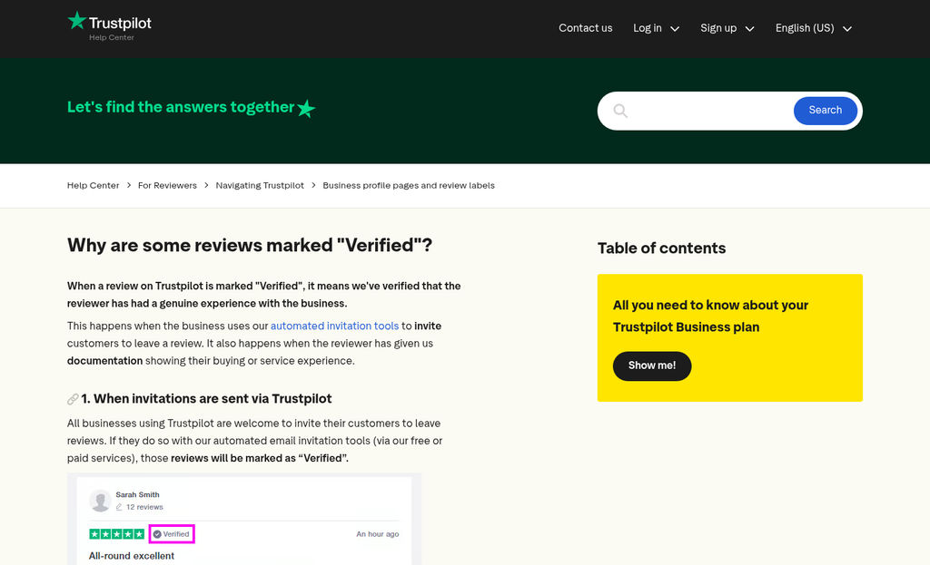
When you include a source - even a small label like "via Trustpilot" or "from verified buyers" - the notification changes from feeling like a marketing trick to feeling like information. That small addition does work.
If your notifications pull from a third-party review platform, link to it directly. A clickable source gives visitors somewhere to go if they want to check for themselves - and most won't actually click it - but knowing they could is what matters. That option to verify is a quiet signal that you have nothing to hide.
Aggregated data needs its own honesty. If a notification says "50 people bought this this week" and that number combines multiple product variants or locations, it's worth labeling it as such. Something like "across all sizes" or "globally" takes two seconds to add and heads off any sense of exaggeration. Small adjustments like these are among the tiny website design changes that can instantly boost sales without a full redesign.
| Notification Format | Example | Trust Implication |
|---|---|---|
| Transparent with source | "Rated 4.8 stars on Google Reviews" | Feels verifiable and credible |
| Transparent with scope | "23 purchases this week (all variants)" | Honest about how data is counted |
| Vague and unsourced | "People are buying this!" | Hard to trust, easy to dismiss |
| Opaque aggregate | "100 sold recently" | Raises questions about what "recently" means |
The table above shows how small wording choices change how a notification lands.
Transparency is not about over-explaining - it's about giving just enough context to feel like they're looking at activity instead of a sales tactic dressed up as data.
How to Audit and Calibrate Your Notification Strategy Over Time
Your notification setup is not a one-time job - it works more like a garden. You plant it, but you still have to tend to it if you want it to do its job well.
Start with a simple self-audit every few weeks. Pull up a page where your notifications fire and count how many appear during a single visit. If you lose count, that's your answer. Too many notifications - even accurate ones - train visitors to tune them out or feel like they're being pushed.
Next, read your notification copy out loud as if you've never seen your site before. Look for words that create artificial pressure - phrases like "only 2 left" or "selling fast" that aren't tied to inventory data. If the language feels pushy to you in that moment, it will feel pushy to a first-time visitor too.
Check your data freshness settings as well. A notification that shows a purchase from six months ago breaks trust the second a visitor notices the date. Set a cutoff that aligns with recent activity on your site - not the most flattering window you can find.
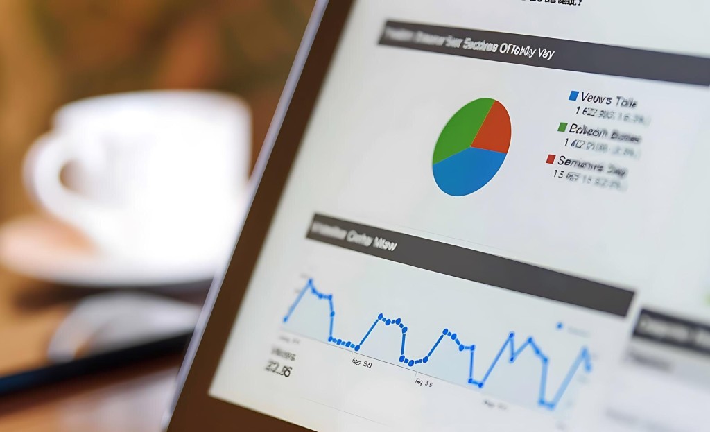
On the metrics side, keep an eye on a few numbers that matter over time.
| Metric | What to look for |
|---|---|
| Bounce rate | A spike after adding notifications can mean they feel intrusive |
| Conversion rate | Gradual decline may mean notifications have lost their credibility |
| On-site feedback | Survey responses or chat logs that mention popups or alerts |
None of these metrics tell the whole story on their own. But together they give you a clearer picture of whether your notifications are building trust or quietly working against it. Tracking micro-conversion metrics alongside these signals can help you spot patterns that would otherwise stay hidden.
You want to treat this as a living system. Small adjustments to timing, frequency, and copy can make a difference in how your site feels to visitors over time. When you're unsure what's actually moving the needle, A/B testing tools can take the guesswork out of those decisions.
Honest Nudges Beat Pushy Tactics Every Time
The mindset worth carrying forward is simple: your notifications should help visitors feel well-educated and confident - not rushed or cornered. When that's the standard you hold your setup to, the right options become easier to find. Real numbers, honest timing, relevant context - these things don't need embellishment because they are already doing actual work.
If you want a helpful next step, pick one notification in your current setup this week and ask yourself: is this helping my visitor, or is it just pressuring them? That single question, asked consistently, will keep your strategy grounded. Done with integrity, social proof is one of the quieter ways to build long-term trust - and that is always worth it.
FAQs
What are social proof notifications?
Social proof notifications are real-time signals showing others are buying or trusting a product, such as purchase popups, live visitor counters, or review snippets. They work as live trust signals designed to reduce visitor hesitation at the moment of decision.
When should social proof notifications appear on a page?
Notifications should appear 5-8 seconds after page load. Appearing sooner feels intrusive because visitors haven't had time to orient themselves, making the notification feel like a demand for attention rather than helpful information.
How many notifications per page visit is appropriate?
1-3 notifications per page visit is the recommended range. Showing more trains visitors to ignore them entirely, similar to banner blindness, while staying within this range keeps each notification feeling credible and worth reading.
Can visitors detect fake social proof notifications?
Yes. Studies suggest around 95% of consumers can identify fake or unverifiable social proof. Nearly 45% also lose brand trust when they sense urgency has been manufactured, making fabricated notifications actively harmful to credibility.
How should you source data for social proof notifications?
Use live or frequently updated data sources and clearly label where figures come from, such as "via Trustpilot" or "from verified buyers." Sourced, specific data like "48 purchases in 24 hours" builds far more trust than vague, unsourced claims.


