

Bounce rates between 30% and 55% are widely considered normal for lead generation sites, and that range gets thrown around so often that it starts to feel like permission to stop caring. It is not. A bounce rate sitting at 50% means half the visitors you worked hard to draw - through ads, SEO, social media, or word of mouth - are leaving without giving you anything in return. That is not just a vanity metric problem - it's a direct hit to your pipeline and your budget.
To be clear about what we mean here: in the context of lead generation pages, a bounce happens when a visitor lands on your page and exits without taking any action - no form submission, no click to another page, no engagement with your offer. When that happens, it tells you there is a disconnect between what brought them to the page and what they found when they got there. That gap is usually fixable.
The good news is that cutting back on your bounce rate is less about overhauling everything and more about making targeted, strategic improvements that match your visitors' expectations and lower the friction standing between them and your offer. The strategies covered here are helpful, tested, and built for marketers who want results - not just better-looking numbers on a dashboard.
Key Takeaways
- Bounce rates over 70% usually signal a disconnect between what your ad promised and what your page delivers.
- A one-second load delay increases bounce rate by 8.3%; compressing images and auditing scripts can significantly improve speed.
- Pages with multiple competing calls to action can reduce conversions by up to 266%; one focused goal per page works better.
- Removing even one unnecessary form field can increase conversions by up to 50%; minimal fields reduce abandonment.
- Placing trust signals like testimonials and privacy statements near the form helps overcome visitor doubt before they leave.
What Your Bounce Rate Is Actually Telling You
Before you make changes, it helps to know what your bounce rate is pointing to. A high number on a lead generation page carries very different weight than the same number on a blog post or a news post. Context matters quite a bit here.
To put some numbers to it, HubSpot data shows that B2B sites average around 56% and B2C sites average around 45%. So if your lead gen page sits at 60%, you're not automatically in trouble - but you do need to ask the right questions to figure out what's going on.
The most helpful question to ask: is your page attracting the wrong visitors, or is it failing the right ones?
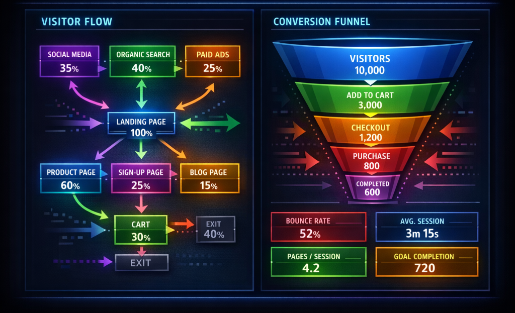
These are two very different problems that can look identical in your analytics. If your traffic is coming from a poorly targeted ad or a keyword that doesn't match what your page delivers, visitors will leave fast - it's not a page problem. But if your traffic is well-matched and they are still leaving, the page itself has work to do. Personalizing your opt-in offers based on traffic source can help close that gap.
| Bounce Rate Range | What It Might Indicate on a Lead Gen Page |
|---|---|
| Under 40% | Strong alignment between traffic source and page content |
| 40% - 55% | Reasonable performance with room to improve |
| 56% - 70% | Worth investigating traffic sources and page messaging |
| Over 70% | A likely disconnect between expectation and delivery |
It's also worth checking where your traffic comes from before drawing conclusions. Paid traffic tends to bounce more than organic traffic because user intent can vary depending on the ad. Email traffic, on the other hand, tends to bounce less because those visitors already know who you are. You can also look at micro-conversion metrics to get a clearer picture of how visitors are engaging before they leave.
Your bounce rate is a signal, not a verdict. Treat it as a prompt to investigate instead of a score to panic about.
How Slow Load Times Are Quietly Killing Your Conversions
Page speed is one of the most ignored reasons visitors leave a lead generation page before doing anything. At that point it's not about design or copy - they're gone before any of that even registers.
The numbers here are hard to ignore. A single second of delay increases bounce rate by 8.3% on mobile, and 53% of mobile users will leave a page that takes more than three seconds to load. Most lead generation pages pull in heavy images, tracking scripts, and third-party widgets that push load times well past that threshold.
The Economic Times put this to the test and saw a 43% reduction in bounce rate after making speed improvements to their pages; it's not a small win - it's an actual change driven entirely by technical fixes, not content changes.
The good news is that you don't need a developer on call to make a difference. Unoptimized images are one of the biggest contributors to slow load times, so image compression is a great place to start. Tools like Squoosh or TinyPNG let you cut back on file sizes dramatically without any visible drop in quality.

Take a look at how scripts are running on your page. Every third-party tag - analytics tools, chat widgets, retargeting pixels - can add to the load time. Audit what's actually necessary and remove anything that isn't pulling its weight.
Browser caching is another helpful fix worth implementing - it tells a visitor's browser to store page elements locally so they don't have to reload everything from scratch on repeat visits, especially helpful if you're running paid traffic to the same landing page repeatedly.
A content delivery network, or CDN, can also help - it serves your page from servers that are physically closer to your visitors so there's less distance for data to travel. Many hosting providers include this as part of their plans.
Run your pages through Google PageSpeed Insights to get a baseline - it tells you what's slowing things down and gives you prioritized recommendations to work through. Once speed is under control, small design tweaks can push your conversions even further.
The Message Match Problem Most Marketers Overlook
Once your page loads fast, the next thing a visitor does is read it. And if what they see doesn't match what brought them there, they leave - it's that quick.
Message match is the degree to which your landing page aligns with the language, promise, and tone of the ad or email that sent them to it. When those two things line up, visitors feel like they're in the right place. When they don't, there's a disconnect that no amount of design can fix.
Here's an easy example to make this concrete. Someone clicks an ad that says "Get Your Free SEO Audit." That promise is clear - it tells them what they're going to get. But the link drops them on a generic homepage with a tagline about "growing your business online" and a contact form at the bottom. The visitor doesn't see the audit. They don't see the word "free." They see something that feels unrelated to what they clicked, so they go back.
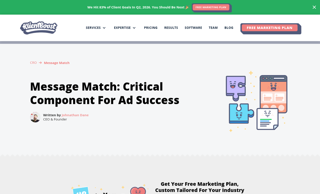
This happens more than most people realise. The ad gets written by one person, the landing page by another, and no one checks that the two are actually talking about the same thing. Sometimes the page just hasn't been updated to match a newer campaign.
The fix is to look at your funnel from the visitor's point of view. Read your ad first, then click through to the page and ask yourself: does this page deliver on what the ad promised? Is the headline on the page close to the language in the ad? Is the same benefit front and centre?
You don't need a perfect word-for-word match. What you need is for the visitor to feel a sense of continuity - the page should be a natural extension of what they already read or heard. That continuity builds trust before they've even scrolled. If you're running paid traffic, it's also worth reviewing how your ad platform integrations are set up to make sure your campaign data flows cleanly alongside your messaging.
Take 20 minutes this week to go through your active campaigns and check each one. Click your own ads and emails. See what your visitors see.
Why Cluttered Pages and Too Many Offers Drive Visitors Away
Once a visitor lands on your page, the next threat to your conversion rate is the page itself. Too many options, buttons, and too many competing messages create a mental friction that makes visitors shut down and leave.
This has a name: choice fatigue. When the brain has to review too many options at once, it takes the easiest path available. That path is usually the back button. Research has shown that pages with multiple competing calls to action can cut back on conversions by as high as 266%; it's not a small dip; it's the difference between a page that works and one that quietly fails.
A helpful exercise is to go to your lead generation page and count every "ask" on it - this includes newsletter sign-ups, download buttons, contact form links, social media icons, and anything else that wants a click. Most marketers find more than they expected.
Simplicity also signals confidence. A page that knows what it wants the visitor to do feels honest and intentional. A page that throws five things at you feels uncertain, like the business itself isn't sure what it wants.
The fix is to follow one focused goal per page and build everything around that single action. Every headline, every sentence, every image should support that one outcome and nothing else. A well-crafted call-to-action button becomes far more effective when it's the only real choice on the page.
| Single-Offer Page | Multi-Offer Page |
|---|---|
| One clear call to action | Multiple buttons competing for attention |
| Focused, minimal navigation | Full site navigation still visible |
| Copy supports one outcome | Copy pulls in different directions |
| Visitor knows what to do next | Visitor has to decide what matters most |
| Higher chance of conversion | Higher chance of abandonment |
A cluttered page actively works against you by making visitors do mental work they didn't sign up for.
Form Design Mistakes That Make People Bounce Before They Convert
Form design is usually the last place standing between a visitor and a conversion- it's also one of the easiest places to lose them. Small friction points in form design push visitors away before they ever hit submit.
The biggest mistake is asking for too much information. Every extra field you add is a reason for people to leave. Research has shown that removing even one field from a form can increase conversions by as high as 50%; it's a dramatic return for a small difference.
A helpful question to ask is if you actually need a given field, or if it's just habit. A phone number, a job title, a company size - these might feel helpful to collect. But if they aren't needed to follow up, they're costing you leads. Start with the bare minimum and add fields later in the relationship.
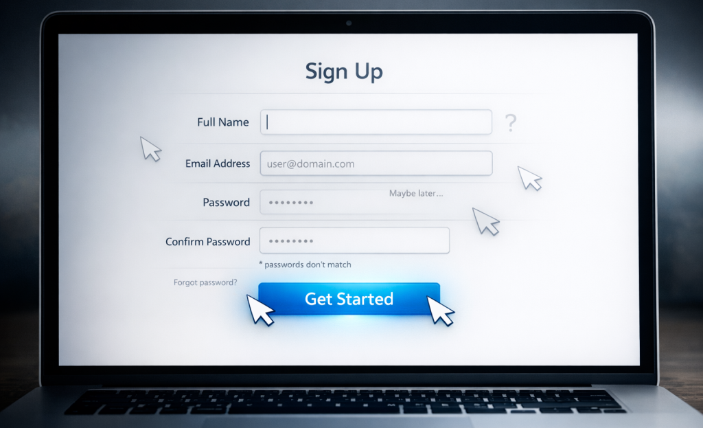
Button language matters more than you might expect. A generic "Submit" button has been shown to cut back on conversion rates by around 3% compared to buttons that tell visitors what they're getting. Something like "Get My Free Guide" or "Send Me the Checklist" gives a reason to click and reinforces the next step so they don't pause.
Here's a quick look at button language and how different strategies affect perceived value:
| Button Text | What It Communicates | Effect on Conversion |
|---|---|---|
| Submit | Nothing specific | Lower conversion rate |
| Get My Free Guide | Clear benefit, personal | Higher conversion rate |
| Sign Up Now | Action-focused, vague reward | Moderate conversion rate |
| Send Me the Checklist | Specific, low commitment feel | Higher conversion rate |
Form placement is another point worth checking. A form buried below the fold means visitors never see it. If your page is long, it's worth repeating the form or at least a call to action partway through the content. Sticky bars and banners are one way to keep a signup option visible without cluttering the page.
Short forms, well-written field labels, and placement work together to cut back on the friction that sends visitors away.
Building Trust Fast So Visitors Don't Leave Out of Doubt
A page can load fast, look great, and have an easy form - and still lose. If a first-time visitor doesn't feel confident about who you are or why they're there, they'll leave without a second thought. Doubt is quiet. But it's one of the biggest reasons visitors don't convert.
Consider what a skeptical visitor sees above the fold. They don't know you, so they're scanning for tells that tell them this is a legitimate business worth trusting. A logo and a headline aren't enough on their own. You need elements that do the work of reassurance before anyone has to scroll.
Testimonials are one of the most helpful tools you have here. Short ones tend to be more helpful than long glowing paragraphs. A name, a result, and maybe a photo - that combination carries weight. Place at least one testimonial near the top of the page instead of burying it at the bottom where most visitors won't reach it.
Security badges and privacy statements matter more than expected, and that's also the case near the form itself. A small line that says "We don't sell your information" right below the submit button directly addresses the hesitation a visitor might feel. That placement is deliberate and it works. You can also review your privacy policy to make sure the language is clear and reassuring to visitors.
Cold traffic and retargeted visitors need different things from you. Someone who has never heard of your brand needs more reassurance - include recognizable client logos, media mentions, or third-party review ratings. A retargeted visitor already has some familiarity, so a testimonial or a reminder of what they get can be enough to tip them toward converting. Learn more about how to use social proof without appearing manipulative to get this balance right.
| Trust Signal | Best Placement | Works Best For |
|---|---|---|
| Short testimonials | Above the fold or near the form | Both cold and warm traffic |
| Privacy statement | Directly below the submit button | Cold traffic especially |
| Client logos or media badges | Below the headline | Cold traffic |
| Review ratings | Near the form or headline | Cold traffic |
You want to remove the mental friction that makes visitors pause. Every trust signal you place is a small answer to a question your visitor hasn't asked out loud yet. If you're also using urgency or scarcity tactics alongside trust signals, make sure they're implemented in a way that reinforces rather than undermines confidence.
Mobile Experience Fixes That Stop the Silent Exit
Mobile visitors behave differently from desktop visitors. They're mid-job, distracted, or using one thumb - and any friction in your layout will make them leave without a second thought.
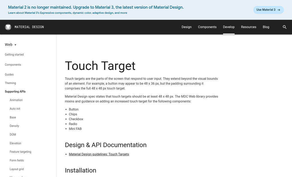
One of the most ignored problems is tap target size. Buttons and links that feel fine on a desktop can be frustratingly small on a phone screen. A good rule is to make interactive elements at least 44x44 pixels so fingers can hit them reliably. When a visitor taps the wrong thing twice in a row, they're gone.
Font size matters more on mobile than you might expect. Body text below 16px forces visitors to pinch and zoom, which breaks the reading flow. Your headline should feel strong and immediate, and your supporting copy should be easy to scan in a single downward scroll. Vertical layout controls attention on mobile in a way that horizontal desktop grids never do.
Forms are where mobile lead generation pages tend to lose people. A form with six fields and small input boxes doesn't work on a small screen. Cut your form down to only the fields you legitimately need, use large input areas, and set the right keyboard type for each field - so a phone number input pulls up a number pad, not a full keyboard. Small details like that cut back on friction in a way visitors will feel even if they can't name it. If you're struggling with why mobile opt-in forms convert so poorly, input type and field count are often the culprits.
Sticky CTAs are worth testing on mobile. A button that stays visible as the visitor scrolls means they never have to hunt for the next step. Just make sure it doesn't eat too much screen space and block the content underneath.
One thing that always gets skipped: test your pages on physical devices. Browser simulators in desktop tools are helpful, but they don't replicate touch behavior, scroll inertia, or how a page actually loads on mobile data. Hand the page to someone on their phone and watch what they do. Tools like Crazy Egg or Microsoft Clarity can also help you see how real mobile users interact with your layout.
| Mobile UX Element | Common Problem | Quick Fix |
|---|---|---|
| Tap targets | Too small to press accurately | Minimum 44x44px size |
| Body text | Below 16px forces zoom | Set base font to 16px or above |
| Form fields | Too many fields, wrong keyboard type | Trim fields and use input type attributes |
| CTA button | Disappears on scroll | Use a sticky CTA for mobile layouts |
| Testing method | Relying only on simulators | Test on real devices with real users |
Turn Your Lead Gen Page Into a Page Worth Staying On
The best place to start is the lead gen page that gets the most traffic. Open it with fresh eyes - or better yet, watch a session recording and see where visitors pause, scroll back, or leave. Use what you've learned here as your audit checklist and let what you find set your goals. You don't need to rebuild everything at once.

Pick one or two changes, do them cleanly, and measure the results before moving on. A shorter form, a faster load time, a headline that actually speaks to your visitor's problem - small, deliberate improvements compound faster. Over time, those incremental gains add up to a page that converts - not just one that occasionally gets lucky.
FAQs
What is a normal bounce rate for lead generation pages?
Bounce rates between 30% and 55% are widely considered normal for lead generation sites. HubSpot data shows B2B sites average around 56% and B2C sites average around 45%, so context and traffic source matter when evaluating your numbers.
How does page speed affect bounce rate?
A single second of load delay increases bounce rate by 8.3% on mobile, and 53% of mobile users leave pages taking more than three seconds to load. Compressing images and removing unnecessary scripts are quick ways to improve speed.
What is message match and why does it matter?
Message match is how well your landing page aligns with the ad or email that brought visitors there. When the headline and offer don't reflect what was promised in the ad, visitors feel misled and leave immediately.
How many form fields should a lead generation form have?
As few as possible. Research shows removing even one form field can increase conversions by up to 50%. Only ask for information you genuinely need to follow up, and add additional fields later in the relationship.
Where should trust signals be placed on a landing page?
Place testimonials above the fold or near the form, and add a privacy statement directly below the submit button. Positioning trust signals close to where visitors make their decision helps reduce doubt before they leave.


