

Thank you pages are one of the most ignored places in any funnel, and that's what makes them such a missed opportunity. Marketers spend weeks A/B testing headlines, obsessing over button colors, and rewriting copy on landing pages - then abandon the page that comes right after. They're treated as the finish line, a formality, the online equivalent of a receipt stuffed in a drawer.
Let's talk about what makes the thank you page different from almost every other page you own: the person landing on it has already said yes to you. They're not skeptical strangers scrolling past an ad. They're warm, engaged, and - for a quick window - paying close attention. It's a rare combination in marketing, and most businesses fail to say anything worth remembering.
The good news is that optimizing your thank you page doesn't need a full funnel overhaul or a big budget - it just requires learning what your visitors are ready to hear and giving them a strong next step. This post walks you through how to do that, so the page you've been ignoring starts doing some work.
Key Takeaways
- Thank you pages receive 5-10x more engagement than blog posts, yet 74% have no secondary call to action.
- Conversion rates within the first 60 minutes post-conversion reach 8-12%, versus just 2-3% for next-day emails.
- Secondary offers like upsells, referral prompts, and content upgrades perform best when they feel like natural next steps.
- Post-conversion surveys on thank you pages achieve 30-40% completion rates, revealing valuable audience insights.
- One focused next step outperforms multiple competing calls to action; confirmation should always appear first.
Why Your Thank You Page Is the Most Underused Page in Your Funnel
Most marketers put effort into their landing pages and almost none into what comes after. The thank you page gets a quick "you're all set" message, and it's a missed opportunity of the highest order.
Thank you pages receive 5 to 10 times more engagement than standard blog posts or promotional emails. People who just converted are actively paying attention. They clicked, they committed, and now they're waiting to see what comes next.
That matters because post-conversion visitors are in a different mental state than a person who just stumbled onto your site. Cold traffic is skeptical and distracted. Someone who just signed up, purchased, or registered has already decided they trust you enough to take action. That trust doesn't disappear the second they hit submit - it's actually at its highest point right then.
Consider what that means in practice. You have a visitor who is engaged, receptive, and has just proven they're willing to do something you asked them for. That's not the moment to send them to a dead-end page with a checkmark graphic and nothing else.
The psychology here is worth understanding. When someone completes an action, there's a brief window where they feel good about their choice and want to keep that momentum going. They're not ready to close the tab and move on - at least not immediately. If you give them a reason to stay, to learn, or to take one more step, a number of them will.
But most thank you pages work as an exit door. The conversion happens, the page loads, and the relationship pauses. All that engagement, all that goodwill, just sits there with nowhere to go.
Most marketers underestimate what this page is capable of - it sits at the end of a funnel and gets treated like the end of a conversation, when it's the best possible time to start the next one. The people landing here are your warmest audience at their most attentive moment, and that combination doesn't come along very often in a marketing funnel.
So if this page already gets that level of attention, the question worth asking is what you're actually doing with it.
The Costly Mistakes Most Thank You Pages Make
Here's a number worth sitting with: research from Levri found that 74% of thank you pages have no secondary call to action. That means nearly three out of four businesses collect a lead and then do nothing with the momentum they just built.
The most common version of this looks like a plain page with a short message - "Thanks, we'll be in touch!" - and nothing else. No next step, no link, no way for the visitor to go deeper. The person who just raised their hand to say they're interested is left with nowhere to go.
This gives you a problem because the moment someone converts is one of the highest points of engagement they'll have with your brand. They've just made a choice. They're paying attention. And if you hand them a dead end right at that moment, that's the experience they walk away with.
Consider what that looks like from their side. They filled out a form, gave you their email, and trusted you enough to take an action - and the response they get is a closed door. It's a missed chance to generate more leads, and it says something about how much you value the relationship past the first transaction.
Another mistake is treating the thank you page as a formality instead of a page that can do work. A lot of businesses put effort into their landing pages and none into what comes after. The landing page gets the conversion, sure. But the thank you page is where you choose what comes next - and most businesses just don't make that choice.
There's also the issue of no reciprocal value. Someone gave you something - their contact information - and the page gives them nothing back. No related resource, no invitation to connect, no reason to stay involved; it's a one-sided exchange and people feel it even if they can't name it.
The cost of all this isn't abstract. Every visitor who leaves your thank you page without taking a second action is a lead you'll have to re-engage later through email or ads. That takes time and money. The easier path is to give them a reason to stay in touch before they ever leave the page.
The timing of it all is what makes this work - and that's what comes next.
How to Use the 60-Minute Conversion Window to Your Advantage
The first 60 minutes after someone converts are different from any other point in your funnel. Studies show that conversion rates during this window sit between 8-12%, compared to just 2-3% for a follow-up email sent the next day. That gap is too big to leave on the table.
A few things line up at once during this window. The person just made a decision, which means their attention is still on you and their trust in you is at its highest point. They haven't closed the tab, moved on with their day, or forgotten why they converted.
They're also in what you might call a "yes" mindset. Making one choice actually makes it easier to make another, and that's also the case when the next step is a natural continuation. That's why your thank you page has more pull than almost any email you'll ever send.
The key is to match your ask to the moment. Someone who just downloaded a free guide is not ready to book a strategy call - but they'd be ready to join a free community, watch a short video, or follow you on social media. Think about what a small, logical next step looks like instead of a leap.
A helpful question to ask yourself: what do you want this person to do in the next 60 seconds? Not the next 60 days - the next 60 seconds. That answer should shape everything on your thank you page, from the headline to the button text.
Urgency can also play a role here. But it has to be genuine. A limited-time bonus or a time-sensitive invitation works because the person is already engaged. An arbitrary countdown timer does not - and it can damage the trust you just built. Using urgency and scarcity ethically is the difference between keeping momentum and losing it.
You want to keep the momentum going and not make it feel like they've walked into a sales pitch. You want the next action to feel helpful and connected to what they just did. When it does, the conversion window can become one of the most productive moments in your entire lead generation process.
The next section gets into the types of secondary actions that work best here - and how to frame them so they feel like a natural part of the experience.
Secondary Offers That Turn Thank You Pages Into Lead Machines
A thank you page with nothing but a confirmation message is a missed opportunity. The person on the other end has just taken action and is already in a yes-oriented mindset; it's the best possible moment to present something that builds on what they just did.
The key phrase there is "builds on." The secondary offer has to feel like a natural next step in the same process- not a detour into something unrelated. If someone just downloaded your beginner's guide to email marketing, showing them an advanced automation course makes sense. Pointing them toward your podcast about social media does not.
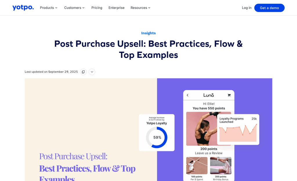
A few offer types perform well in this context. Upsells work especially well after a purchase because buyers have already made a financial commitment. Post-purchase upsells convert at around 5-15%, which is a strong return for content you are already showing to everyone.
Referral prompts are another underused option. Research from Wharton found that referred customers have around 16% higher lifetime value than non-referred ones. An easy "know someone who'd find this useful?" push right after someone converts can quietly build your pipeline without extra ad spend.
Content upgrades, free trials, and demo invitations round out the toolkit. A content upgrade gives the visitor something complementary to what they just received, like a checklist to go with an ebook. A free trial or demo invitation works when someone has just engaged with educational content and could be ready to see the product in action.
| Offer Type | Best Used When | What to Expect |
|---|---|---|
| Upsell | After a purchase or paid conversion | 5-15% conversion on related product |
| Referral Prompt | After any positive action | Higher-value leads with better retention |
| Content Upgrade | After a content download or sign-up | Deeper engagement and longer session time |
| Free Trial or Demo | After educational content consumption | Warm leads closer to a buying decision |
One thing worth keeping in mind: the offer should feel low-pressure. If it reads like a sales push, people will ignore it or feel like they made a mistake by converting. Frame it as an addition- not an ask.
Designing a Thank You Page That Guides Without Overwhelming
The structure of your thank you page matters just as much as what's on it. A visitor who just converted is in a receptive state. But that doesn't mean you can throw everything at them and expect it to land. The page needs to do one thing first: double-check that their action worked.
Start with a short, direct confirmation at the top of the page. Something like "You're all set" or "Your download is on its way" tells them the job is done. Only after that should you introduce the next step - if that's a video, a case study link, or a secondary call to action.
Think about what a first-time visitor actually sees when they land on this page. If there are three calls to action, two banners and a pop-up, they'll do nothing. One next step, placed after the confirmation, is far more likely to get clicked than a page full of competing options.
A short video can do work here. Flare.io added a 90-second product video alongside a case study on their thank you page and saw a 65% increase in demo conversions within a week. The video didn't replace the confirmation or the next step - it supported them - it gave a reason to stay on the page and take action without feeling like they were being sold to.
That distinction matters quite a bit. A page feels honest when the next step makes sense given what the visitor just did - it feels pushy when the next ask seems unrelated or too big a jump from where they are.
Hierarchy is the design principle to keep in mind. Confirmation comes first, then context, then the next action. A secondary element like a video or a testimonial should support the main next step instead of compete with it. Every ingredient on the page should have a job to do.
It also helps to look at your page on a mobile screen before you publish. A layout that feels balanced on a desktop can become a scroll-heavy wall of content on a phone. If the most important action isn't visible without scrolling, visitors won't find it.
The goal is a page that feels like a natural continuation of the experience instead of a change in direction.
Using Post-Conversion Surveys to Learn What Your Leads Actually Want
Most thank you pages focus on what to give the lead next. But taking a moment to ask them something can be just as helpful. A short post-conversion survey can tell you more about your audience than weeks of analytics data.
The completion rates alone make this worth trying. Post-conversion surveys on thank you pages tend to reach 30-40% completion rates, far higher compared to what you'd get from a follow-up email survey. The person just took action, so they're engaged and the page still has their attention - the right moment to ask.
The key is to limit it to one or two questions. You're not running a research study here - you just want enough to know who this person is and what pushed them to convert.
Some questions are more helpful than others. Asking what problem they are trying to solve gives you language you can use in your own copy. Asking what almost stopped them from converting helps you find friction in your funnel that you didn't know was there. Asking how they found you tells you which channels are bringing in motivated leads.
| Question Type | What It Reveals | How to Use the Data |
|---|---|---|
| What problem are you trying to solve? | The real language your leads use to describe their pain points | Rewrite headlines and ad copy to mirror this language |
| What almost stopped you from signing up? | Hidden objections or trust gaps on your landing page | Add reassurances, testimonials, or FAQs to address these |
| How did you hear about us? | Which traffic sources are sending your most motivated leads | Invest more in the channels that convert, less in those that don't |
| What made you decide to sign up today? | The strongest motivators that push someone to act | Emphasize these in your value proposition and email sequences |
The answers feed directly back into your funnel. If ten people say the same thing almost stopped them from converting, that's not a coincidence - it's a fix waiting to happen on your landing page.
Survey replies also sharpen your email nurture sequences. When you know what your leads are actually worried about, you can write follow-up emails that speak to those problems directly instead of guessing.
Turn Your "You're All Set" Page Into a Page That Actually Works
Small, deliberate changes can produce results faster. One SaaS company added a time-limited offer to their thank you page and generated $804 in new monthly recurring revenue - not from a campaign overhaul, not from a new ad budget, but from a page that already existed - the one most marketers forget.
This week, pull up your thank you page and look at it with fresh eyes. If a stranger landed here, would they know what to do next? Would they feel closer to your brand, or just... done? If the answer isn't a confident yes, there's room to grow. Add a relevant CTA, introduce a next step, give them something helpful, or build the relationship before the moment fades.
The best funnels don't close loops - they open new ones. Every page is a chance to build trust, deepen engagement, and move one step further into a relationship with your brand. Your thank you page is no exception. Even tiny design changes can make a meaningful difference, and if you're not sure which version of a page works better, A/B testing tools built for smaller teams can help you find out fast.
FAQs
What makes thank you pages valuable for lead generation?
Thank you pages receive 5-10x more engagement than blog posts, and visitors have already demonstrated trust by converting. This makes them ideal for presenting secondary offers or next steps while attention and goodwill are at their peak.
What is the 60-minute conversion window?
The 60-minute window refers to the period immediately after conversion when engagement is highest. Conversion rates during this window reach 8-12%, compared to just 2-3% for follow-up emails sent the next day.
What secondary offers work best on thank you pages?
Upsells, referral prompts, content upgrades, and free trial invitations perform well. The offer should feel like a natural next step related to what the visitor just did, not an unrelated sales pitch.
How should a thank you page be structured?
Start with a clear confirmation message, then introduce one focused next step. Avoid multiple competing calls to action, as a single well-placed CTA significantly outperforms a cluttered page.
Why include a survey on a thank you page?
Post-conversion surveys achieve 30-40% completion rates. One or two questions can reveal what motivates your leads, what nearly stopped them from converting, and which channels bring your best traffic.


